Taking a Kitchen Down to the Studs and Back
Two architects rebuild their kitchen with a minimalist look at a minimal cost.

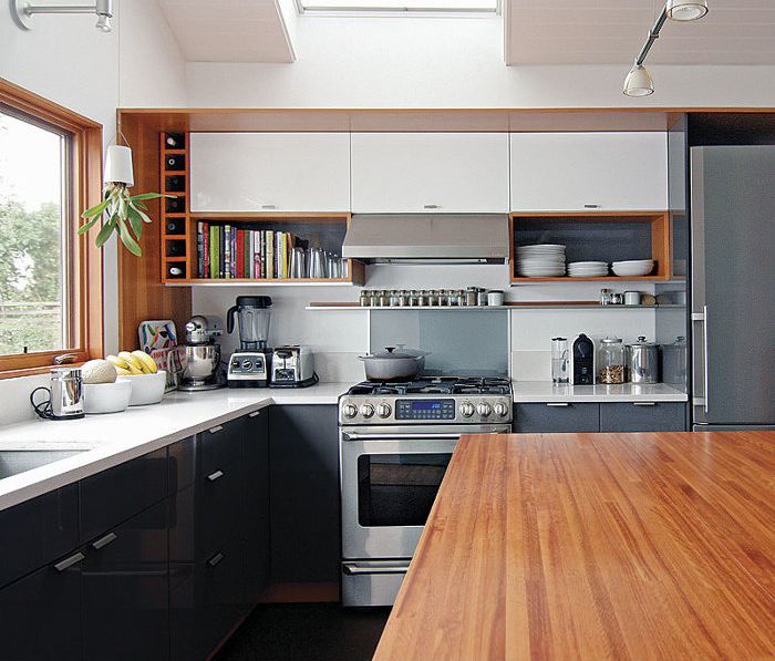
Synopsis: In Lauren and Kyle Zerbey’s 1910 house, the kitchen was effectively the hallway, and its five doorways added to its traffic problems. The Zerbeys lived in the house for four years before they began renovating the kitchen, which gave them time to get the new design right. By surrendering a small porch and a closet, they were able to shift a bath into a corner and move the kitchen to the back of the house. Following an aesthetic they call “natural modernism,” they outfitted the new kitchen with materials and products that feature warm woods, bright whites, and cool grays.
Our house was built in 1910, and although it was Craftsman in style, its small size and lack of custom details led us to believe that it was originally a worker’s cottage. Because of its modest square footage, the kitchen was effectively the hallway of the home — with five doorways adding chaos to its inefficiency.
We lived in our home for four years before tackling the kitchen, which gave us ample time to design and redesign it until we got everything just the way we wanted. By taking the space down to the studs, we were able to move the kitchen toward the back of the house and take over an enclosed porch that was rarely used. Not only did this free up space in the rest of the house by allowing us to shuffle rooms around and squeeze in a second bedroom, but it also created a better visual and physical connection to the backyard.
The kitchen had been “remuddled” in the 1960s. The range was placed where the original woodstove had been, and next to that was a fake cabinet that provided head clearance for a stair down to the basement. A freestanding fridge was located in another corner, and the sink was barely large enough to wash pots and pans in. Soon after moving in, we sacrificed the one bank of drawers the kitchen had to put in a dishwasher, but that was only the beginning of greater changes to come.
As architects, we chose to do most of the work ourselves. Not only was that a way to afford the remodel, but it was also an opportunity to have more hands-on experience with residential construction. Fortunately, Kyle had inherited his grandfather’s tool collection, which gave us a huge boost.
The main objective for remodeling our home was to maximize its space and to create functional and inviting areas with plenty of natural light. One way we handled transitions between these areas was to vary the ceiling form. Over the living area, we exposed the original joists; over the kitchen and dining area, we vaulted the ceiling. New windows and a pair of skylights ensure that we rarely need to turn the lights on, even on the cloudiest of Seattle days.
The kitchen is the workhorse of our house, and the materials and products we chose reflect that. We call our aesthetic natural modernism — warm woods, bright whites, cool grays — a style that’s minimal without being overly austere or impractical. We were able to stay within budget and distinguish our space by modifying a number readily available items.
For more photos, drawings, and details, click the View PDF button below:


