Kitchen and bath design is an ongoing process of problem and solution. As our lifestyles evolve, the problems become more complex, and designers must adapt. And adapt they do. Year after year, the submissions for this issue prove that our readers are a clever and creative lot. Here is a collection of some of the surprising and delightful solutions they shared with us this year.
Breakfast Booth, China Cabinet
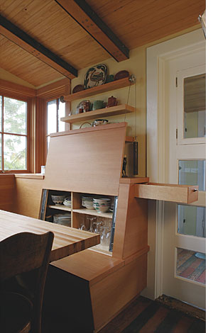
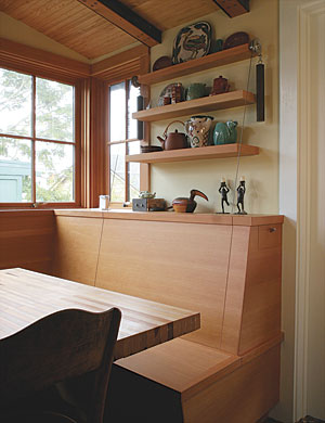
“Let no space go wasted” could be the motto in this house. Its kitchen isn’t large, and yet it feels roomy and right. One reason is this built-in booth beneath a bank of windows. The booth backs are affixed to full-extension drawer slides, allowing them to glide upward to reveal generous storage spaces. Cabled counterweights ride on sheaves, making it easy to hoist the sliding panels. Drawers in the tops of the booth sides claim the rest of the space. The table has an 18-in.-sq. base with skateboard wheels affixed to the two rear corners. Skids on the front two corners keep it from moving inadvertently. To slide it in or out, one simply lifts the front edge of the table.
Architects: Arkin Tilt Architects, Berkeley, Calif.
Cabinetmakers: Bryan Harris and Greg Tolman Emeryville, Calif.
Hot Pad for a Cool Counter
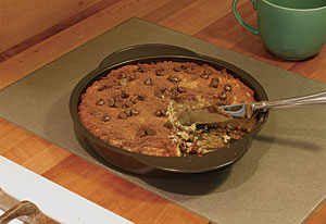
When the coffee cake is ready to come out of the oven and cool off before treat time, this aluminum tile is the perfect rest stop for the cake pan. Designer/builder Paul Johnson routed a recess for the tile into the madrone countertop. The tile, made by Eleek from recycled aluminum, is set with a bead of silicone caulk so that it can move as needed with the wood.
Designer/builder: Paul Johnson, Portland, Ore.
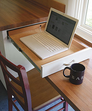
Kitchen Laptop Drawer
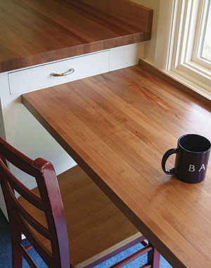
The kids eat their breakfast at this windowsill-height counter next to the kitchen cabinets. Once the kids are off to school, Mom pulls the laptop out of the drawer built into the side of the base cabinet, grabs a cup of coffee, and gets to work. An electric outlet in the base cabinet provides the power.
Designer/builder: Paul Johnson, Portland, Ore.
Powder Room Plus
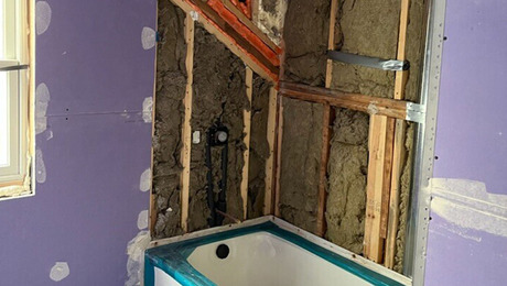
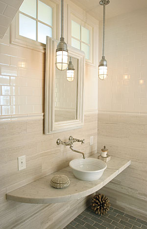
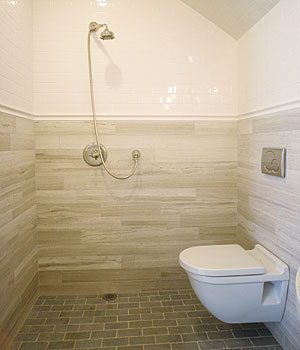
The challenge was complex: Design a sunlit, wheelchair-accessible full bath, without an exterior wall for a window. Make it feel like a powder room, and therefore fit everything into a small footprint. The solution was simple: Make the whole room a shower. Taking a European “wet-room” approach to this project allowed the architect to break free of the clearances needed for a separate shower stall. The entire bathroom is waterproof, tiled, and sloped to a floor drain. Transom windows above the vanity borrow light from a sunlit stairwell. And a wall-mounted toilet and cantilevered vanity keep the floor clear for easy cleaning and visually enlarge the space.
Architect: Stephanie Horowitz, Zero Energy Design, Boston, Mass.
Interior design: Lisa Kauffman Thorp, Concord Green Design, Concord, Mass.
Builder: Aedi Construction, Waltham, Mass.
Sauna-Style Bath
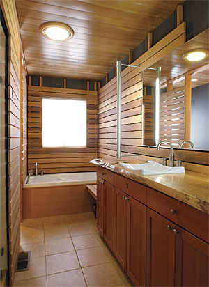
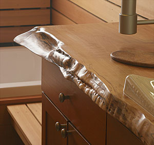
The Scandinavian heritage of this bathroom’s owner inspired its sauna-slat detailing. The existing wallboard, painted a dark gray, makes the old walls recede behind the 1×4 cedar slats. The basic floor plan, fixture locations, and base cabinet all remain the same. A stunning live-edge maple-slab counter tops it off.
Architects: David Hall, HKP Architects, Mt. Vermon, Wash.
Cabinetry/countertop: Smith and Vallee Woodworks, Deming, Wash.
General contractor: The Robbins Company, Edison, Wash.
Dining-Room Desk
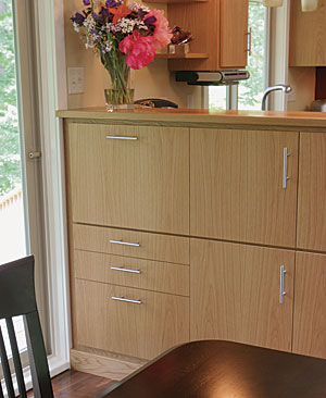
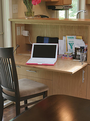
A chest-high buffet cabinet separates the dining area from the kitchen in this house. The buffet turned out to be the perfect place to tuck an old-fashioned flip-down desktop, in the service of 21st-century technology.
Designer/builder: Chris Stebbins, Eugene, Ore.
Cabinets: The Cabinet Factory, Eugene, Ore.
Zipper Door
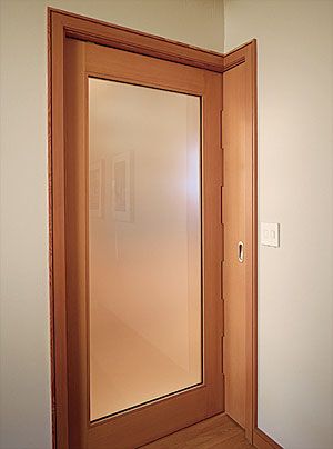
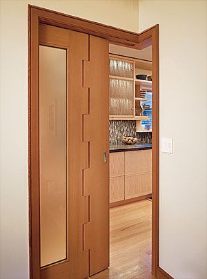
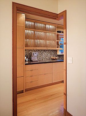
When designing his own kitchen renovation, Nils Finne wanted to create the largest possible opening between the kitchen and the dining room for a strong visual connection. In addition, the door between them needed to be a pocket door, since it would be tucked away most of the time. Constraints limited the opening to 37 in., but Finne was able to expand the opening another 12 in. by making it L-shaped. But how to make a pocket door for an L-shaped opening? The answer was to make a glass panel door, then add a solid panel with a large finger joint pinned with a stainless-steel rod. The finger joint allows the two panels to be coplanar while tucked into the wall pocket. Then, when the door slides out, the return panel swings out to make an L-shaped door.
Architect: Nils Finne, Seattle
Door: Quantum Windows and Doors, Everett, Wash.
Timber-Frame Range Hood
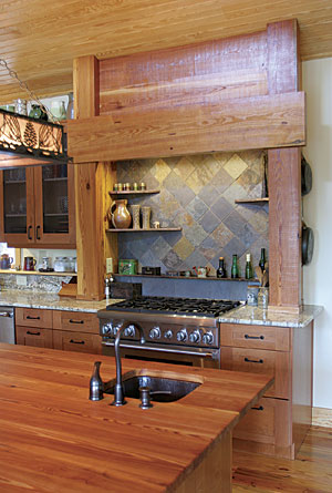
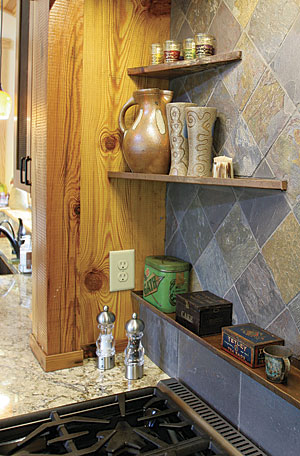
The hood in this North Carolina home is made from reclaimed heart-pine timbers. Wiring to the roof-mounted fan and to the hood’s LED lights runs in channels hollowed out of the centers of the timbers. Copper shelves and slate tiles complete the rustic look.
Designer/builder: Chandler Design-Build, Mebane, N.C.
French-Door China Cabinet
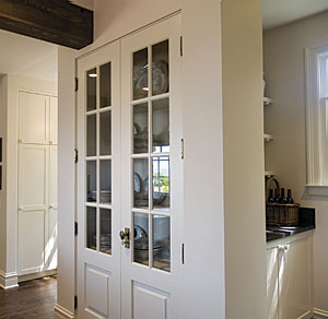
Most of the storage space in this kitchen is behind paneled doors, but the client wanted to display some of the nicer serving pieces in a tall cabinet. Architect Jay Lazerwitz knew that most cabinetmakers won’t warranty doors more than 5 ft. tall against warping over time, so he suggested using a pair of stock French doors. They are plenty sturdy, and affordable as well.
Architect: Jay Lazerwitz, Seattle Cabinetmaker: Dave Logan, Seattle
Hair-Salon Cabinet
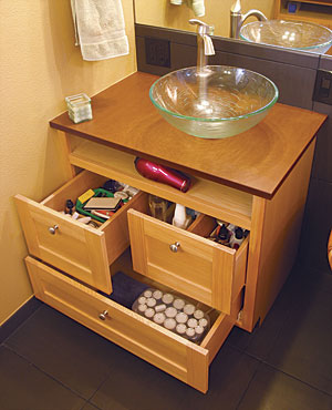
A plugged-in hair dryer is at the ready in this hardworking vanity cabinet. An outlet at the back of the top shelf provides the power. Drawers for curlers, brushes, and hair-care products are notched to fit around the sink’s P-trap.
Designer/builder: Meyers Woodworks, Olympia, Wash.
Floor Tiles as Countertop
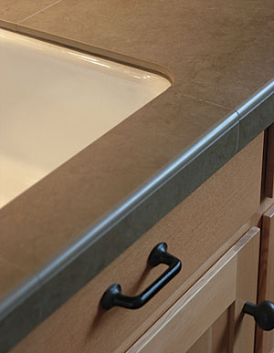
Porcelain floor tiles are a bargain. They’re affordable and come in large sizes, so you can cover a lot of area with minimal grout lines. They’re tough and smart looking, and their color isn’t just skin deep—it runs all the way through. That’s why designer/builder Chris Stebbins uses them for countertops. His tilesetters used diamond saws and grinders to cut and polish both the cutout for this undermount sink and the bullnose profile on the edge of this kitchen counter.
Designer: Chris Stebbins, Eugene, Ore.
Tile installer: Marcelano Villegas, Eugene, Ore.
Fridge Cabinets—Sideways
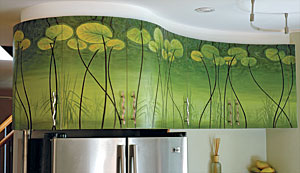
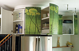
The problem with cabinets over the fridge is that they’re too high and too deep to be of much use. Furniture maker and artist Dean Jackson solved this problem with side-loaded drawers on full-extension drawer slides. Each pullout has a lipped base so that stuff stays put. The long curvy line of doors provided the perfect canvas for Jackson’s hand-painted water lilies, making this cabinet not only useful but also the focal point of the kitchen.
Designer/builder/painter: Dean Jackson, Toronto, Ont.
Contoured Drawer Front
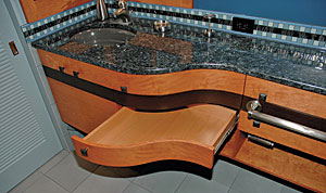
To make this remodeled bath feel less cramped, cabinetmaker David Getts raised the cabinet above the floor and gave it a sweet curve to lessen its visual weight. The drawer front is laminated from 1/8-in. bending plywood covered on all sides and edges with cherry veneer.
Designer: Robin Kmet, Arlington, Wash.
Cabinetmaker: David Getts, Seattle
Corkscrew Drawer
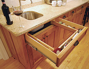
Having spent far too many hours installing and adjusting tilt-down drawer fronts for sinks, Bob Rasero decided to make something different that not only would be a useful space for tucking away the little kitchen items that need a home, but also a nice surprise when the dinner guests think they’ve seen it all. Here’s one he did for a customer’s wine bar for the corkscrew collection.
Designer/cabinetmaker: Bob Rasero, Cumberland Foreside, Maine
Avoiding the Rheostat
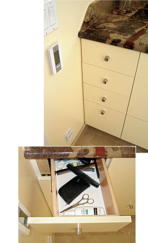
Home building is full of curveballs, and here was a wicked one: The wall control for the radiant floor stuck out far enough to catch the top drawer front. To solve the problem, architect John McLean had the cabinetmaker position the drawer slides at an angle inside the cabinet and make the drawer box a parallelogram rather than a rectangle. As the drawer is pulled out, it travels at an angle sufficient to glide just past the control when the drawer reaches it.
Architect: John McLean, San Francisco
Builder: Mayta and Jensen, San Francisco
Pivot Drawer
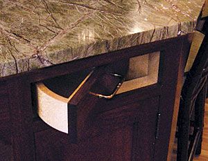
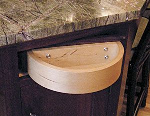
This kitchen-island corner is faceted at 45° to eliminate a sharp, hip-catching corner. But how to use the potential storage space? A 12-layer laminated-birch half-circle forms the drawer’s back. The drawer pivots on a 1/4-in.-dia. aluminum pin that passes through the drawer front. This has turned out to be the client’s preferred car-key storage drawer.
Designer: David Heide, Minneapolis
Cabinetmaker: Jon Frost, St. Paul, Minn.
