Project Description:
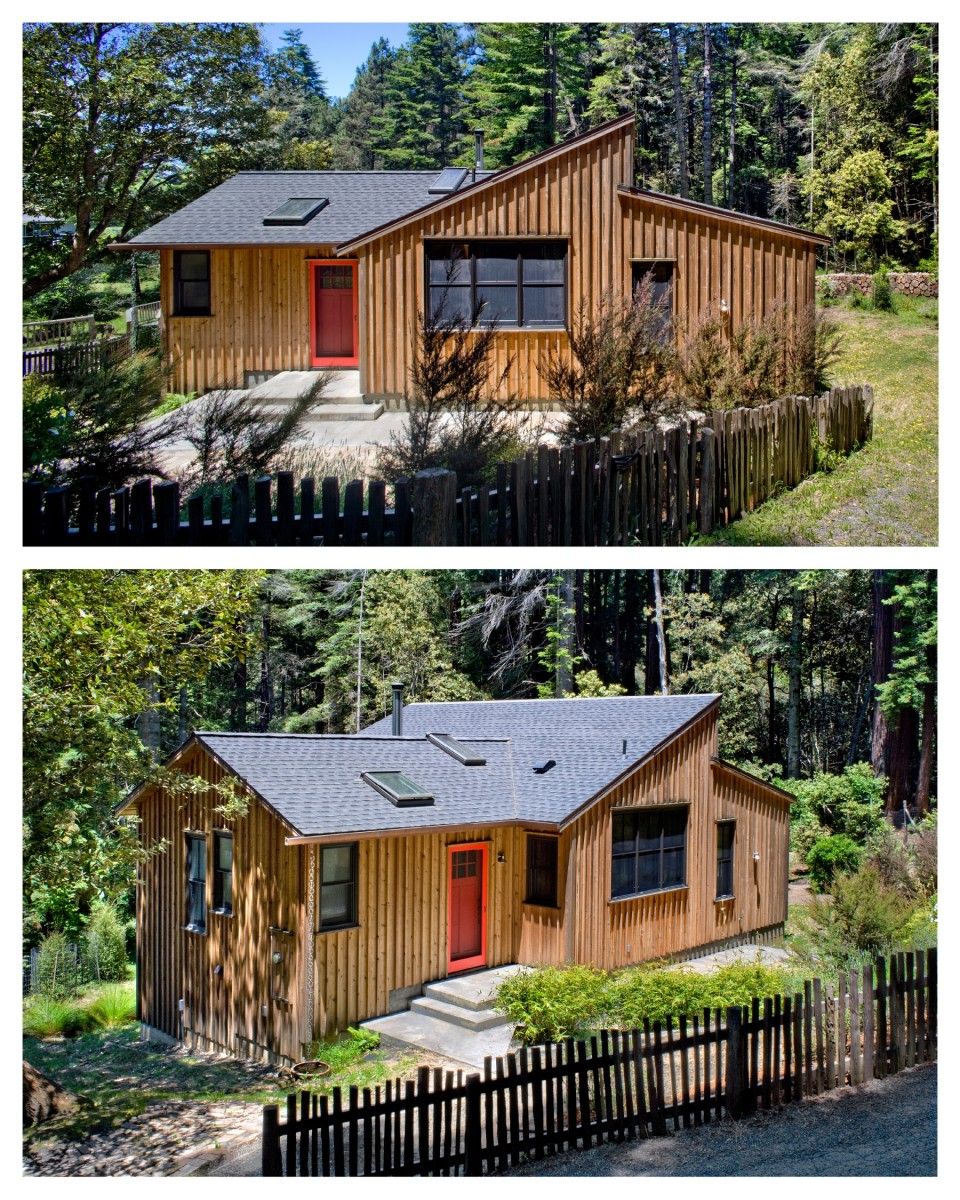
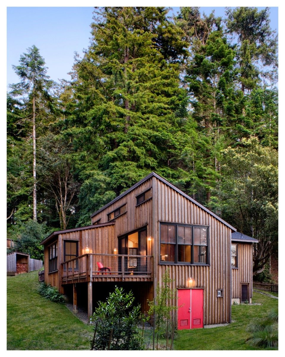
Designed as a weekend getaway, this compact (762 SF – net) 2BR cottage often elicits the same two reactions from visitors: that it feels much larger than it is, and how easy it would be to live in full time – as it has all that one needs.
As both the architect and the client, the design of this cottage provided a wonderful opportunity to respond to a question I ask almost all clients – especially those who are interested in green design – how small are you willing to consider? Demonstrating that one can live extremely comfortably in a house smaller than most clients would consider possible also nicely dovetailed with a universal question – that is, how do you do all that you want within your budget?
The site is where one starts. On this project, the site presented the first challenge as it easily was described as a lot that only an architect (or landscape architect) could love. On the plus side – it was an affordable ¼ acre, near the coast in northern California, within a few hours from where I live and work. It was sunny and naturally protected from the often fierce coastal winds and it looked towards a wooded watershed preserve through which one can see filtered views of the ocean. On the less than plus side, as the third property in a line of four, it shared a steep private road that angled through every lot dividing each one into an unbuildable uphill zone and a buildable downhill section. The lot contained a loop road for fire truck access that would need to be reworked to reclaim building area but still preserve neighborhood safety. The adjacent houses were close by and were likely candidates for expansion so the planning needed to anticipate this – especially from the privacy + view standpoint. A new driveway set on one side with a lightly landscaped extension for the fire truck solved the loop road problem and doubled the available site. The house was oriented so that most openings faced towards the natural views and or parts of adjacent lots that could never be built upon. This ensured permanent views and privacy.
The quality of careful construction I wanted coupled with the cost of certain features such as the many large, good quality windows and doors would result in a cost/SF that meant the cottage had to stay under 800 SF of conditioned space to remain in budget.
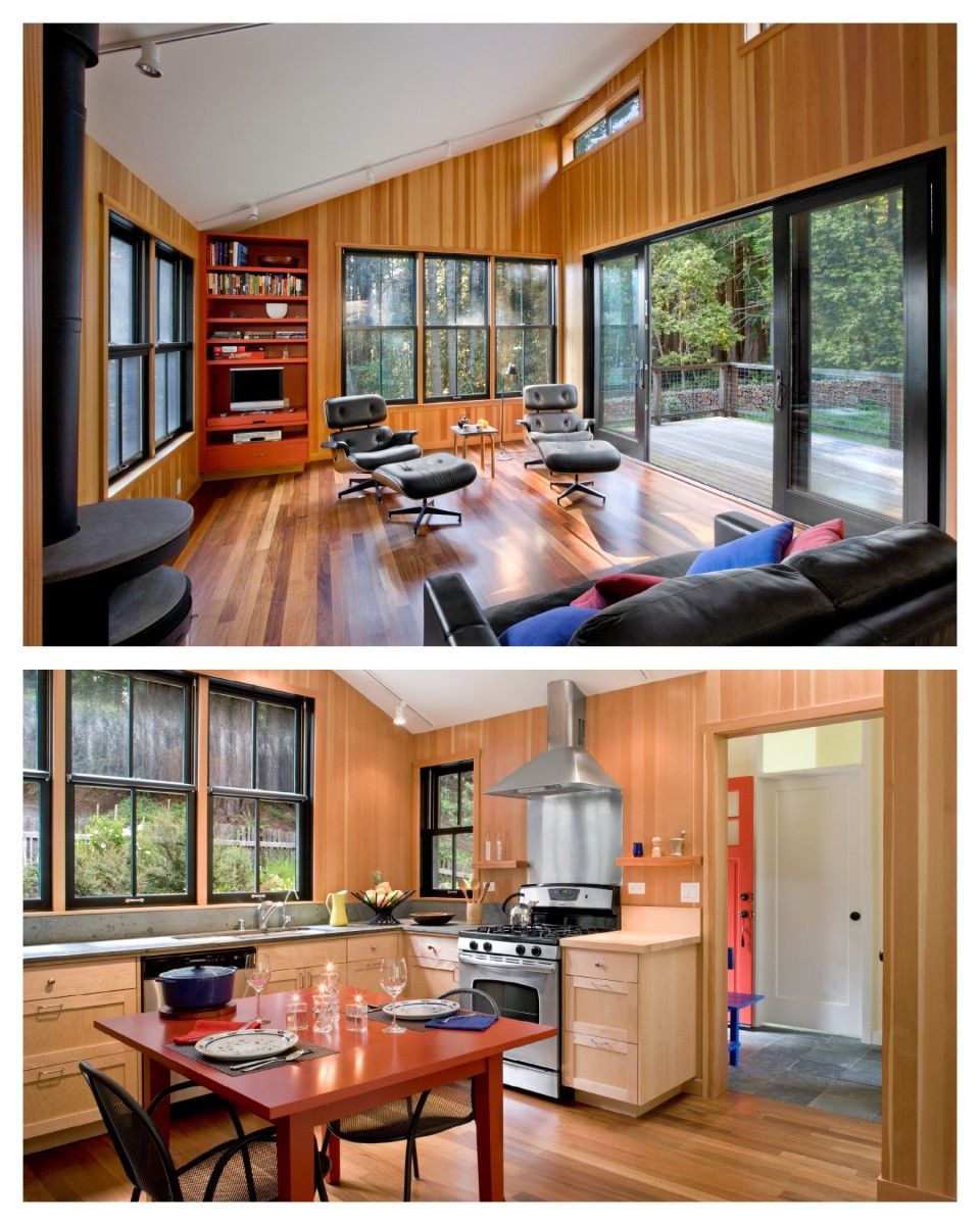
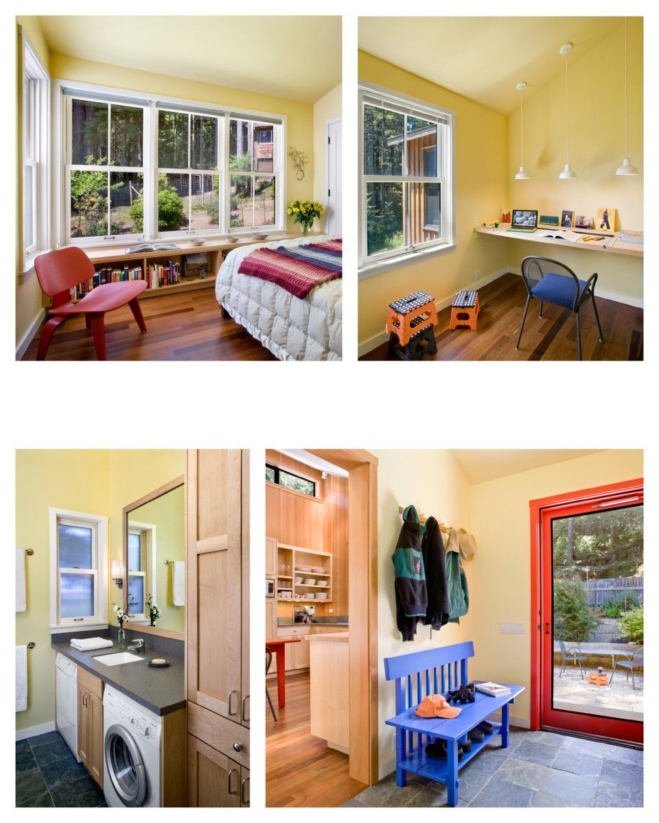
To achieve this size – and include two small bedrooms, one for guests – spaces would have to share functions to the greatest extent possible and dedicated circulation space would have to be kept to a minimum. The rainy winters – and the need to get in and out of wet clothes – suggested the solution to the circulation issue and the linking of functions followed. A centrally placed entry acts as a mudroom and is also where three of the four other rooms are accessed: a bathroom/laundry, a small guestroom/study and the main room – that combined kitchen, eating and living space, eliminating a standalone hallway and grouping more than one function in each space. The one other room, the primary bedroom, sits off of the main living space.
Spaciousness does not always require a lot of space as it is more directly tied to a feeling of openness than actual square footage. In this design, the height within the repeated simple volume of each room, a one way sloped cathedral ceiling, and the openings on multiple sides, through which one can both connect and borrow space from the out of doors, create the spacious feel. Built-in cabinets in all but the entry/mudroom, mean that one needs less furniture. This is a well proven strategy for making a small space feel larger.
The selective use of special wood finishes was a cost savings strategy first proposed to me by a client and this suggested the design idea of using two very different paint colors for the wood interiors of the metal clad double hung windows. An Ipe floor was used in all but the entry and bath which is slate tile. All of the rooms except the main room have painted sheetrock walls and ceilings with painted white doors, windows and trim. The light color palette makes these smaller rooms feel larger. The main room uses Douglas Fir boards for the wall material, and the large windows and exterior doors in this room are painted black. The black frames nearly disappear and the tall opening proportions mirror the trees beyond. The warm palette makes this tall space feel more intimate.
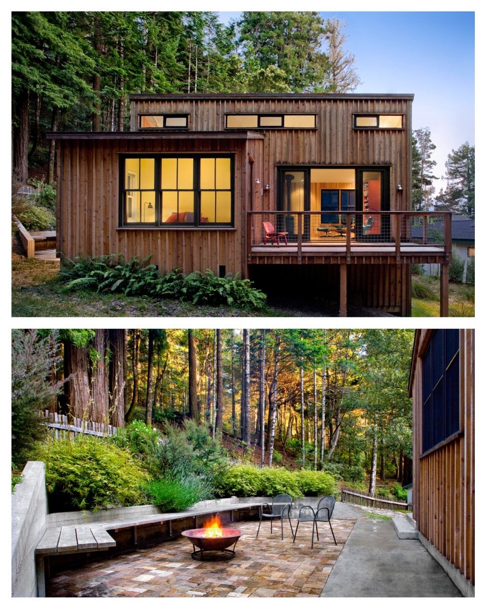
The house has a cozy feel with a sense of privacy that makes it a wonderful quiet retreat for two and at the same time the unexpected but obvious spaciousness make it feel comfortably large enough for groups. The exterior spaces most immediately adjacent to the house – the landscaped front terrace whose retaining wall planter includes a built in bench – permitted a simpler house foundation while the rear deck is set high like a tree house; both spaces allow one to move in and out of the sun and shade through the day and further expand the living area. The cottage lends truth to the adage that “small is beautiful”, and further, that small is sensible and small is livable.
