Carolyn Bates, photographer extraordinaire, recommended I contact you about my recent kitchen remodel.
Please consider including my “less is more” remodel in the upcoming 2013-4 KitchenBath edition.
Small is the new big.
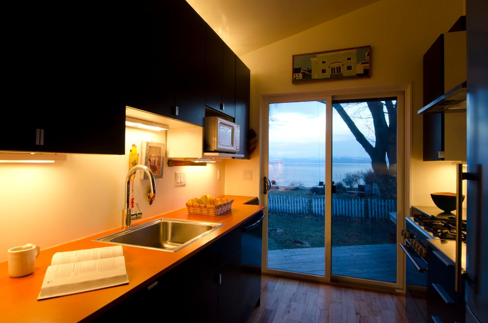
Just take a look at my kitchen. Eighty square feet of…wow! …
Is it the view? Is it the “butterfly ceiling ? The lighting designed by Naomi Miller? The simple palette of white, black and a dash of paprika? Or is it the practical convenience that puts everything a good cook needs within a pivot’s distance from anywhere in the room?
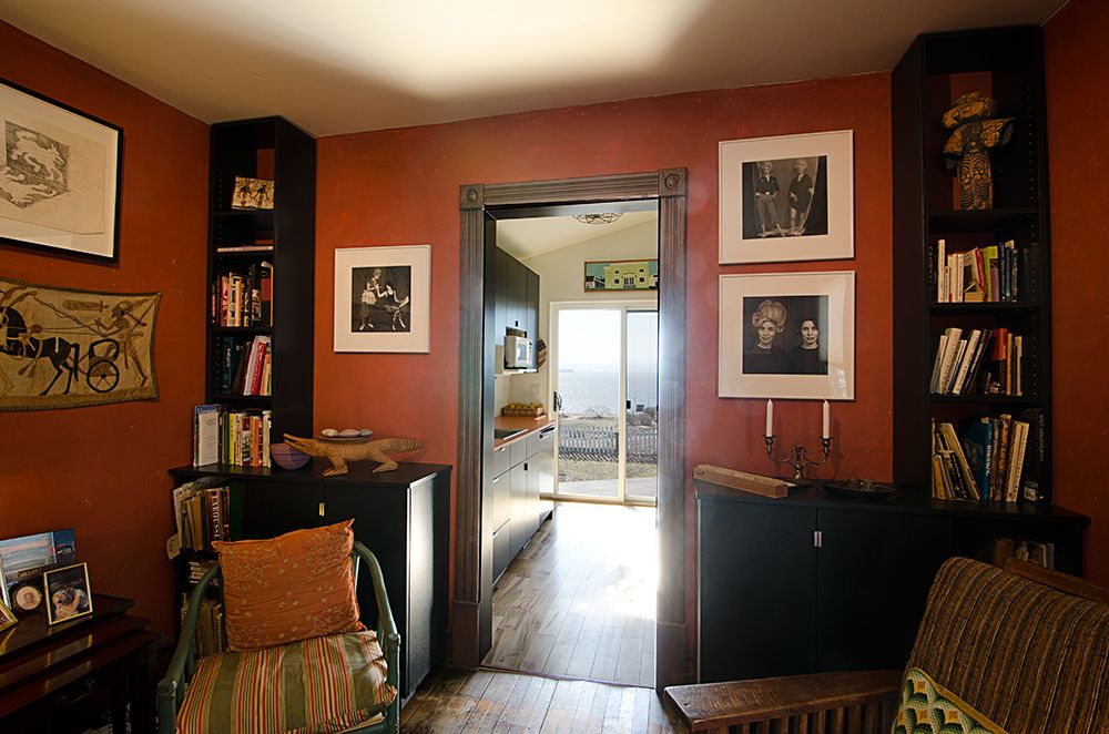
Whatever it is, visitors are immediately drawn to the room despite the fact that it was specifically designed for one person or two, max. It’s tininess allows my guests to be with me without being underfoot while I prep meals. They can visit just as intimately from the living room inside or the deck outside.
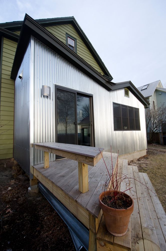
The idea of where to locate the new kitchen may have been mine but the execution was accomplished by Brian Mac, AIA, Principal Architect, Birdseye Design. With one stroke of his Sharpee on a transparent paper overlaid on a picture, he solved a gabled roofline conundrum, offered siding in galvanized metal and elevated a very plain, disproportionate back end of the house into something aesthetic and inviting. Oh. And doable on a limited budget.
As my plumber once said, “Mag, most people knock out walls and make rooms bigger, you build walls and make them smaller. This is the most efficient kitchen I’ve ever seen ….”
Don’t take my plumber’s word for it. See it for yourself. Contact me, Maggie Sherman, at the contact information in my signature.
PS….the reason I did this remodel was because I wanted a ground floor master suite (with a view of Lake Champlain) for myself. The original kitchen and adjacent “el” gave me the space to do this. I just needed to figure out where a new kitchen could go. That perfect spot was to build next to the “el” and adding eighty square feet was affordable for me.
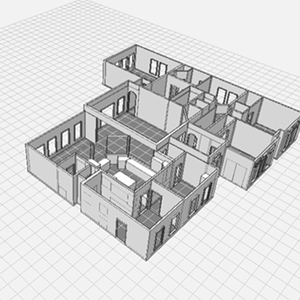
For the kitchen layout and accoutrements I studied small space usage in boat design and European products for their design and use in small spaces. Here are just a few details…
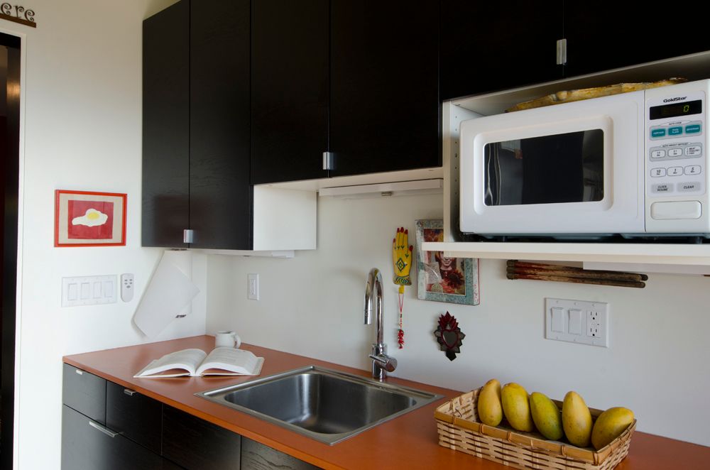
1) The paprika colored countertop is Valchromat, a green product manufactured in Portugal.
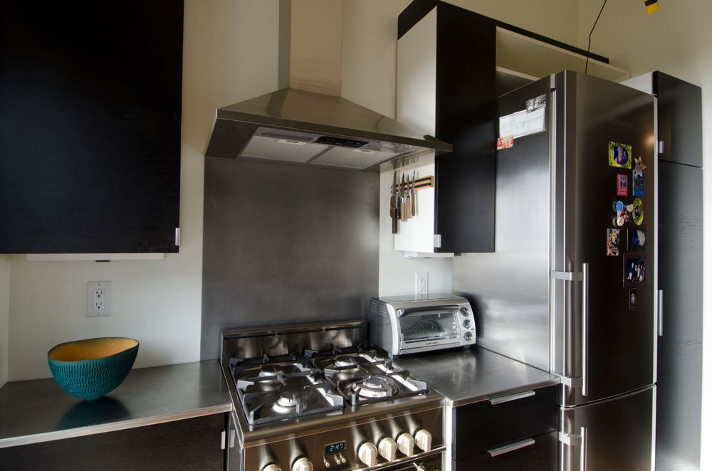
2) The stove is Avanti/Elba (Italian design, Swiss manufactured working, thank goodness not the other way around!)) The refrigerator is Liebherr (Germany) ..it is 24″ x 24″ x 6.5′ and so green as it can all be recycled or bio-degrade.
3) The IKEA kitchen sink has an off center drain so I can take maximum advantage of the storage space under the sink without interference from the drain pipe. I have two slideout IKEA baskets to hold the necessary trash and recycling and cleaning aids.
4) To cool the kitchen in the summer and to push the lake breeze into the living room that adjoins the kitchen, I chose the Diane ceiling mounted oscillating fan by Atlas as it could be mounted at the angle of the butterfly ceiling. it is a showstopper when people look up!
Carolyn Bates has more pics, I have more details and I hope Fine Homebuilding has more interest.
I hope you will want to see more and share with your readers, how small is the new big.
Sincerely,
Maggie Sherman
Burlington, Vermont [email protected]802-862-5576

