An Arts and Crafts Kitchen Remodel
A modern kitchen draws inspiration from materials and methods popular at the beginning of the century.
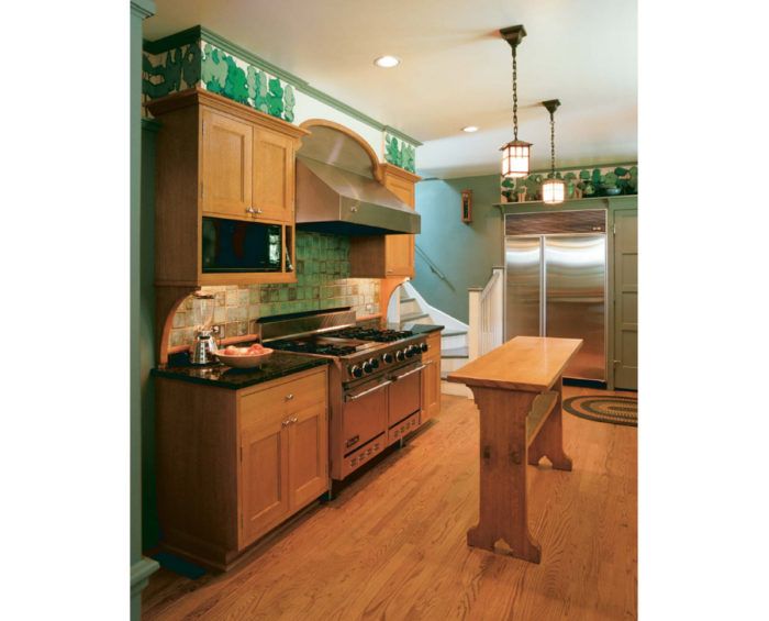
Synopsis: An architect discusses the design of a remodeled Connecticut kitchen, which features materials such as quartersawn red oak and hand-glazed ceramic tile, as well as furniture-quality built-ins that give the kitchen an Arts and Crafts quality.
Older houses have built-in character, but sometimes it takes a tornado to help uncover it. The tornado in this case didn’t damage the house, which was built in the 1920s in Hamden, Connecticut, but it did uproot several large trees that had obscured the view of its somewhat plain facade. Dismayed by the loss of the trees, the home’s owners asked us to design new porches and a pergola to dress up the newly exposed exterior. This initial encounter, inspired by a natural disaster, eventually led us back into the cramped and dark kitchen.
Our original work on the house had introduced us to its Arts and Crafts elements, including an exquisite copper roof and an interior with handsome wood detailing. But as is often the case, the service section, including the kitchen, was cramped, dark and far less gracious than the rest of the house. The owners wanted the efficiency and elegance of a contemporary kitchen. But they did not want to have the old kitchen blasted out and a “grand kitchen” inserted in its place, looking as though it had just landed from outer space.
The homeowners wanted the new kitchen to look like it was part of the original house, as if the craftspeople who built the original house somehow could have understood and anticipated in their work exactly how a family would want to live 70 years later. So our design goal was to make something new look as though it had always been there, remaining true to the Arts and Crafts elements that had attracted the clients to the house in the first place.
Three tricks make a small space seem bigger
Minimal expansion room was available for the kitchen: a tiny breakfast area next to the existing kitchen. Our first priority was to reorient and reconfigure the existing space to make it feel bigger and more elegant.
The first trick was to reorganize some existing features. Straightening out a clumsy pantry/back-hall arrangement and building a recess for the refrigerator created considerable new floor space. Without sacrificing any storage area, this new arrangement permits a straight view directly through the house, from front to back, and dramatically eases the tight feeling at this end of the room.
The next trick was to magnify any benefit that could be gained from the breakfast area. By opening the wall between the kitchen and this area with an arch, the kitchen feels larger without actually overwhelming the dining space. The arch connects the two spaces while maintaining their individual functions.
The final trick was to capitalize on space elsewhere in the house that might be directed toward the kitchen. Several of the doors and halls on the first floor lined up, although this alignment was not immediately apparent because of a few misplaced walls. Modifying the walls slightly and aligning the new openings in the kitchen and eat-in alcove with existing doorways now visible through the rest of the house make the kitchen feel bigger.
For more photos and details, click the View PDF button below:

