The Hardest-Working Room in the House
In her own kitchen, a designer orders chaos by keeping the palette simple
Have you ever noticed how much stuff you pack into your kitchen, or how often you use this one space? Hands down, the kitchen is the most intense room in the house, and the importance and complexity of its design are far greater than any other space.
As a building designer who loves to cook, I am naturally intrigued by kitchens. I’ve spent a lot of time studying how other people have solved their kitchen-design problems. So when it came time for me to design a kitchen for myself, I put those observations to work. What I came up with, without breaking the bank, has proved to be a functional, poetic space.
Durable materials for the long haul
Some building materials die ugly deaths. Plastic-laminate counters and vinyl floors, for example, don’t look better with age. But some materials do, taking on a patina of use that charts the passage of time. Without getting extravagant, I chose materials that would hold up and, with proper care, look better with age. I started with the floor.
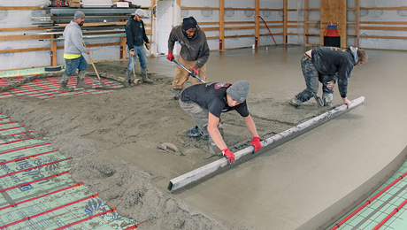
Most of the floors in our house are wood, but in the kitchen I have a slate-green concrete slab-on-grade floor. The slab gets its color from dry pigment troweled into the freshly screeded concrete (L.M. Scofield Co., 4155 Scofield Road, Douglasville, GA 30134; 800-800-9900). The pigment mixture, Lithochrome Color Hardener #A-50, is called slate gray, but it’s more green than gray. After the floor cured for a couple of days, the concrete crew cut shallow grooves into the slab, dividing it into a 4-ft. by 4-ft. grid. Then they applied a sealer to the slab to protect it from dirt and spilled liquids. The sealer (also by Scofield) comes in colors and further enriched the slate-green finish. We’ve sealed it three times: once as a curing coat two days after the slab was poured, once when the building envelope was dried in and just before we moved in. I won’t seal it again unless I notice a pattern of wear.
The floor is durable and requires only a wet mop to keep it clean. It has the feel of a slate floor without the cost or the grout lines to clean. And in the winter, the floor is heated with radiant hydronic tubing, which is just enough, with the solar gain from southern exposure, to keep me toasty.
I should, however, sound a cautionary note about the floor. It wasn’t a snap to make. Our concrete contractors had to tear out the first attempt because the surface set up too fast on a long, hot August afternoon. That slab left town in a dump truck, radiant tubes dangling like roots from its 6-in. thick edges.
Synthetic-slate counters and simple cabinets
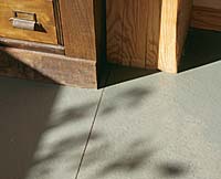
The counter is another concrete product called Fireslate 2 (Fireslate, 6 Fireslate Place, Lewiston, Maine 04240; 800-523-5902; www.fireslate.com). Originally developed as a hearthstone, Fireslate 2 is a mixture of portland cement, silica sand and fillers. It is easily worked with masonry-cutting blades and carbide-tipped router bits, and can withstand hot pots. Although sealed, Fireslate 2 does spot like natural slate, gradually showing a pattern of wear.
The painted maple and plywood cabinets were built by a contractor and timber framer (Robert Engdahl of Winthrop, Maine) from my drawings. I kept the cabinets simple. Using finger grooves instead of knobs or pulls keeps the cabinet doors and drawers uncomplicated and makes wiping down the cabinets much easier.
The stove, by the way, is a combination gas-burner/electric convection-oven appliance by Jenn-Air (240 Edwards St. SE, Cleveland, TN 37311; 800-688-1100; www.jennair.com). This stove (model SVD 8310S) occupies the realm (and price range) between the typical residential stove and the commercial-type ranges that have become popular in recent years. Like all Jenn-Airs, this one has a downdraft vent in the middle of the cooktop. The vent works great, but turned on, it can actually pull the flames out from under the pots. I don’t think this is dangerous, but it does pull the heat away from the intended target pot. I solve this problem by placing 2-in. tall sheet-metal baffles between the vent and the burners when I need to use the vent. The baffles interrupt the airflow between the flames and the vent.
Natural light, direct and indirect
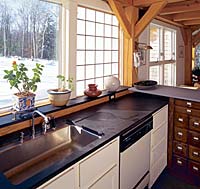
The sink, and the countertops on both sides of it, are bathed in light both from a clear glass window and from two translucent panels. The panels are 2-3/4 in. thick and resemble shoji screens. Made by Kalwall (1111 Candia Road, P. O. Box 237, Manchester, NH 03105; 800-258-9777; www.kalwall.com), the panels have a higher R-value than windows, but that’s not why they’re in my kitchen. I wanted daylight along the whole south wall but not the glare from direct sunlight on the counter. The panels provide a soft glow on the work surface, and in the morning, if the sun is out and there is a light wind, I get a dance of shadows across the translucent surface. Plants love the indirect light as well, and I keep a healthy stock of herbs on the windowsill for cooking.
All the light fixtures are simple porcelain sockets. The three along the south wall are new, and the ones over the stove and in the middle of the room are from a local antique-lighting dealer. Keeping most of the light over the counter and stove keeps shadows off my task.
Fine-tuning the layout
I spend a lot of time in the kitchen. To me, it is a living space, so I paid a lot of attention to how I could make it comfortable. I placed the kitchen in the southeast corner of the house to avoid the hot western sun on summer evenings and to gain the morning light and southern solar warmth in the winter. The mass of the floor and countertop keeps the area cool in the summer. At night we open all the windows to cool down the mass, and in the morning close the house again against the heat. I also tinkered with the standard of 36-in. high countertops. I am tall, and after leaning over a typical-height counter for long periods of time, as I tend to do, my back becomes sore. So I raised the surface height to 38 in., and I am ache-free.
Bigger is definitely not better. The last thing you want to be doing is running a marathon with a pot of boiling water to get from stove to sink, or feeling like you have just trekked across the White Mountains after baking cookies. The size of a kitchen (this one is just about 13 ft. sq.) is a delicate balance between efficiency of space, storage and preparation surfaces. The efficiency of space is, of course, the limiting factor. You want to have enough prep and storage space, but you do not want to have to walk too far to get to any area.
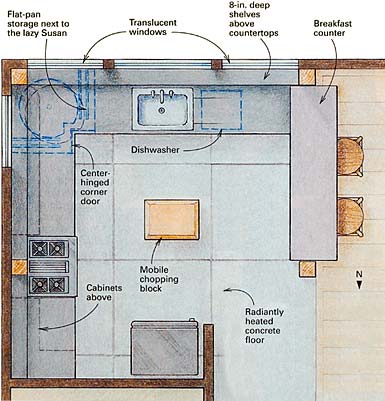
To capitalize on efficiency and prep surfaces, I made the space between the stove and the sink the biggest because this is where the most chopping, mixing, slicing and assembling occurs. Having a corner in between also divides it into two areas, which can be useful. On the west side of the sink, I had the counter sloped as a drain board for drying dishes. I never have to worry about water dribbling over the edge of the counter, and being on the other side of the sink, I am never mixing dirty dishes with clean ones.
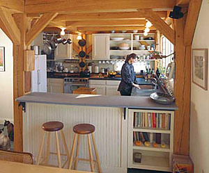
Storage is the biggest concern in the kitchen, and it can push the scale out of control. Instead of trying to hide everything out of sight, I designed the kitchen to display some of my stuff, alleviating the demand on cabinet space. I used a piece of 3/4-in. galvanized pipe, screwed into a beam above and to the side of the stove, to serve as a pot rack. For my collection of Griswold cast-iron skillets, I fastened hooks to the post behind the stove so that they are easily grabbed.
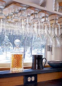
To both sides of the skillets are the only upper cabinets with doors, which frame and accentuate the timber post and the stove below, giving it a dignified position in the space. The remainder of the upper cabinets are open. The absence of doors makes it easy to find what I need, and allows my dishes and glassware to give texture and color to the space.
The counters are 24 in. deep, but they are bordered all around the room by 8-in. deep Fireslate shelves that hold things off the prep surface but within easy reach. These shelves, which my plants rest on by the south windows, increase the effective depth of the counters to 32 in. And because of these shelves, my lower cabinets are extra deep. To avoid losing things in the depths, all the cabinets are equipped with roll-out drawers with full-extension drawer slides. The drawers are one of my favorite things. I never have to get down on my hands and knees to root around in the back of the cabinets. This added depth also prompted the builder to suggest setting the lazy Susan in the corner farther back, giving us room for trays and cookie sheets.
Ongoing evolution
I added a breakfast counter to the kitchen 18 months after we completed the house. I had planned the counter in the original design, but to economize, eliminated it. It was interesting to experience the kitchen before and after its addition. When I entertained before the counter, people would mill around the kitchen socializing, and get in the way of food preparation. Even my husband, while discussing the day’s events, would have a hard time anticipating which way I would pivot, often leaping out of the way as I wheeled this way, then that.
The new counter has solved that dilemma. It gives people a place to lean and to watch the action from a safe distance. As it turns out, it was worth the wait because I was given a marvelous old pharmaceutical cabinet for the base. I trimmed it out so that it fit between the post and the existing end of the cabinets, painted the back and added a Fireslate top.
Now that the counter is in place, I can think of only one other thing that I’d change. We need a bigger pantry. Right now, I have some shelves in the mechanical/laundry room, which is right behind the refrigerator wall. But it’s not enough. Next time, more pantry space in the kitchen.
Sloane M. Chambers is a building designer in Manchester, Maine. Photos: Charles Miller; drawing: Dan Thornton

