Small Addition, Big Improvement
A new entryway dramatically helps the function and appearance of a small Cape.
Synopsis: An architect shows how a new entryway addition on a modest Cape Cod brought major improvements in the house’s exterior appearance and as well as interior function.
When most people start thinking about additions to their houses, they think big, and rightfully so. Additions are the most direct route to an extra bedroom or a bigger kitchen. Sometimes, a few small changes can have an equally large impact on a house. In our case, adding only 50 sq. ft. radically changed the little Cape my husband and I bought a few years ago.
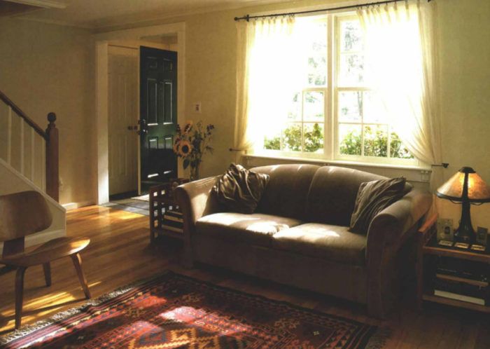
We loved the tree-lined, kid-filled neighborhood made up of small “starter” Capes built just after World War II. But our house’s front entry was a problem. There was just a door in the wall, nothing that acknowledged the importance of the front door as a symbol of hospitality. The lack of an overhang or roof meant that we got wet as we fumbled for our keys in rainy weather. Plus, the entry landing was so shallow that we had to back down the steps when we opened the front door. Once through the door, visitors and family alike walked directly into the center of the living room, where there was no place to hang coats or leave muddy boots, backpacks, briefcases or any other bundles. Because of the constant traffic, the living room was not used much and became more like a hallway with a fireplace. My goal was to solve these problems without ruining the integrity of the house.
Relocating the front door was a key move
I knew that we needed more space for a closet, larger stairs outside and some sort of shelter over the doorway. As I was thinking about these ideas, it occurred to me that the entry location of our house, opening directly into the living room, was something of an anomaly. Most houses have a front entry that opens into a foyer that’s centered on the main stairs with the public rooms opening off to either side. This arrangement separates these rooms from the hubbub of entrance traffic. My first change, then, was to move the front door approximately 7 ft. to the right, aligning it with the stairs and the passageway from the living room to the kitchen. Most of the foot traffic now circulates across the end of the living room instead of diagonally through it, making the living room a quieter place.
The new entry vestibule I designed measured just 5 ft. deep and 10 ft. wide. I put a window next to the door that not only lets in light but also lets us see who is at the door. I chose bluestone for the floor because it can tolerate wet and muddy things that will be brought into the house; I used the same stone on the porch landing and steps. I also made sure that there was space for a hall tree with a bench, coat hooks and mirror. (Luckily for me, my father is an avid and willing furnituremaker; he made quite a few of the pieces in the house in addition to the hall tree.) Finally, I made enough space for a closet for coats, hats and boots.
For more photos, drawings, and details, click the View PDF button below:


