Designing Dining Rooms
Formal or not, comfortable, thought-out dining spaces add to the pleasure of a good meal.
“Company’s coming … Everyone out of the dining room —now!” What child hasn’t heard similar words? More than any other room in the house, the dining room is harnessed with an age-old solemnity that even children seem to respect … with a little urging. Most of us, however, take our meals in a more informal setting. This place might be an eat-in kitchen, or a nook located between a kitchen and a dining room. But even in those informal spaces, the social aspect of dining hangs on. Meals are an opportunity to stop the hectic pace of the day and to catch up on each other’s lives. No matter what the setting, comfortable dining spaces call for good layout. Here are some guidelines.
Size a formal dining room for furniture and family
Many clients insist on formal dining rooms, anomalies in otherwise informal plans. I think that the dining room remains formal because it symbolizes tradition. From Christmas to Thanksgiving, birthdays to bar mitzvahs, the dining room is where families gather, year after year.
I give careful thought to this important room. I like to size dining rooms to accommodate the maximum number of people that might be expected to come to dinner. Clearly, though, this plan may not make sense for a couple who entertain large groups only occasionally.
Formal dining seems to take place after dark, so windows provide decoration rather than views. Therefore, high windows above the floor work well. High windows open wall space below for furniture. I’ve taken the opposite tack as well, by framing alighted landscape with lower windows.
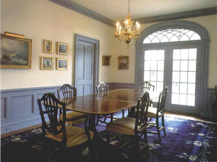
Upper walls are best finished plainly so that they won’t distract from art-work. I limit embellishments to casings, base molding, crown and, frequently, a chair rail. I like the top of chair rails to be low, never higher than 33 in., and placing them lower can make the ceiling seem higher. Raised-panel wainscoting below the chair rail is an elegant touch. In Italian Renaissance architecture, from where much of the detail we use today is derived, wainscoting symbolized a garden wall. This is why the space above is classically painted with a landscape, as might be seen over a garden wall.
Differing in effect from chair rails is a high wood-wainscoted wall surmounted by a plate rail. Wood trim can add intimacy and warmth to a room, and this detail is common to Arts and Crafts-style homes. The wall above the plate rail is often painted as an extension of the ceiling or used to showoff wallpaper or a mural.
Booths make good use of space
Probably the most efficient and comfortable dining arrangement is the booth. I’ve noticed restaurants that offer a choice between booths and tables usually fill up the booths first. People like the protected feeling of being nestled in the back corner of a booth.
A compact unit that can be tucked almost anywhere, a booth may be ideal for smaller homes. Because all service takes place at one end, there is no need for space behind the other three sides. Even an alcove off a busy corridor can become a comfortable home for the adaptable booth.
Booths can feel larger by being surrounded with windows that come down to the bench top. This arrangement is effective if windows wrap around two or three sides of the booth. Booths invite casual breakfasts or lunches, daylight meals when a sunny outdoor view can be savored.
The width of the table in a booth is critical. Too wide, and sliding in is difficult. Too narrow, and you’re forever leaning forward to eat. Ideally, the table should overhang the front of the bench by several inches.
For more guidelines about designing dining spaces, click the View PDF button below
