Daylighting Strategies for a Ranch-Style House
A kitchen cupola and bedroom/bath clerestories bring natural light into a suburban ranch.
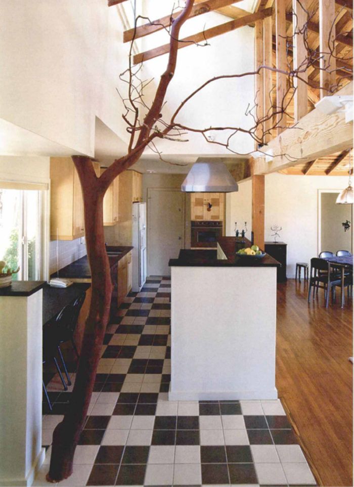
A California architect explains how she remodeled a conventional ranch house with small, dark rooms into a house with an open, airy floor plan and plenty of natural light.
Alan and Catherine Palter’s house looked like every other house on the block. With the exception of a nicely landscaped front patio, it featured all the faults of the typical 1950s ranch house: small dark rooms, poor circulation and utter disregard for orientation and connection to the site.
When the Palters approached my architectural firm and builder Ernie Columbell to discuss remodeling, they said that they wanted to make their house into a hidden treasure. From the street, the house would be almost unchanged, but inside, it would be open, airy and connected to the natural wilderness of a canyon behind the house. Everyone agreed that the design solution and the materials had to be both ecological and cost-effective while adding character to the building. The reality of the Bay Area’s present, frenzied building climate, however, made cost control a major factor.
Daylighting is an elegant, cost-effective way to make spaces feel bigger and more vibrant. Rather than adding a lot of square footage, then, daylighting became the form-giver for the remodel, enhancing what was good about the house and improving what was not.
Rearranging the floor plan makes better use of space
We first rearranged the use of spaces within the existing plan to create a master suite. In the public space, we removed walls between the kitchen, living room and entry to create one large great room. Flooring materials and ceiling heights still define the different functions without obstructing sight lines.
The former family room, a flat-roofed 1960s addition on the northwest corner of the house, was enlarged to become a master suite. This arrangement gave the master bedroom both more privacy and more space, including access to a back deck
The existing master bedroom became the family room, facing south onto the front patio and the street, a much sunnier and more suitable location for a public room. With the former dining room reclaimed as a child’s bedroom, the four rooms in the front became “the girls’ wing,” a sanctuary for the Palters’ two daughters as they grow. That includes two bedrooms, the family room and a study.
A cupola lights the main space
The most difficult design issue was how to fill the north-facing great room with light. Removing walls and an awkward fireplace opened up the main space, but that space would still have felt dark with the existing 8-ft. ceiling and north-facing orientation. So we added a cupola just to the south of the roof ridge and removed the living-room ceiling, bringing light deep into the northfacing room.
Fine Homebuilding Recommended Products
Fine Homebuilding receives a commission for items purchased through links on this site, including Amazon Associates and other affiliate advertising programs.

Not So Big House

Graphic Guide to Frame Construction

Homebody: A Guide to Creating Spaces You Never Want to Leave
