Creating The Not So Big House: Affordable Comfort
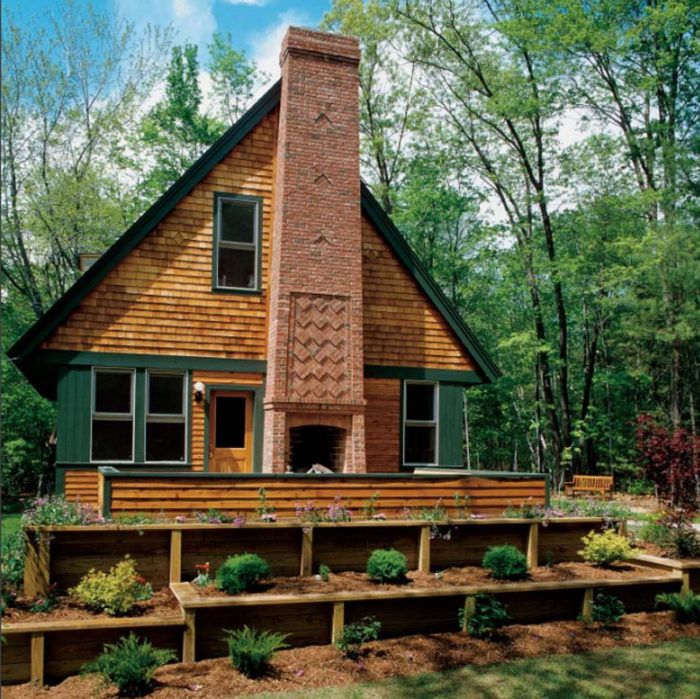
A Massachusetts house designed by Ross Chapin is a good example of how to create a sense of spaciousness in a small home.

Synopsis: As an advocate of “less is more” in residential architecture and interior design, Fine Homebuilding contributing editor Sarah Susanka has emerged as one of America’s favorite home architects. Her first book, The Not So Big House, created a movement that proposed a new blueprint for the American home: a house that values quality over quantity, with an emphasis on comfort and beauty, a high level of detail, and a floor plan designed for today’s informal lifestyle. Creating the Not So Big House is the blueprint in action. Focusing on key design strategies such as visual weight, layering, and framed openings, this book takes an up-close look at 25 houses designed according to Not So Big principles.
In this excerpt, you’ll read about a 1,750-sq.-ft. home in western Massachusetts, designed by architect Ross Chapin for a family of four.
This house, designed by architect Ross Chapin for a family of four in Amherst, Massachusetts, presents another view of the archetypal qualities that speak to us of home. Like the house in Pennsylvania designed by Jeremiah Eck, it has a steep roof with living space below, a magnificent brick chimney, a front dormer with a focal window, and a central front door under its own sheltering roof. This home, however, was constructed on a much tighter budget, proving that you can build a truly beautiful home even if there isn’t a lot of money available. You simply have to evaluate what’s important to you and distribute the money accordingly.
For Rene and Susan and their two teenage children, the location of the house was a high priority, and like many people, they ended up spending more of their overall budget on land than they had intended. So when it came time for the design process, they knew they’d have to make some compromises. Ross helped them identify what spaces they really needed and explained how to design them to get the most value for their money.
Common Ground
Rene and Susan’s previous home had a formal living room, a dining room, and a tiny kitchen on the main level. As in many households, even though there was no family room, the living room still didn’t get used much. Instead, the living happened mostly in the kitchen and adjacent dining room. So in their new home, Ross suggested making one large common room, with a high ceiling and lots of light, where the family could congregate to cook, eat, do homework, and socialize. It would be beautiful and filled with warm materials that encouraged both family and friends to linger.
When a house is small, it’s important to have at least one area that gives a sense of spaciousness, and in this house the common room serves that function. At 16 ft. by 24 ft. with a 10-ft. ceiling, it’s still not a large space for what is essentially three living areas: kitchen, dining room, and living room. But combining them into a single large space creates the illusion of being in a bigger house while using far less square footage than building a separate room for each function.
Built-In Benefits
Another interesting spatial trick helps the common room stretch even farther. An everyday dining table typically requires at least 3 ft. to 4 ft. between the table edge and the wall, so that there’s room for chairs and some additional circulation space. Here, the chairs are replaced with a built-in bench, so there’s no need to allow for that extra space. Built-in furniture can save a significant amount of square footage and give the room a cozy feel at the same time.
For floor plans, photos, and more reading on how to create comfort in a small home, click the View PDF button below.


