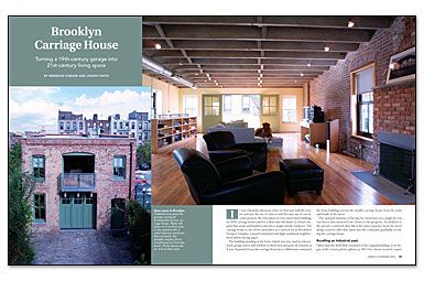
Synopsis: The transformation of a two-story brick 1870s carriage house from an old garage (and one-time soda factory) to a modern, single-family residence evoking the building’s industrial past remains one of authors Brendan Coburn’s and Joseph Smith’s favorite projects. Initially, the interior was a blank slate: The first floor became a kitchen/dining area, which opens up to a courtyard via a triple “barn” door; two small bedrooms; and a shower tucked under the stairs. The second-floor loft became a spacious living room with a Juliet balcony overlooking the courtyard.
It was a Saturday afternoon when we first met with the owners and saw the site of what would become one of our favorite projects: the renovation of a two-story brick building, an 1870s carriage house (and for a short time the home of a local company that made and bottled soda) into a single-family residence. The carriage house is one of two structures on a narrow lot in Brooklyn’s Prospect Heights, a mixed residential and light-industrial neighborhood.
The building standing in the front, which was once used as a heavy truck garage and is still redolent of diesel fuel and gear oil, remains as it was. Separated from the carriage house by a cobblestone courtyard, the front building screens the smaller carriage house from the noise and bustle of the street.
The unusual situation of having two structures on a single lot was one factor that attracted our clients to the property. In addition to the private courtyard, they liked the entry sequence from the street along a narrow alley that opens into the courtyard, gradually revealing the carriage house.
Recalling an industrial past
Other than the shell, little remained of the original building, so we began with a clean palette. Our clients wanted a spare interior that recalled the industrial feeling of the neighborhood. Our initial conversations determined that the first floor would have two bedrooms, a bathroom, and a large eat-in kitchen, and the second floor would be an open loft. To maximize the kitchen/dining area, we decided to make the bedrooms small, almost diminutive. Even the first-floor bathroom makes good use of space, fitting below the stairs to the loft.
The kitchen/dining room was to be the major family space, and its physical and visual connection to the courtyard was critical. To enhance this connection, a large triple door opens to the courtyard. Reminiscent of barn doors, they hearken back to the building’s origins. These doors are meant to be opened mainly in fine weather, so a separate day-to-day entry door also serves this room.
One budgetary compromise was the kitchen countertops. The expense of stone, concrete, or solid surface just didn’t make sense to our clients, so they decided to use plastic laminate. To add some zing to an otherwise ordinary material, the counters were made with their standard particleboard substrate edged with exposed Baltic-birch plywood. The cabinets are prefinished maple plywood.
For such a large kitchen, the counter space in the room is actually fairly minimal. We made up for this counter-space disparity in part by incorporating a custom dining table that includes a small section of countertop that is removable . An undercounter washer/dryer unit is hidden in the base cabinets of the east wall of the kitchen.
Working the old into the new
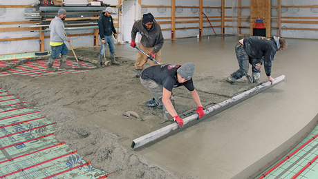
Because the existing structure had no cellar, we decided that the best way to finish the floors and to heat the space would be with a radiant slab. The existing slab was broken up and hauled away, and replaced by a new acid-stained concrete slab over a vapor barrier and rigid-foam insulation.
For more photos and details, click the View PDF button below:


