Kitchen Highlights on the Bay
Furniture-grade cabinetry, a woodburning pizza oven and sleek details set this shiny kitchen apart.
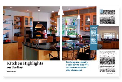
Synopsis: A cabinetmaker discusses how his firm’s custom maple cabinetry, including a small round island with curved stainless-steel doors, contributes to the design of a contemporary Rhode Island kitchen equipped with a wood-fired baking oven.
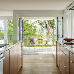
Charles and Karen Faber built their house right on Narragansett Bay for the light, the air and the great views. Despite the picturesque setting, the house is home to some serious business, most of it in the kitchen. An enthusiastic and talented cook, Karen wanted a state-of-the-art working environment outfitted with professional-grade appliances including a wood-burning brick oven and cabinetry as elegant in function as it is in appearance. Because of architect Shahin Barzin’s open plan, the kitchen would have great water views, but it also would be in plain view of the living and dining areas and would have to complement the appearance of those rooms.
In a nutshell, the strategy was to hide what could be hidden and to put the rest on display. The hiding part was relatively easy: The adjacent laundry room also doubles as a pantry, where inexpensive stock cabinets provide abundant storage. Putting the kitchen on display took some doing. Thompson & Brouillette Inc., the company I work for, was hired to build the cabinetry.
Cabinetry complements open plan
The Fabers wanted maple for their kitchen cabinets; the wood goes well with the white-ash flooring and reflects light from the adjacent windows. We used a clear catalysed lacquer finish that holds up well to the heavy demands of kitchen work.
The architect’s design uses plenty of open shelves — both wood and glass — in a variety of configurations. The glass shelves are supported on stainless posts made in a local metal shop and set into solid-maple brackets, which in turn are set into maple-plywood panels that amplify the furnished look of the room. Upper cabinets have doors with sandblasted-glass panels that give the illusion of an opening but don’t reveal much of the cabinets’ contents.
Small details also contribute to the kitchen. Recessed lights in the ceiling give Karen plenty of task lighting and make the room glow at night; hanging over the islands, the pendant lighting made by Herstal has the right balance of simplicity and elegance that suits the room. Also, the rail and stile widths of the doors are proportionally larger than normal kitchen doors, giving the cabinet fronts a more solid look. The simple brushed chrome drawer and door pulls from Häfele are based on a sample the architect saw while traveling in England. We’ve found that Blum or Hettich undermount slides work best on any pullouts or drawers.
Islands big and small
The kitchen plan revolves around two islands, one in the room’s center, the other a larger structure between the kitchen and the dining area. To enhance the furniture effect, both islands sit atop stainless-steel legs rather than toe kicks. Like the surrounding counters, the tops are polished black granite.
The centerpiece of the kitchen — the circular island — started out square. It eventually evolved into a circle to ease traffic flow between equipment and work centers. The architect likes to provide 42 in. of walking space between counter surfaces, with 36 in. as an absolute minimum. On the cooktop side, curved doors conceal canned and dry goods. At the other side of the island, a large drawer has storage space for food-processing equipment.
For more photos, drawings, and details, click the View PDF button below:
Fine Homebuilding Recommended Products
Fine Homebuilding receives a commission for items purchased through links on this site, including Amazon Associates and other affiliate advertising programs.

100-ft. Tape Measure
Original Speed Square
Plate Level
