Minneapolis Town House: Industrial Merger
A professional couple creates ample space for combining their offices and home
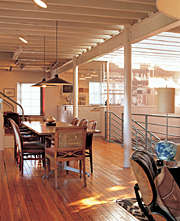
Looking for innovative ideas for creating a comfortable, well-crafted city home? Leslie Plummer Clagett’s book The New City Home shows design ideas for a wide variety of urban spaces. In this excerpt from Part 3, Clagett shows how a couple with a plethora of professional pursuits turned a pair of commercial buildings into a live/work space while maintaining the character of the original buildings.
Sage and John are retired, but they remain actively involved with causes and consulting projects that reflect their interests. Sage, a dancer for most of her life, now heads up a leading foundation in that field. John, previously a publishing executive, is engaged in a variety of pursuits. While their myriad professional and social activities exempt them from the rocking-chair set, they were tired of having to maintain separate offices, traveling to them daily from their home. The couple was ready to consolidate this far-ranging pattern, and started looking for a place that could accommodate their soon-to-be-streamlined lifestyle.
In addition to needing ample space for the combining of their offices and home, they wanted an environment that reinforced their affinity for the simple, tactile technologies of the 19th century. It was partly this sensibility that helped them recognize the potential in a run-down pair of attached brick buildings in a then-forgotten area of Minneapolis. A former electrical contractor’s shop stood perpendicular to the street; a onetime horse barn was connected to its far end. The ground floors were filled with junk, the roofs (where they were still intact) leaked, wood elements were rotting, and sections of the masonry were crumbling. But despite all this, the melancholy appeal of the property — and its secluded yet central location — still shone through.
Passing the “Flash” test
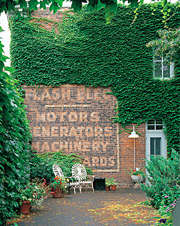
The architectural firm Meyer, Scherer & Rockcastle worked with Sage and John on this unusual project. The stable — the more derelict wing of the building — was gutted and essentially rebuilt. The home’s ambience, it was agreed, would remain true to the building’s blue-collar origins. In fact, the influence of an invisible third party was felt throughout the planning process. The question “What would Mr. Flash have done?” became a yardstick for design decisions. It’s a reference to the electrical shop’s namesake, who, judging from the state of things, apparently favored the expedient over the artful when it came to maintaining the property.
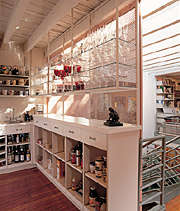
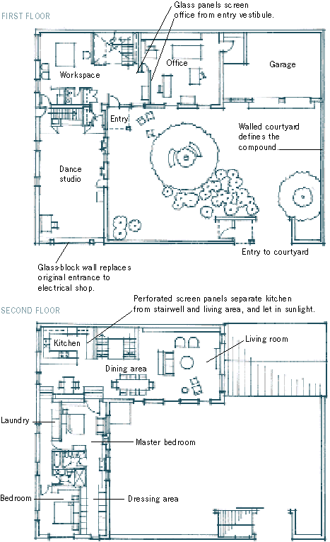
The result is an unabashedly plebeian palette of materials — corrugated sheet metal, concrete block, and rubber flooring — applied to a basic plan. By taking such a low-key approach, Sage and John were able to achieve the unassuming impression that was so important to them. In the interest of authenticity, worn surfaces and materials were repaired rather than replaced wherever it was feasible. The wood floors were preserved and patched; spalling brick was plugged with mortar. When new materials were introduced — as in the kitchen, where panels of perforated metal screen separate the kitchen from the stairwell and the living room beyond — they were chosen for their compatibility with the industrial atmosphere.
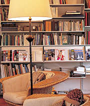
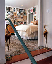
Even the significant additions and alterations were kept tightly in character. For instance, on the second floor where the two buildings were originally joined many years ago, the new doorways leading to the bedrooms are deliberately out of proportion; they’re a shade wider and slightly shorter than would normally be expected. This is in keeping with the unaligned floor levels that occurred when the pair of structures were originally cobbled together, a condition that required the architects to raise a small area of the roof to gain sufficient headroom.
Access to the building was moved off the street, from the end of the electrical shop to near the crook where the two sections of the structure meet. Sheltered by a plain, metal shed roof, the entry sets a casual mood that’s more “employee entrance” than formal front door. It’s also a secure, convenient point at which to enter the home. Workspaces are kept to the ground floor (see the Floor plans), so deliveries and visitors aren’t traipsing through the family’s private quarters. Access to the upstairs living areas is made via a new stairway just inside the door, sparing guests the sight of a busy office space. On the second level, the plan is filtered yet again, where it’s separated into a public and a private wing.
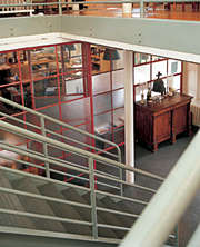
Joining two structures
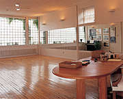
Windows old and new let the light in
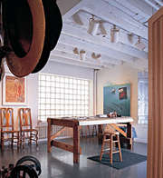
The different ways natural light was introduced throughout the building are no exception to the ad hoc aesthetic. While the back wall of the stable was without usable openings, most of the existing windows have been preserved, with some of them enlarged. The couple’s workspaces received close attention. In the dance studio, where good illumination and visual privacy needed simultaneous solutions, a large field of mismatched glass block was laid on the end wall. John’s office is separated from the entry vestibule by a steel-framed wall of glass panels, which borrow light from the adjacent stairwell. The portions of the home where light is especially important to safety are given special consideration. Over the central stair, a sawtooth skylight jags up to capture the daylight, while boxy twin funnels resembling grain hoppers rise from the other wing, directing the sun into the baths.
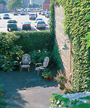
On the outside, the compound hardly aspired to be the belle of the block, but its L-shaped plan did beg for completion. The lot was large enough to accommodate a garage and a yard. In another act of studied slapdash, a utilitarian metal-roofed shed was appended to the former stable. A cinder-block wall was erected around the boundaries of the property, creating a secure, secluded courtyard. In true Flash fashion, the courtyard is surfaced in asphalt instead of grass.
From backwater to boom
Since they moved in, Sage and John have embraced the diverse quality of downtown and have seen the once-ragtag blocks around their home gradually develop. Even as mixed-use neighborhoods — those that have a vibrant blend of commercial, industrial, and residential buildings — become more popular with municipal planners and city dwellers, Sage and John’s neighborhood boasts a tenant that’s especially arresting: The Metrodome rises just 400 yd. away from the couple’s home.
The sports complex is a contemporary anchor to the eclectic nature of the area, which includes a paint factory, a hotel-turned-office building, and a warehouse that’s now the locus for several nonprofit literary organizations. Sage and John’s pioneering home is still the ultimate exemplar of this funky mix.
Graffiti
Although it hasn’t been an issue at Sage and John’s residence (sports fans in certain other urban centers are less benign than their Twin Cities’ counterparts), graffiti can be a problem in neighborhoods through which large crowds pass.
There are some steps homeowners can take to offset the potentially permanent harm done to their property by taggers. Beefing up the exterior lighting is one strategy. Another is to install physical deterrents, such as a fence or other landscaping element. Among the most widespread approaches fights fire with fire, so to speak.
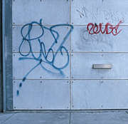
Barrier coatings — a technical term for anti-graffiti paints — can be an effective ounce of prevention for masonry buildings, but choosing the correct formula is critical. Some barrier coatings render repair and maintenance impossible. There are gloss-finish, water-soluble treatments that, depending on exposure to sun and wetness, may wear off in a few months; these are cheap fixes meant for situations where appearances don’t matter. Other coatings — undetectable when applied, color stabilized, and dirt repellent – -are more appealing to the homeowner.
But should you come home one day to find that your uncoated door has been darkened by illegal urban expressionists, don’t despair. Graffiti stripping — equal parts science and craft — is an option. Techniques for removal vary; popular methods include absorbent poultices, chemical strippers, and pressurized washing. Laser-based technologies are also being developed. All are best left to professionals, who are accomplished in analyzing the nature of both the stone and the stain–the wrong prescription can result in irreversible damage to the surface.
It’s a field that’s unfortunately overcrowded with underskilled practitioners. Local architectural preservation associations are a good source for referrals to competent service providers. Contacting officials working in museum conservation or restoration departments is another avenue that might yield leads to reputable contractors (or, just as important, warnings against unsatisfactory ones). In addition, many cities operate free or low-cost graffiti-removal programs; check with your local streets and sanitation department for help.
Leslie Plummer Clagett’s passion for urban residential architecture includes over 20 years of writing and editing articles on the subject for publications such as the New York Times Magazine, the Los Angeles Times, and the San Francisco Herald-Examiner. She is also the author of three other books. Photos by: davidduncanlivingston.com
