Tight Lot, Tighter Budget
In San Francisco, simple materials artfully arranged doubled the size of this small row house.
Designing and remodeling homes in San Francisco can be difficult for lots of reasons. The road to a building permit is arduous and complex, and neighborhood objections can be fierce. Given the city’s hilly topography, just getting to a site can be tough. And as an architect, I have to balance the needs of my clients against the realities of zoning, design review and the high cost of construction in San Francisco, which can add another level of anxiety to the design experience. But this project was different: I finally found a house I could afford, and it had plenty of room for improvement. At last, I could be the client.
Room to grow up and out
My house is on the south slope of Bernal Heights, in a working-class neighborhood of houses representing a variety of architectural styles. The original house was a tiny two-bedroom cottage built in the 1940s. It caught my eye for two reasons. First, it was a one-story house in a row of two-story houses. Second, it had an undeveloped front yard. In a way, I viewed this little house as a small vacant lot, affording me a fine opportunity to build a two-story addition in front. I would be adding what amounts to a brand-new house to the streetscape, and I wanted the house to look as though it belonged there without mimicking the older houses.
The collection of small homes that cling to this steep hillside has no defining architectural style. My house is, however, on a section of street where the houses alternate between flat roofs and gable roofs. To fit into this tempo, mine would require a flat roof. That was fine with me. A flat roof is consistent with the urban, modern home I had in mind.
Keep it straightforward: outside
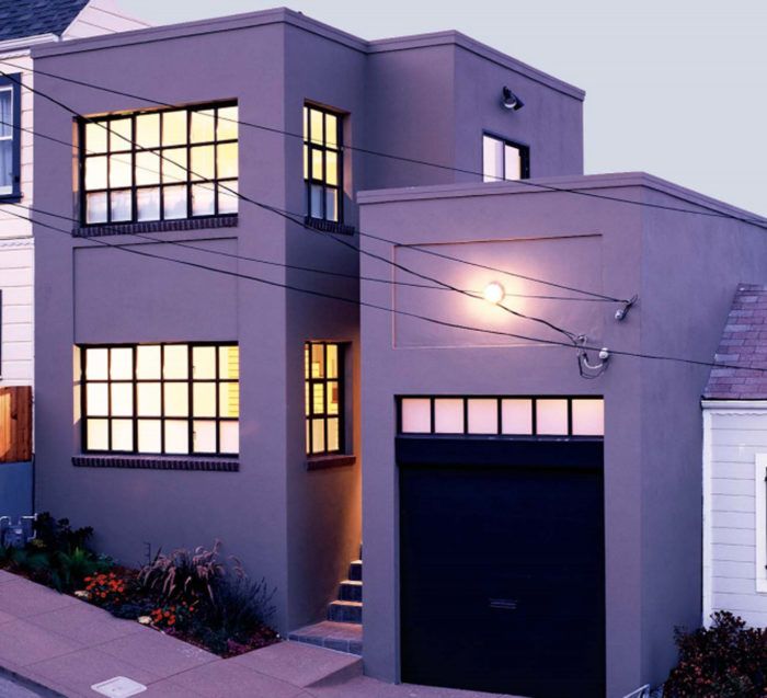
I wanted this house to be distinctive, and I didn’t have a big budget. So I decided to keep things crisp and simple. The exterior is composed of rectangular shapes that step down the hill, following the slope of the street. On the uphill side, the parapet is slightly below the neighbor’s roof. On the downhill side, it’s a little above the adjacent house, creating a consistent progression.
I centered the entrance, dividing the house into two slender towers with the front door in the slot between them. I think this look gives the house a vertical assist and keeps it from seeming chunky and squat. The downhill tower is the original garage, reborn with a new skin and a rooftop terrace. The uphill tower is a two-story addition that includes a living room downstairs and a master suite upstairs. The new and the old are joined at the steps to the dining room, with the original house altered only slightly within its existing footprint.
Being a modernist at heart, I wanted the house to strike a note somewhere between stately and stoic: a contemporary home akin to an artist’s loft on a small scale. Its simple shapes are finished in smoothly troweled stucco, painted buckskin tan, with industrial accents.
For more photos and details on this two-story addition, click the View PDF button below.

