A Surprisingly Roomy Little Kitchen
A small kitchen that's fine-tuned for comfort and efficiency.
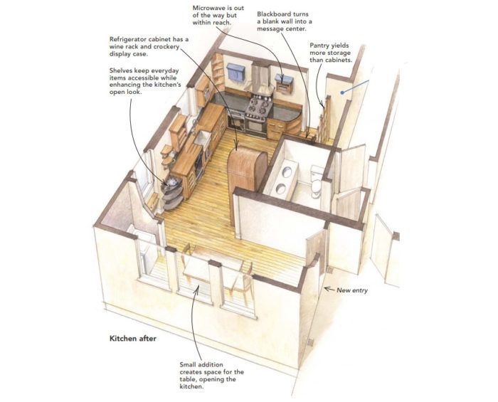
Synopsis: A kitchen remodel includes a small addition, new doors for the pantry, a cherry-framed chalkboard and open shelving for display. By interviewing the homeowner, the author learned how she lived and worked in the kitchen. Then, by emptying her cabinets and separating the essential items from the nonessential ones, he could determine how much space was needed for storage and appliances; the rest stayed open.
Margaret Lewis raised her family in a stone farmhouse on a bluff overlooking the Potomac River in Washington, D.C. After 30 years and approximately 30,000 meals, Margaret’s kitchen was simply worn out and sorely in need of an upgrade.
Margaret grew up in England, and she envisioned a classic English-farmhouse kitchen with freestanding furniture for storage, a forgiving wood countertop, and a central worktable like the one she grew up with. All well and good, but there were obstacles to Margaret’s plan.
Hard realities temper the design
The only downstairs bathroom in the house encroached on the kitchen. Margaret’s budget couldn’t accommodate the bath’s removal, so we had to work around it. Unfortunately, a big, blank bathroom wall was the first thing one saw when entering the kitchen. The wall needed something but couldn’t accommodate anything with much depth, such as a cabinet. Because the bathroom substantially constrained the kitchen’s width, the design challenge was to give the L-shaped back corner of the house new life and to let the entire space breathe a bit easier.
Both the cramped, rather dark nature of the space and the farmhouse-kitchen theme suggested the need for a looser, less built-in look. But the “unfitted” approach also had a downside: It meant not filling the kitchen with wall and base cabinets and giving up some storage. In discussing the problem, Margaret said she didn’t need a lot of storage locations in the kitchen; what she really wanted was space.
The storage that Margaret chose holds her cutlery, crockery, utensils, and food stores, but no more than that. The result is a kitchen that blends fixed cabinets and freestanding furniture with as much room as we could grab. However, no amount of creativity could overcome the intrusive bathroom that narrowed the kitchen, so Margaret’s original idea of having a large central worktable shrank to a freestanding butcher block that is located next to the refrigerator.
Making flaws into features
We fixed the kitchen’s unfriendly entrance by turning the blank wall at the entry into something that positively demands attention. The blank wall is now a floor-to-ceiling chalkboard that Margaret manages to fill easily, thanks to her busy real-estate practice. The cherry frame is rabbeted to hold a chalkboard and is lighted with a recessed halogen down light. To the left of the chalkboard is a pantry with attractive cherry sliding doors that have transparent reeded glass panels.
I played a shell game trying to make space for the large side-by-side refrigerator. It is housed in a cabinet with a rounded top. A wine rack crowns the refrigerator, and above it is a neat little cubby where Margaret can display her collected crockery.
In front of a deep-set window was the natural place for the apron-front fireclay sink and its flanking wall cabinets. The cabinet to the right is for drinking glasses, which are hidden behind the reeded glass in the door. The wall cabinet to the left holds the everyday earthenware, and the inside of that cabinet is painted blue just for fun.
For more photos, floor plans, and details on this kitchen remodel, click the View PDF button below.
Fine Homebuilding Recommended Products
Fine Homebuilding receives a commission for items purchased through links on this site, including Amazon Associates and other affiliate advertising programs.
Pretty Good House

Musings of an Energy Nerd: Toward an Energy-Efficient Home

Code Check 10th Edition: An Illustrated Guide to Building a Safe House
