Designing Around the Stove
By placing the stove in the center of the kitchen, more spaces were created without taking up extra room.
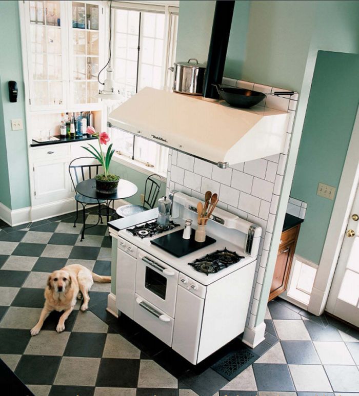
At first, you might not notice a lot of details in Warner and Allison McConaughey’s kitchen—the way the window muntins line up with those on the adjacent cabinet doors, the little cutout in the corner that looks into the stairway, the pet door, the border around the floor tile. But you can’t miss the stove. It’s a vintage 1950s Tappan that they bought for $100. And it sits in the middle of the room.
Owner of a design/build firm in Decatur, Ga., Warner McConaughey intentionally positioned the stove in the center of the kitchen to create the two spaces behind it. One is an intimate eating area with a café table flanked by two built-in cabinets. An oversize window behind the table looks out to the backyard. The other space holds a cabinet for recyclables and trash with a counter for the coffeemaker and microwave. This area also has the back door, so it not only makes taking out the trash easy but also functions as a mudroom.
It may seem like the stove placement would make the 12-ft. by 18-ft. room too cramped, especially when entertaining. But the stove serves the same function as many kitchen peninsulas: It stems the flow of traffic, keeping guests away from the work areas of the kitchen but allowing them to interact with the host. The narrow passage by the oven diverts guests into the seating area for refreshments.
The stove also sets a tone for the room that is consistent with the rest of the 1910 four-square house. In his restoration of the house, McConaughey went to great lengths to retain the spirit of the original. Surprisingly, it wasn’t difficult to include modern appliances in a kitchen meant to evoke the early 20th century. “Kitchens of that era had a very industrial feel,” McConaughey explains. “I chose stainlesssteel appliances to re-create that.” The appliances and the pot rack running along the wall reflect light from the large windows, making the room feel bigger than it is.
McConaughey replaced the kitchen’s original wood floor with porcelain tiles in a diagonal pattern, which enhances the room’s size. Rather than regular black and white, he chose a faded black and gray to make the tiles appear worn, adding to the room’s patina. A period-style border surrounds the new porcelain floor, while the old wood was saved to patch floors in the rest of the house during its remodeling.
For more details and photos of the McConaughey’s 20th century kitchen, click the View PDF button below.
Fine Homebuilding Recommended Products
Fine Homebuilding receives a commission for items purchased through links on this site, including Amazon Associates and other affiliate advertising programs.

The New Carbon Architecture: Building to Cool the Climate

Pretty Good House

All New Kitchen Ideas that Work

