Putting the Craft Back in a Craftsman Bath
Tilework triumphs over sagging floors and out-of-plumb walls.
Synopsis: An architect tours readers through a remodeled bathroom, explaining the design and material choices. A sidebar offers tips on working with mosaic tile.
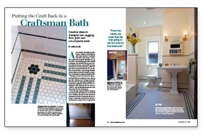
As an architect who works on older homes, I spend a lot of time fixing past “improvements” to kitchens and baths. My clients’ Craftsman-style house is a perfect example. During the 1970s, its second-floor guest bath received a makeover that included dark brown floor tiles, laminate counters, and a shadow-casting partition over the tub. Our goal was to return this bathroom to its Craftsman roots and cheer it up with light finishes, modern fixtures, and new tilework in sympathy with the home’s original look.
The house was built in 1905, just as the formality of Victorian architecture was relaxing into the Craftsman style. During this period, both styles shared some types of signature finish materials, especially ceramic tile. The 1-in. hexagonal floor tiles and the 3-in. by 6-in. “subway” wall tiles the homeowners chose for this project fall into this category.
From the outset, we knew that tile was going to set the tone for this bathroom. So we pored over traditional tile patterns for decorative touches and looked at a multitude of color selections. In the end, we settled on white for the field tile as the best way to brighten the room. And to give the floor character and to emphasize its shape, we devised a border detail of dark green tiles linked at the corners by a detail composed of hexagonal tiles in an abstract flower pattern.
The frame remains the same as tiling tricks lower costs
Restorations can get pricey quickly, especially when structural and plumbing changes crop up. With that in mind, we decided early on not to relocate plumbing fixtures.
You can expect a few sags here and there in an old house. We had our share, with an out-of-square floor that sloped enough to drain and walls that were distinctly out of plumb. The structure was still sound, however, which was good news for the budget and an opportunity for our tilesetters (Riley Doty and his associate, Jane Aeon) to use some tricks of the tile trade to hide the framing anomalies.
Before installing the tile, they brought the floor closer to level by adding a base layer of tile backerboard to the subfloor, followed by a tapered layer of mortar. You can see the extent of the built-up base in the threshold at the entry to the bath.
The out-of-square corners were handled differently. Rows of 1-in.-sq. white tiles between the borders and the walls are tapered as necessary to meet the wall. But because the eye is drawn to the dark stripes in the borders, the skewed wall lines are minimized.
In a similar manner, the horizontal bands of green trim tiles on the wall establish strong, level sightlines. The tiles below them are tapered to adjust for the remaining slope in the floor. The finishing touches were to install compatible fixtures.
For more photos and details, click the View PDF button below:

