The Small House Done Well
Proper scale and great details make 1200 sq. ft. an interesting place to live.
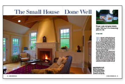
Synopsis: In upstate New York, the owners of a large farmstead decided to convert an existing outbuilding into a house. This article looks at the finished design, with an eye to gleaning lessons for any small home.
Right away, I could see that this project wouldn’t result in a big house that followed a ten-Dumpster teardown. The owners of a large farmstead here in upstate New York wanted the firm my wife and I own to expand a tiny outbuilding into a small house. The site was a real challenge: The building was situated near a busy road in front; behind, the ground rose abruptly up the hillside. The owners also insisted we save a 40-ft. cedar tree that grew only a few feet from the structure, which immediately limited our options. This project would be a challenge.
But despite this peculiar context, there are lessons here for anyone who is building a small house or addition, including this key issue: How do you make a 1200-sq.-ft. space an interesting place to live? Instead of using an open plan, we tried to create a sense of separation between the main spaces so that each room became a destination with its own views, light, and character. Of course, we wanted the new design to fit in amid the surrounding farm buildings, so the scale and the details were important, too. Sometimes smaller projects are more suited to a surgical approach than to a bulldozer and a chainsaw.
Don’t overwhelm the original structure
When many homeowners think about enlarging a house, they often want an addition that’s much bigger than the existing building and thus run into a potential problem: how to preserve the character of the original and keep the addition from engulfing the house. Choosing to preserve the overall scale lets the house remain integrated in its surroundings while still making more living space, a point that became central to our work on this project.
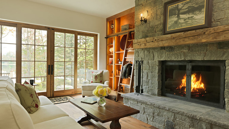
Because scale also was important to our clients, we used a cruciform-like plan that allowed us to distribute the rooms into gabled boxes that matched the scale and detail of the existing buildings. The small boxes also were instrumental in establishing a sense of separation between rooms that’s essential to making the interior of a small house seem bigger and more engaging. Instead of an open, undifferentiated plan, each major room has three windowed walls with a different view and sense of place that changes from room to room.
The character of the house’s interior also is affected by ceiling heights. From room to room, the ceiling heights change: high in the kitchen, living room, and master bedroom; and low in the hallways between. This constant variation gives a small interior a complexity that makes it seem larger.
For more photos, illustrations, and details, click the View PDF button below:


