Blending Styles in a Kitchen
Elements from different eras combine for a comfortable kitchen that looks like it evolved over the past 120 years.
Synopsis: Want a Victorian kitchen with all the flair and function of the 21st century? This article tells you how to combine two distinct styles into a single, cohesive design via a step-by-step walkthrough of a modernized, 17th-century kitchen.
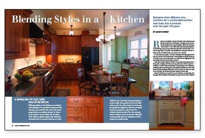
Roxanne and Mark wanted a kitchen where friends and family would feel comfortable, welcome, and at home. But the kitchen that came with their 1885 home had been “modernized” in the 1980s with white-laminate cabinets, vinyl flooring, and ceiling-mounted light fixtures that didn’t provide enough light. The space was chopped and cramped, with no relation to the rest of the house; in a word, it was soulless.
As the kitchen designer, I had the challenge of bringing back the character of the Victorian/colonial-revival period in which the house was built, but in a way that made sense with the new appliances and conveniences Roxanne and Mark wanted.
I saw three distinct choices. The first was to hide and disguise everything new, creating a kitchen entirely in the style of the original architecture. I call this choice convolution. The next choice was revolution, accepting and announcing that a new kitchen had been born of an old house, but this strategy could have turned out to be a variation on what occurred when the kitchen had been updated 20 years ago.
Instead, the choice we opted for was evolution, recognizing that change is both inevitable and healthy. Our goal was to create a kitchen that contained elements reflecting the various phases of its life span, from its inception in the 1880s through the advancements of the 1900s and into the present millennium.
Layout? Think circles.
My first task was to determine the general flow of work and traffic through the space. In a well-designed kitchen, this movement should be circular as you unload, store, prepare, cook, serve, and then clean up after the meal. Rather than criss-crossing the space a zillion times, there should be a logical flow from one area and task to the next.
In Roxanne and Mark’s kitchen, I separated the functions of food preparation and cleanup so that there is room for everyone to participate in the meal together. The table in the center of the room establishes the circular pattern of movement, and it feels more at home as the place for everyday meals than an island would.
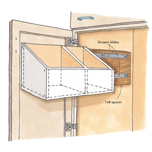
Once we had the general layout in order, we worked on storage. Everything Roxanne uses and stores in her kitchen was inventoried and its location designated, based on storing things as close as possible to where they are used the most. These factors were critical for establishing the optimal placement of drawers, cabinets, shelves, roll-outs, and pantries. To find a place for everything, we had to use every square inch of space. We worked with the cabinetmaker to create several ingenious storage systems, including a series of roll-out trays that provide access to the deepest recesses of a bottom corner cabinet.
For more photos and details, click the View PDF button below:
