Cape Revival
An addition to an antique gem turns an old house into a new family home.
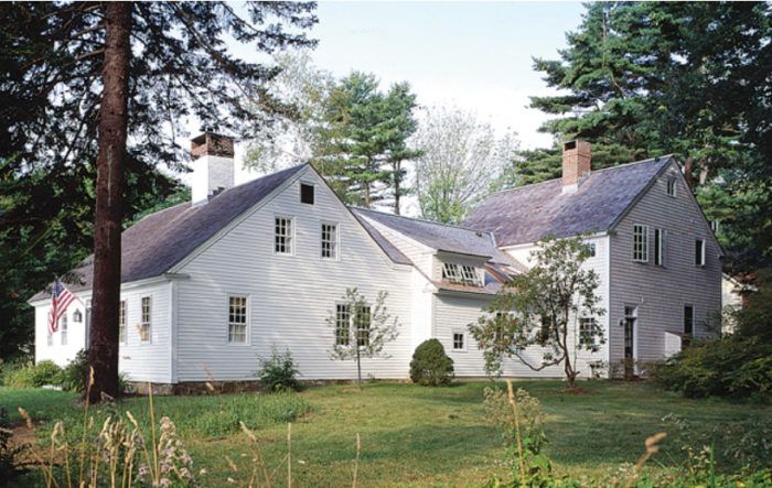
Synopsis: Martha and Brady bought an 18th-century cape in Maine because it was a beautiful example of the type of house from their childhood memories. It needed updating, but they wanted to maintain the historic character of the property. Architect Rob Whitten explains how he replaced an outdated addition to the house with new spaces that work for the family but respect the original structure. Highlights include reclaimed oak floors that compliment the original 18-inch-wide pine boards and a new dooryard in line with New England’s tradition of houses connected to their barns.
Martha and Brady grew up in a Maine village and shared a deep appreciation for traditional New England houses. When they returned to the state with a growing family, they wanted a home with character that was both old-fashioned and up-to-date. About ten minutes north of Portland they found the William Knight homestead, a 1760 cape not far from the rocky shore. While the original house had not been subjected to insensitive modernizing or upgrades, later additions, including an outdated solar greenhouse from the 1970s, didn’t fit their needs.
Recent owners had kept the barn and gardens in good condition, but the main addition (known as an ell because of its right angle to the original house) had no basement, and the pipes froze during hard winters. “Original condition” made 21st-century living a challenge, so their antique gem would have to undergo changes to make it livable for their modern family.
“First, do no harm”
Martha and Brady understood that they were the custodians of their home’s heritage and architectural character. The house had sheltered many families for two and a half centuries, and they wanted to be sure the improvements they made respected the integrity of the original house.
At Whitten Architects, we operate with similar principles. Our philosophy in dealing with historic structures is this: “First, do no harm; second, all changes should be revocable in the future; and third, new work should complement and not imitate.” With this in mind, we choose materials and finishes that are in the spirit of the original house, rather than painstakingly recreating antique building materials.
The couple came to us with a clear understanding of what their family home should be. After meeting with them, we knew we needed to add more living space to the house and provide all the latest amenities while keeping to a tight building budget and respecting the character and scale of the original cape. Specifically, the family wanted a new kitchen with a family dining area; a back entry with mudroom, laundry, half-bath, and storage; a large play space for three children and their friends; separate living space for grown-ups; an additional child’s bedroom; and a master bedroom suite.
Connecting old and new
Architectural designer Brian Stephens and I began by measuring and documenting the existing spaces and layout of the cape and grounds. Our plan evolved as a series of connected buildings and spaces, a design common to many period New England homesteads.
A new ell was designed to replace the old one, connecting to the cape in the same spot so that no additional damage would be done. But one of our biggest challenges was resolving the low ceilings of the old cape with full-height new spaces in the addition. A breakthrough came with Brian’s idea to locate the new stairs just at the spot where the two structures meet. The stairwell rises to a second-floor hall and gallery with a cathedral ceiling open to the kitchen below. This dramatic variation in ceiling heights is tempered by the relatively low ceiling over the breakfast area.
For more photos, floor plans, and more details on this cape revival, click the View PDF button below.
