A Busy Family Branches Out
A sensible addition brings more to this home than a few family rooms.
Synopsis: A Minneapolis-area family found a 1940s house they loved, but the tiny kitchen wouldn’t suffice for their busy lifestyles. Working with architect Jean Rehkamp Larson, the Lannins ended up with a three-story addition that expanded and updated the house’s main living area without sacrificing the architectural character; the resulting house is spacious with great flow and a traditional bent.
Grand Central Station’s got nothing on this rambling colonial-style house just outside Minneapolis. It’s where Sally and Charlie Lannin, their three teenagers, and countless friends and neighbors gather for one reason or another, nearly every day of the week.
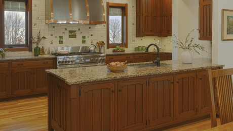
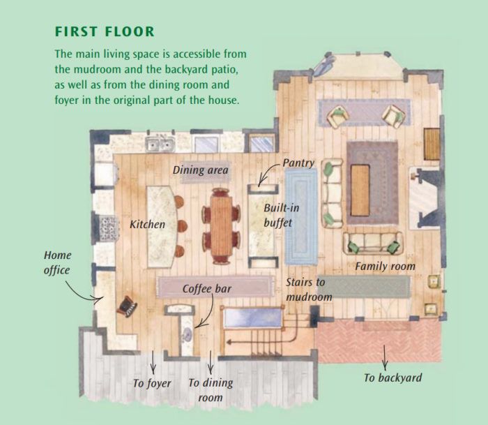
Not surprisingly, most of the activity—from sleepovers and school meetings to bridal showers and pasta parties for the football team—takes place in the home’s new, wide-open kitchen and connecting family room. Which is exactly what Sally hoped would happen when they bought the house three years ago and immediately added on the new rooms.
“More than anything, we wanted the house to be welcoming, open, reasonably neat, and comfortable,” says Sally, adding that it’s interesting how the space reinvents itself to suit any occasion.
Since the renovation, “the kitchen has become the center of our universe; the place where you can most likely find a note from mom on the counter, your misplaced math book, or a video waiting to be returned to Blockbuster,” says Sally.
“We use it—all of it—every day. And we’re very happy with the way it came together.”
The addition transformed the house
On paper, the house had everything, including the perfect location in a lovely older neighborhood. Built in 1940, it had architectural integrity, classic colonial bones, and more than enough bedrooms and baths. What it didn’t have was a big kitchen and the kind of common room the family required for the way they like to live and entertain.
The first-floor kitchen and family room is only part of the transformation designed by architect Jean Rehkamp Larson of Minneapolis. On the lowest level, the Lannins added another garage, a mudroom, and an open stairwell, which makes for a smooth transition into the bustling kitchen. On the second floor, they reconfigured a small guest room and added a laundry room and master suite.
“As with most projects, this one was pared down from the original proposed design,” says Rehkamp Larson. “Sally and Charlie found the comfort level between value and cost and decided to focus on the classic kitchen and family room. The important thing was that the new rooms on all three floors appear seamless.”
While they were at it, they raised the front foyer doorways to 7 feet (“We are a family of Amazons,” says Sally, whose son Charlie, at 15, is already 6 foot 3). To fully integrate the new space, they matched all the flooring on the main level to the pegged wideplank oak in the new space.
The family had quite a wish list, remembers Sally. “My husband and I were very involved in expressing what we wanted as an end product, although neither of us is at all blessed with architectural tendencies. As a result, Jean had to take our vague ramblings like ‘lots of light,’ ‘kids with big feet,’ ‘lots of dirty dishes’ and interpret them into numbers of windows, deep cubbies, and two dishwashers.”
For years, Sally had saved pictures from magazines. “Remarkably, that old file I’d kept for 20 years was really used to express many of our ideas. I also went over to friends’ houses with a camera and opened their cupboards and took pictures, which I gave to Jean. She was great about listening and, voilà, the ideas appeared on the drawings.”
For more photos, floor plans, and details on this third-story addition, click the View PDF button below.


