Balancing Cost and Style
A basic box embellished in just the right places saves an architect money on her first home.
I built my house out of foolish desperation. It happened nearly five years ago, when I was a young architect drawn to a place where I could stretch my design wings: the East End of Long Island, where the clients have sophisticated ideas about design. I wasn’t sure, though, that I could afford to live there. But I got lucky. I inherited just enough money for a down payment on some land, and I found a small lot I could afford. I had no clue what to expect from the loan and construction process, but I knew how to design a house, so I did.
Design details
My design decisions were based on two things: my practical experience as an architect and my personal wish list. Both were tempered by my budget. I knew if I kept the design straightforward and easy to build it would be cheaper. I thought about the houses I’d lived in over the years and what I could do to make this house feel like home. I gave careful consideration to every wall, window, trim, finish, and detail.
In the end, the simple shape of my small house combined with my choices of materials enabled me to complete my home for about a third of the cost of more elaborate homes in my area. Here are my thoughts on building an affordable house with architectural integrity and how they translated into the house I love and live in today.
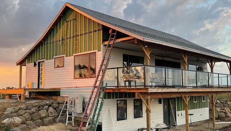
Keep the box plain and simple I chose a flat lot because sloping properties can add to the site work and require a more complex foundation. I didn’t agonize over the style of the house because there was only one choice, given my budget: a Cape Cod. This house is a rectangle, allowing for a relatively inexpensive foundation pour and a second floor situated within the roof structure. Headroom can be an issue in capes, so I added a shed-style dormer, which was economical to build.
The exterior of the house is straightforward and symmetrical. Wood rather than vinyl or aluminum-clad windows were used to lower costs and allow me to change the color eventually. I ordered them primed, then painted them green before they were installed.
Think curb appeal I knew it made sense to spend money on the side of the house that people would see, so I added more detail, including flower boxes, to the front. The less visible sides are plainer, with limited detail.
One feature I had always dreamed about was a romantic covered porch with a swing on it. A porch adds curb appeal because it’s evocative of summer and leisurely evenings. So I designed the house with a porch to one side, found an oak swing at auction, refinished it, and realized that dream.
Make a good first impression As my plans took shape, I decided to loosen things up by creating a two-story entry hall and painting the walls a brilliant red. Everyone who walks in immediately looks up and says they like the intense color.
For more photos and details on building a cost-saving home, click the View PDF button below.
Fine Homebuilding Recommended Products
Fine Homebuilding receives a commission for items purchased through links on this site, including Amazon Associates and other affiliate advertising programs.
Original Speed Square

Anchor Bolt Marker

100-ft. Tape Measure
