A Thoroughly Modern Makeover
A surprising second story changed the space, while innovative materials gave this home a sense of style.
Synopsis: The remodel was 10 years in coming. Michelle, John, and their young son lived in a small, style-starved ranch. Finally, Michelle, a graphic designer with a passion for bold colors, drew up a wish list. They’d raise the roof and transform the humdrum house into a bright, light, contemporary haven. After working with architecture/design team ColePrévost, they ended up with an airy house that, at 2,016 square feet, is expansive without being huge and incorporates an inspiring array of materials.
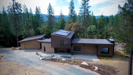
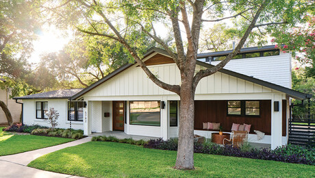
They call it the big shoji screen in the park. It sits on a leafy lot surrounded by smallish traditional homes of a certain age (around 50) across the street from a pleasant park and a creek that runs down to the Potomac River.
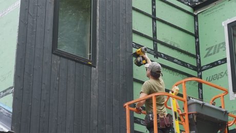
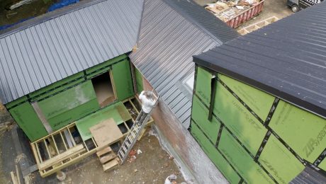
The house rises from an original brick foundation, its second story of stucco, steel, and translucent panels peeking through the tops of ancient oak trees. At night, with the lights on, it looks like a giant paper lantern.
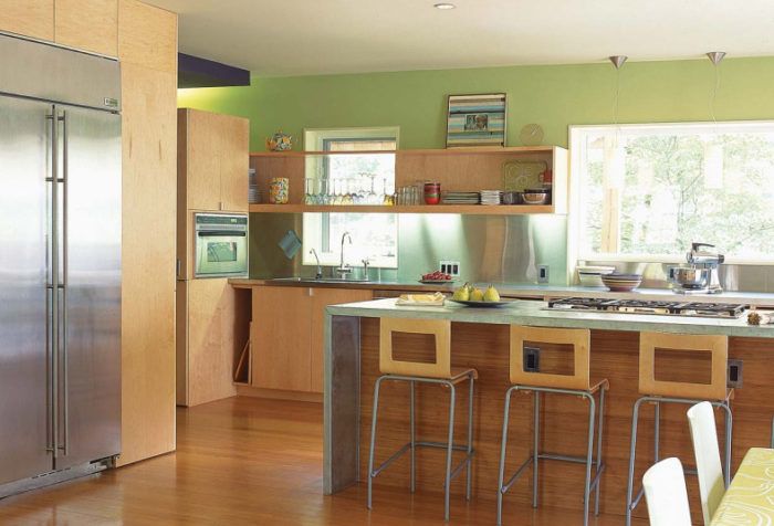
If the outside of this house surprises, then the interior delights. Jammed with color and unpredictable planes, rich, sleek textures, and an unmistakably modern sensibility, the house looks nothing like the ranch it once was. It went from six small, dark rooms to a series of dynamic spaces infused with style.
There’s a soaring second floor that opens to the first, distinct rooms but few walls, warm woods alongside cool metals, original art on nearly every wall, and color everywhere: a palette of pale maple, blueberry, eggplant, three shades of green, and eye-popping orange.
Artist Michelle Higgins and her husband, John Cohan, lived in the Silver Spring, Md., house for 10 years before they remodeled. “The spirit of the house was welcoming,” Michelle says. “I had a good feeling about it. But when people walked in, they didn’t know which way to go.”
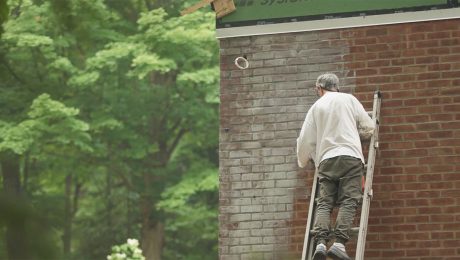
Five years in, they made a few changes, knocking down the wall between the kitchen and a jalousie-windowed Florida room, but it wasn’t enough. Five years after that, they hired Robert Cole and Sophie Prévost, of the architecture/design firm ColePrévost, to refresh the tired ranch.
“We had our son by then (Finbar, now 8) and we had to do something. It wasn’t just a spatial issue. It was visual,” says Michelle. “What drove the remodel was aesthetic claustrophobia.”
Going up inspired a more dynamic interior
“We didn’t want it much bigger, just different and modern. I wanted people to enter, pause, see something wonderful, and feel welcome,” Michelle says. “It had to be unique because we were not going to spend a lot of money unless it was.”
Cole made this assessment early on: The home would have to be “open, light, fresh, witty, and warm.”
Stately oak trees and zoning regulations prevented them from bumping out the house, so they decided to do the only logical thing and go up, but not the way you’d expect. Michelle and John opted for a loft like second story with a translucent balustrade separating the master bedroom from the living room underneath. The configuration on the second floor is quite simple: There’s a master bedroom, Finn’s room, and a shared bathing space between them.
For more photos, floor plans, and details on this modern remodel, click the View PDF button below.

