Bright Side of the Room
Turning the kitchen to the south, toward the family room, did more than improve the view.
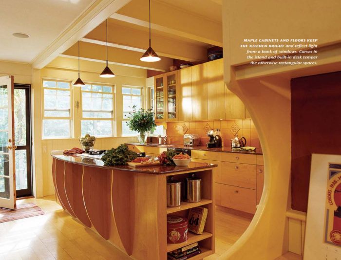
Synopsis: Lisa and Theo had a dark, cramped 1960s kitchen addition stuck onto the back of their 19th-century shingle-style house. Oriented toward north light, it provided a view of the driveway and garbage cans. But then Amory Architects came up with a new design that turned the kitchen around to south and west light, unblocked the circulation in the room, and opened up the back of the house to a new veranda that runs the length of the kitchen. The result is a space that integrates the kitchen into the rest of the house and is far more functional and expansive — without exceeding the original’s square footage.
Lisa and Theo’s kitchen in their Queen Anne house outside Boston was a dark, unfriendly space diagonally across from the family room, where their two children spent much of their time. The kitchen counters faced away from the family room, requiring the cook to turn away from the activities of the rest of the family.
The rooms needed an about-face. Not only did the kitchen point in the wrong direction, but the family room didn’t take advantage of the wonderful views toward the rear of the house. After we talked at length with Lisa and Theo, our architectural firm came up with a plan to turn the kitchen toward the family room while adding natural light to both spaces and improving the traffic flow in the downstairs of the house—all without adding to the footprint of the existing house.
Adding an island turned the kitchen around
In the original kitchen, both the range and the sink were on the north side of the building. Small windows over the sink provided the only natural light. The room was tucked into a corner and dislocated from the family room, making a distance of about 16 feet between sink and breakfast table.
Our plan moved the major work areas of the kitchen—sink and cooktop—directly across from the table. A 9-foot-long curved-front island holds the cooktop and provides lots of food-prep counter space to each side. Not only does the island make it easy for family members to walk around and through the kitchen, but it also orients the cook toward the family room to the south. The wall ovens and refrigerator are close at hand to the side of the island.
Another important design strategy was to minimize the number of cabinets to keep the room full of light. Using fewer upper cabinets—there are none along exterior walls or hanging between the kitchen and the eating area—helps to maximize natural light and makes the room feel larger. Space planning is crucial when you have fewer cabinets, but Lisa and Theo were willing to limit their number because we put extra kitchen storage nearby in the butler’s pantry and in several deep cabinets around the refrigerator.
New windows improve the view
With the orientation of the kitchen shifted toward the family room, our next move was to fill the south- and west-facing rooms with light. A bank of new windows runs the length of the room and wraps around the south end. A French door with 10 lights also lets in sunshine. While the top sash of the double-hung windows has nine divided lights, the bottom of each is unobstructed by muntins.
Since we had done so much to make the windows a focal point, we didn’t want to block them with furniture. So we helped Lisa and Theo find wood-and-cane furniture for the sitting area that is no higher than the window sills. This makes the space feel taller and lets the view to the outdoors command attention.
For more photos, floor plans, and details on this kitchen remodel, click the View PDF button below.






View Comments
thanks a lot for sharing this great idea's!