From Dead-End Kitchen to Drop-Dead Gorgeous
Removing a wall and adding an island improve traffic flow and storage space in a Craftsman-style kitchen.

Synopsis: More and more, kitchens are becoming the center of a homes activity. Unfortunately, many older kitchens just aren’t up for that task, whether they’re cramped, filled with obstacles, or just lacking the elegance of a modernized kitchen. Learn how to increase counter and storage space while removing obstacles and maximizing traffic flow. Work off of your existing floor plan to lighten up your kitchen, and give it a custom look and newfound functionality.
Some cooks subscribe to the culinary-cockpit theory and want everything at their fingertips. Good organization and a compact work area can make the cooking process more efficient. These days, though, most kitchens aren’t just for cooking. They’re the center of a home’s activities and require more space. Because the design/build firm I work for handles quite a few kitchen-remodeling projects, we’ve found that the trick to making a bigger kitchen without blowing the budget is to rework the existing floor plan.
Rethinking the plan
Our clients’ ranch house was built in 1980, and the kitchen was ripe for renovation. The U-shaped work area lacked both counter and storage space; half the kitchen was used for an eating area, despite the adjacent dining room, which was used only twice a year. During parties, guests gathered in the cramped kitchen because they felt isolated in the living room and as a result wouldn’t congregate there. In the summertime, the sun’s heat penetrated the uninsulated vaulted ceiling, making the whole space uncomfortable. Another concern was lack of backyard access. The homeowners thought an addition would solve their problems. We convinced them otherwise.
Tear down the walls—carefully
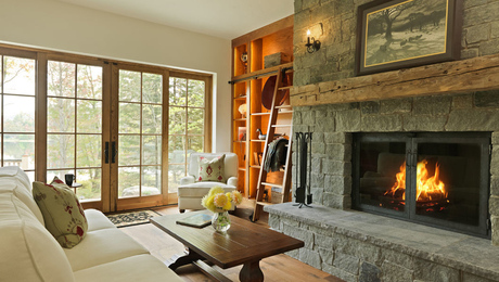
The obvious way to get more space was to remove the partition wall between the dining room and kitchen, creating one big room with better access to the backyard. The new open floor plan provides plenty of space for guests and also allows easy flow between entry, kitchen, dining area, and living room. The dining area now can be used all the time, which frees the space formerly occupied by the kitchen table.
The wall between the kitchen and living room had to stay; it is load-bearing and a shear wall. We shortened it slightly and reengineered it to meet seismic-code regulations.
To address the heat issues, we installed R-30 rigid-foam insulation between the exposed ceiling rafters, then covered the foam with custom V-grooved plywood and 1×6 battens to give the ceiling a rustic look.
Even a stock kitchen needs custom details
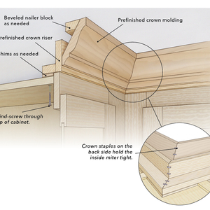
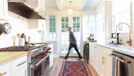
Once the space was gutted, we could begin to build the new kitchen. To maximize the work area, we lined both walls with counters and also added a large island in the center of the room. The homeowners selected cherry Arts and Crafts-style cabinets from Medallion Cabinetry; we added the matching cherry trim to the windows, doors, and baseboards.
The kitchen island has a 3/4-in.-thick granite counter with a large overhang at one end. To maintain a slim edge profile and not clutter the space underneath the island with any supports, our carpenters routed channels into the countertop’s 5/8-in.-thick plywood substrate, then screwed and glued two 1/4-in.-thick steel plates in place.
For more information and before and after photos of this kitchen remodel, click the View PDF button below.


