A Hard-Working Bungalow Kitchen
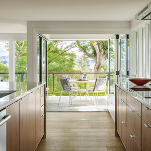
Small, smart, and beautiful, this kitchen makes the most of a modest addition.
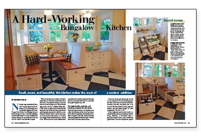
Synopsis: White cabinets and a checkerboard floor make a kitchen that looks at home in this 1920s house. Maximum storage in a limited space is the focus of this design article. The author details how a breakfast booth and a baking center were designed and built to store all kinds of kitchen equipment. A sidebar offers the owners’ opinion of their linoleum floor.
Nine years ago, my husband, Steve, and I bought the home of our dreams. It’s a 1920s bungalow in a wonderful neighborhood near Oregon State University. Although our new home had great bones, it needed updating, especially the kitchen. It was so cramped that anyone sitting at our tiny table had to get up to allow room for the back door to open.
When it came time to remodel, we faced a tough decision. We either could knock down the wall to the adjacent dining room and lose our formal dining area, or we could seek approval for a 44-sq.-ft. addition. The first option would have been less expensive and would not have required the special permit necessary for additions in our National Historic District. At the same time, we really enjoy eating dinner as a family every night in the tranquility of our dining room. With a plan for a small addition that eventually won unanimous approval from the local historic-preservation board, we took the latter path.
The right details, materials, and hardware maintain the old charm
Steve and I agreed that our new kitchen must reflect the character of the rest of our home. Even with new appliances, the kitchen had to look as original as possible, which meant the scale and proportions had to be right. And the details had to be historically accurate.
Central to the period-style design was the custom cabinetry. Historic detailing meant the door and drawer fronts had to be flush-mounted and that the panels had to be recessed. We chose nickel bin pulls, cupboard latches, and ball-tipped hinges for their authenticity.
Other important period-style details included beaded wainscot and ceilings, double hung windows, a farmhouse sink, a porcelain-handle faucet, and schoolhouse light fixtures. We even salvaged the original doors, stripping them back to bare wood and replating the hardware.
We knew we wanted a natural material for the countertops. My husband lobbied for wood counters (they are historically correct), but I was concerned about maintenance. Eventually, I found some granite that looked like marble. (Marble is also historically correct, but too porous for a kitchen counter.) To make sure we made the right choice, we decided to test-drive three samples — oiled cherry, varnished cherry, and granite — for a few days. Several fruit smoothies, wet bread bags, and red-wine glasses later, our decision was easy: Granite ruled.
Our other big dilemma was flooring. The original floors, including the kitchen, are fir. Based on past experience, we knew that a fir floor in the kitchen wouldn’t hold up to our family. Oak would be more durable, but it wouldn’t match the other rooms. Ceramic tile seemed too unforgiving and too cold. So we found ourselves leaning toward linoleum. We placed a sample on the floor, spilled things on it, and even fed the dog on it. It passed the test. We had 20-in. squares installed in a diagonal checkerboard pattern to give the illusion of space and to be forgiving to a not-so-square room.
For more photos, drawings, and details, click the View PDF button below:
