Bath Math
Adding a dormer and subtracting a double closet yields a compact but luxurious master bath.
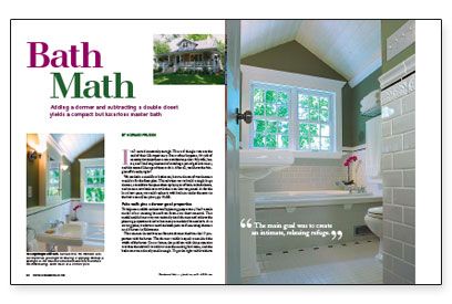
Synopsis: The clever design of a new dormer improves the exterior of this Canadian home while creating space for an upstairs bath, outfitted with white tile and black accents for a 1920s look. The article shares advice and lessons learned that will benefit any homeowner looking to begin a major remodel project.
It all started innocently enough. The roof shingles were at the end of their life expectancy. But as often happens, this job of necessity developed into a more ambitious project. My wife, Janice, and I had long dreamed of installing a pair of gable dormers, and this seemed like a good time to do it. After all, we’d have the shingles off already, right?
We needed a second-floor bathroom, but our dream of two dormers wouldn’t fit the floor plan. The solution was to build a single large dormer, consolidate the space taken up by a pair of back-to-back closets, and create a new bathroom with the room that we gained. As for the lost closet space, we could replace it with built-ins under the eaves in the bedrooms.
False walls give a dormer good proportion
To help me establish architecturally pleasing proportions, I built a scale model of our existing house from foam-core sheet material. This model enabled me to try out variously sized dormers and achieve the pleasing proportional scale that many remodeled houses lack. As a starting point, we drove around and took pictures of interesting dormers on old houses in Edmonton.
The common thread that our favorite dormers had was the 1:3 proportion with the house: The dormer’s width is equal to one-third the width of the house. On our house, the problem with this proportion was that the sidewalls would cut into the existing bedrooms, and the bedrooms were already small enough. To get the right width without cutting into the bedrooms, I built false walls atop the roof. As explained in the article sidebar, the false outer walls give the illusion of a larger dormer from the street without stealing interior floor space.
Living with an unfinished space improved the final design
The bathroom sat framed and insulated for a year as we ran low on funds. But the hours spent sitting and lying in that framed room helped us to visualize the best location for bathroom fixtures, lighting, storage, and other features.
Because the room is small and the ceiling height short (7-1⁄2 ft.), we sloped the dormer ceiling to avoid a claustrophobic room. To get enough R-value in the roof, I installed rigid insulation between the 2×8 rafters with an airspace above the insulation.
I even built a plywood version of a mission-style vanity I had seen in Fine Woodworking magazine. Thanks to this mock-up, I realized that the vanity would be far too big for the room. Instead, we chose a pedestal sink, which gives the airy, open feeling we were after.
Built-in cabinetry complements a smart-looking tile motif
I loved the medicine-cabinet design as soon as I saw it in a magazine, but I wouldn’t have been able to look at myself in its mirror had I paid the asking price. So I built one. To the left of the chimney was a perfect space for a built-in linen closet. Adjustable shelves and drawers with full-extension slides house bathroom supplies and cleaning products. The leaf-embossed glass in the door softens the view of our linens.
For more photos and details, click the View PDF button below:
Fine Homebuilding Recommended Products
Fine Homebuilding receives a commission for items purchased through links on this site, including Amazon Associates and other affiliate advertising programs.
Roof Jacks

Ladder Stand Off

Roofing Gun

