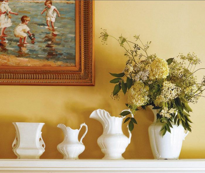
Synopsis: Photo stylist Karen Lidbeck-Brent knows how to create an engaging vignette on any mantel, in any style. For this article, she used her intimate knowledge of color, proportion, and object placement to style the same mantel in six different ways, both formal and informal. The photos are accompanied by detailed descriptions of why she did what she did and why it works.
In many homes, a fireplace mantel is the most conspicuous feature of the most frequently used room, and the first thing people see when they walk in. But I think all too often it’s a missed opportunity. I’ve seen a lot of bland mantels in my day—mantels that are frozen in time, decorated once (soon after moving in) and never changed. In general, I think people have a tendency to be too timid and traditional when it comes to creating a still life on the mantel. They do the expected, like flanking a family portrait with a pair of candlesticks, and call it a day. Or they create a jumble of too many things and never give it another thought.
It’s too bad, because decorating a mantel is a great way to express yourself, to set the tone for a room, and to freshen things up. I recommend changing your mantelscape with the seasons.
Balance and harmony are everything
I like symmetry—I almost always center paintings or prints in the space over the mantel—but even if you prefer asymmetrical arrangements, balance is critical to a well-styled mantel. Vary heights and weights, countering tall objects with shorter ones, narrow with wide, heavy with less substantial pieces. When decorating with similar objects, I think it’s best to point them in the same direction, keeping angles and tangents the same.
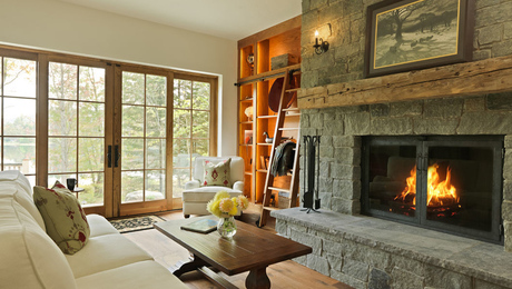
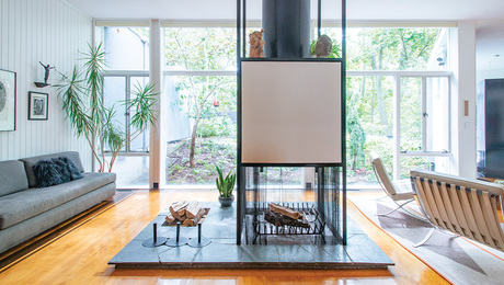
What looks good on a mantel has a lot to do with the mantel itself—its style, depth and width, and how prominent it is. But remember to look beyond the mantel shelf when planning your composition. Consider ceiling height (lots of low things will be lost in a vaulted room); fireplace materials (brass or glass can be beautiful against rustic stone); and the overall style of the room (country collectibles may not be the best mantel choices for a sleek, contemporary room).
Unity is another principle of good design that can make or break a mantel arrangement. It’s important that objects relate to one another in some way; the connecting thread may be color (red vintage toys), materials (terra-cotta pots of all shapes and sizes), or theme (objects found in nature).
The one exception to this rule is what I call “the surprise.” I believe that bringing an unexpected object, like a polished brass candlestick amid rustic pots filled with holiday greens, is a good way to jazz things up.
For more photos and tips on how to decorate a mantel, click the View PDF button below.


