Downsize and Upscale
A planned community's modest model home raises the bar for production houses.
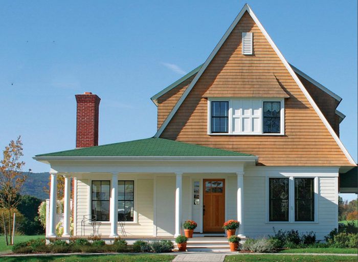
Synopsis: This picturesque spec house, with its steep roof and shingled gable, is a great example of how traditional shapes, colors, and textures can be re-arranged into a house with a contemporary floor plan. In this case, the plan is aimed at empty-nesters who are ready to downsize to a more manageable home that still has room for visiting family. The article includes a sidebar on affordable details that have a big impact, and advice on how to make a great outdoor space on a small lot.
Four years ago on a flight home from a New Urbanism conference, I was seated next to Steve Maun of LeylandAlliance, a developer from New York. A friendly conversation led to a partnership to design homes for a new community aimed at fighting urban sprawl and cookie-cutter houses by drawing on the best examples of prewar neighborhood planning and architecture.
We designed this house as the model home for a “new traditional neighborhood” called Warwick Grove, currently under construction in Warwick, N.Y., about 55 miles northwest of New York City. The neighborhood will be for the over-55 crowd known as “active adults.” For these folks with established careers and grown kids, a new home is a chance to enjoy their autumn years in a neighborhood of their peers, without the burden of a sprawling lawn and a large house to maintain. Although the idea of downsizing has appeal, these people are not inclined to give up the comforts they have worked long and hard to achieve. To persuade them to downsize to a 2400-sq.-ft. home on a 50-ft. by 100-ft. lot, they need to perceive the move as a gain.
The challenge was to create a speculation house designed specifically for production building, but with the proportions, quality, and appeal of a custom home.
A steeply pitched roof captures the eye
One of our goals is to create a neighborhood that invites walking, and that means we have to build a neighborhood that is interesting to look at. The architectural details in older neighborhoods play a significant part in making them “walkable,” or friendly to pedestrians. Although not a direct quotation of a particular style, this house takes its cues from the Queen Anne, shingle, and Dutch-colonial styles that line the town’s main street and dot the surrounding farmland.
The house’s proportions speak of a bygone era. The unusually tall 6-ft. first-floor windows confer a measure of Victorian-era elegance to the house. And instead of stock 1 x trim, we built the exterior casings of relatively inexpensive, flat 2×4 cedar. This detail creates an unusually deep shadowline at the windows, avoiding the deadly flatness of contemporary construction.
The dramatically pitched 18-in-12 roof immediately catches the eye. By using simple trim along the roof edges, we saved time and materials, keeping down costs. I’ve found that when the proportions are right, we don’t need as many details to make a house appealing. And the details we do use can be of higher quality.
The shingled sweep with a 30-in. roof overhang and the shingled canopy above the front window are beautiful as well as functional. Gutters in this part of the country take a real beating during the winter from snow and ice sliding off the roof, so we eliminate them when it’s feasible. The deep overhang keeps the water runoff (and splash) well away from the house. The sweep of the roof and the window canopy also shelter windowsills from rainwater. An “in-ground gutter,” perforated PVC pipe laid in a gravel-lined trench, collects the water and drains to daylight away from the house.
To access floor plans, and to learn how to plan for an aging population, click the View PDF button below.
Fine Homebuilding Recommended Products
Fine Homebuilding receives a commission for items purchased through links on this site, including Amazon Associates and other affiliate advertising programs.

Peel & Stick Underlayment

Roofing Gun
Flashing Boot Repair

