Lessons from a Suburban Home
Proof that a home can be more livable and more versatile without more cost.
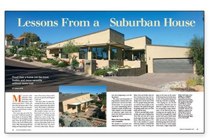
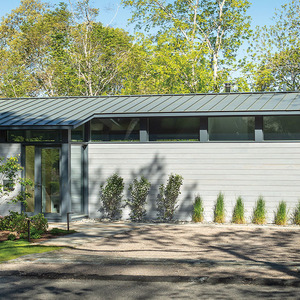
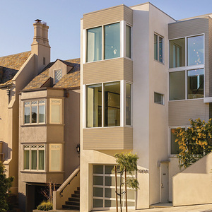
Synopsis: In a Phoenix suburb of faux Spanish Colonial tract houses, this modern home demonstrates that a house can be more livable and more versatile than the neighboring houses without any additional cost. The house is notched into the hill, sheltered from the wicked afternoon sun, and its garage is strategically located to create a shady courtyard with a fountain. Inside, a big sliding door can be retracted to create an open office or closed to make a private guest bedroom. A sidebar on how the owner acted as the contractor addresses some common questions about managing your own home-building project.
My parents like suburbia. They work there, they shop there, they understand there. They just don’t like the houses there. This story is about how my parents’ wish for a good house in suburbia came true.
Two years ago, my wife, Jessica, and I visited my parents at their home in Fountain Hills, Arizona. I was bringing in luggage from the garage and got stuck in the front hall/laundry closet. After bemoaning the bad design and espousing the importance of an entry, Jessica and I got out our pencils and designed a new one.
The more time we spent discussing the house, the more my parents realized just what didn’t work. My brother’s wheelchair could not fit in half the rooms. My mother’s piano was in a back bedroom where no one could hear it. The living room offered no views of the wonderful mountains nearby. The outdoor space felt disconnected and uncomfortable; built on top of a hill, the house was more driveway than home. My parents were beginning to see the big picture.
Two years and thousands of long-distance minutes later, my parents have moved into their dream home. It’s not perched on a view-commanding cliff or nestled in a quiet, secluded river valley. Rather, it is in the middle of suburbia, right down the street from the house where my luggage got stuck.
Make the house flexible and accessible
We needed to overcome two obstacles in designing for accessibility. First, my brother does not live at home every day. He visits each weekend, meaning the design had to work just as well for two people during the week as it did for three people on the weekend. We achieved this goal by getting double duty out of the study and the entry.
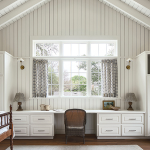
With its own half-bath, a built-in desk, and a pair of sliding barn doors that can close off or open up the space, the study is an ideal home office. But it also doubles as a guest bedroom, thanks to a bench that turns into a bed. Putting the piano in the entry at the center of the house lets my brother hear it (one of his greatest pleasures) from any room he’s occupying.
The sloping lot, our second accessibility obstacle, was not ideal for a single-story house or for navigating a large wheelchair. So we tailored the site. Cutting into the uphill side of the lot left us enough fill to build up the lower parts, which made every portion of the home accessible on one level. Because the detached garage had to be lower than the house to meet height restrictions, a slight ramp leads to the entry by way of a small courtyard.
For more photos, drawings, and details, click the View PDF button below:
Fine Homebuilding Recommended Products
Fine Homebuilding receives a commission for items purchased through links on this site, including Amazon Associates and other affiliate advertising programs.
Original Speed Square
Not So Big House
Graphic Guide to Frame Construction
