Synopsis: There is probably no more evocative feature of residential architecture than the porch, and homes in every region take advantage of its charm. Architect and porch lover James M. Crisp walks us through the design principles that help make a porch a welcoming place to sit for a spell. Inspiring photos, a glossary of terms, and tips for working with a builder accompany the text.
If there’s one icon of American architecture, and one that calls to mind a more leisurely time, it’s the porch. I grew up in the South, where porch sitting is a part of the culture. Even now, some of my most peaceful, introspective times are spent sipping coffee and looking out over the river on the porch of a guest house I stay at when visiting family back in rural Louisiana.
A porch is a great place to take in a view, watch your neighbors, observe weather changes, or just keep an eye on the outside world. It serves as a transition point between the inside of a house and the great outdoors. It can give you shelter without forcing you inside. It can create distance where you might want some—from a busy street, for example. And it can function beautifully as an outdoor room.
Over the years, as I’ve designed homes with porches, I’ve asked myself what makes one porch more pleasing than another. Why do some porches invite gathering and conversation, while others don’t? And what is it, exactly, that makes a porch sittable? I’ve learned that attention to certain design principles and practical matters will point you in the right direction if there’s a porch in your future.
What makes you want to put your feet up?
Porches are nice to look at, and that’s part of their charm. Of course, different styles appeal to different people, but for a porch to be visually pleasing, it should adhere to a few basic design principles:
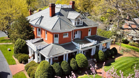
Appropriate scale is critical. A porch should never do battle with a house. It should be visually subservient to the main structure and not overpower it.
Proper proportions provide balance. Vertical components should always appear appropriate to horizontals. Posts, for example, should look substantial enough to be carrying the roof. Sometimes, this means making posts larger than what is structurally required.
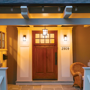
Style is never arbitrary. Everyone has a favorite porch style. Some like simple stone structures, while others prefer elaborately detailed porches with gingerbread trim. Whatever you like, the details of your porch should always be dictated by what already exists. Formal columns will look out of place on a simple, spare farmhouse. Likewise, a grand, formal home will not be enhanced in any way by a contemporary, featureless porch. An exact match is not always necessary, but visually the parts should blend to read as a whole.
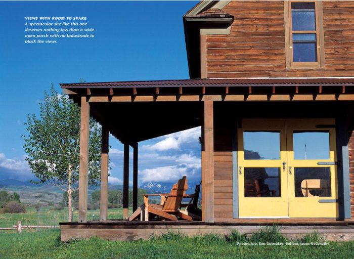
Views are something to aim for. The location of your porch may be predestined by your site—or your desire to look out onto your street— but if there is a choice, it is always best to focus on a view. Remember, the porch is a place where you can connect with your surroundings. If no view is readily available, creative landscaping or a strong focal point, be it an arbor, tree, or garden bed, can be just as effective. I like balustrades because railings provide a sense of enclosure and protection. But if you have a particularly stunning vista, and the distance to the ground isn’t too great, you can do without railings and really open up the view.
For more photos and details on how to create the perfect porch, click the View PDF button below.
Fine Homebuilding Recommended Products
Fine Homebuilding receives a commission for items purchased through links on this site, including Amazon Associates and other affiliate advertising programs.

Angel Guard Deck Demon

MicroFoam Nitrile Coated Work Gloves

Jigsaw


