Small Bath with Big Ideas
Clever design transforms an attic space into a serene master bath.
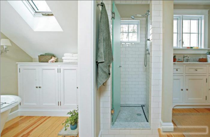
Synopsis: Gina, an interior designer, and her carpenter husband, Tim, wanted to remodel a tiny, cramped second-floor bathroom in their 1895 Victorian cottage. They toyed with the thought of raising the roof but instead decided to expand into the surrounding unfinished attic space. With clever space planning, the couple created a functional and beautiful small master bath; our article takes you inside their design process.
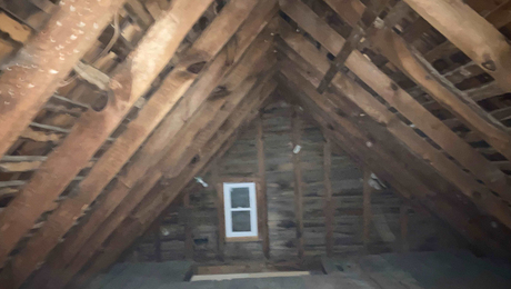
When Gina Porcelli and Tim Kerin decided to remodel the cramped second-floor bathroom in their vintage Victorian cottage, their first thought was to raise the roof. It would have been an obvious solution: The existing bath, added in the 1930s, consisted of a toilet, sink, and tub crammed under a 5- by 8-foot dormer. Expanding the bath into the surrounding unfinished attic space under the eves would give them a 12- by 12-foot room, but as it was, the steeply angled roof would have made much of that space unusable. Raising the roof, then, was an obvious first step in creating a luxurious master bath.
But the budget-conscious couple, who’d already logged many hours remodeling their 1895 fixer-upper, didn’t quite have the patience or the checkbook for a another major project. There was also the integrity of the house to consider. Gina loves all things modern, but the attic’s sloped ceiling and tiny windows peeking over the evergreens in the backyard told her that this was a place to nestle a vintage tub, not an acrylic whirlpool. And then there was the challenge—which Gina, an interior designer, and Tim, a carpenter, couldn’t resist. “If we had raised the roof, the sky would have been the limit as far as design went,” says Tim. “But there was something about the attic space that I found interesting and challenging.” Gina concurs: “We thought, Wait a minute—we’re both designers. We should be able to make this work.”
The first challenges were structural. Reinforcement was needed in both the floor and the roof to support the tub and to make it possible to open up the space. But even as the shell was sufficiently strengthened, there awaited an equally daunting challenge: space. “Everything in here was a matter of inches,” says Gina. Spatial issues would affect every design decision Tim and Gina made in their bath, from the location of the skylights to the paint on the walls.
For more photos and details on how this bathroom was remodel, click the View PDF button below.

