Warming Up to Modern Architecture
A Toronto architect updates a traditional cottage for his office and adds a modern three-story home, but you'd never know it from the street.
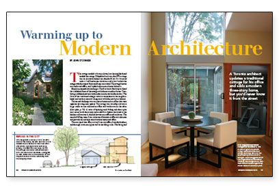
Synopsis: Expanding a cottage-style row house in a historic district presents a unique set of challenges — especially if you want the new spaces to be crisp, modern, and infused with daylight. Toronto architect John O’Connor shows one finely realized solution in this article. With neighbors as close as 18 in. on each side, he nevertheless solved the problem by stepping the new addition back from the street so the cottage roof blocks unwanted views both into and out of the house. The article also discusses the distinct metal detailing found throughout the house.
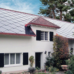
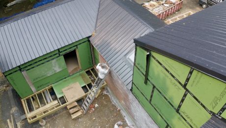
The cottage needed to be torn down, but the neighborhood needed the cottage. Dilapidated as it was, the 1870s cottage was an essential element on Amelia Street. So I worked with it. I still had to tear down most of it, but I rebuilt the cottage with the original form and footprint in mind. The cottage became my studio and office, and I added a three-story home behind it.
My plan presented two challenges. The first was to find ways to blend the traditional form of the cottage with the new modern house. Combining traditional patterns with modern materials was the answer. The form of the renovated cottage retains a connection to the neighborhood, and modern materials integrate it with the new house behind.
The second challenge was to create a home and an office that were separate yet congruent spaces. The cottage was reconfigured into a large studio on one side and an office and washroom on the other. A series of openings and sliding oak doors give consistency to all the rooms and establish a rhythm that leads to the kitchen and courtyard, the link between my office and my home. The sound of falling water from a courtyard fountain muffles outside noise and provides sound separation between home and office.
The courtyard also offers a view from my office, from the kitchen, and through a two-story glass wall in the living room. The living and dining areas have views of the backyard patio and gardens and a waterfall staircase that doubles as a path to the garage. The garage is accessible from a private lane behind the house. The bedroom and main bathroom are out of sight on the second floor, and a third-story retreat is visible only from neighboring rooftops.
I’m an architect, so my home is my portfolio. Just enough of the residence is visible from my office to pique my clients’ curiosity. They’re always invited to explore.
Challenging modern stereotypes
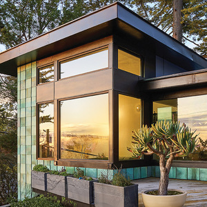
In my professional life, I am constantly challenging the notion that modern architecture is cold and austere. It doesn’t have to be either. For me, modern architecture is the freedom to reinterpret traditional forms into new compositions. Unlike traditional architecture, which relies on historical precedents, modern architecture can distill traditional influences into an abstract composition while retaining the spirit of the precedent.
Natural, tactile materials infuse warmth into my work. Throughout my home and office, I used reclaimed wood as flooring and column cladding to add warmth and history to a new space. Soft natural fabrics, rough and polished concrete, perforated metal, and natural stone bring organic, varied textures into the house. The colors were selected to work with the changing seasons. Snow highlights white and light colors in winter, and browns and dark colors blend with the leaves on the ground in fall. Of course, nothing warms up an interior space like light. I experimented with multiple light sources, natural and artificial, to create flexible levels of lighting for both day and night.
For more photos, drawings, and details, click the View PDF button below:
