Kitchen Addition: From Tiny to Terrific
An architect's kitchen sketches inspire the transformation of her 1970s ranch.
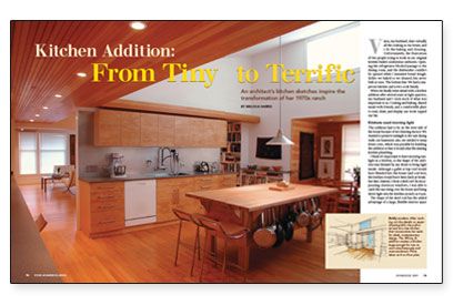
Synopsis: Adding on to this 30-year-old Michigan house created a larger kitchen that two cooks could use and where the morning sun is now a regular guest. A screened porch off the kitchen provides a secondary dining area. Photos, floor plans, and the architect’s design sketches illustrate the article.
Vince, my husband, does virtually all the cooking at our house, and I do the baking and cleaning. Unfortunately, the frustration of two people trying to work in our original kitchen fueled contentious outbursts. Opening the refrigerator blocked passage to the dining room, and the dishwasher couldn’t be opened while I kneaded bread dough. Either we baked or we cleaned, but never both at once. The bottom line: We had a one-person kitchen and a two-cook family.
When we finally went ahead with a kitchen addition after several years in tight quarters, my husband and I took stock of what was important to us. Cooking and baking, shared meals with friends, and a comfortable place to read, draw, and display our work topped our list.
Kitchens need morning light
The addition had to be on the west side of the house because of two limiting factors: We wanted to preserve sunlight to the east-facing walk-out basement; also, we needed to keep down costs, which was possible by building the addition so that it would abut the existing kitchen plumbing.
I think it’s important to have morning sunlight in a kitchen, so the shape of the addition was dictated by my desire to bring light inside. Although a gable or hip roof would have blended into the house (and cost less), the kitchen would have been dark at breakfast time. Instead, I chose a shed roof. By incorporating clerestory windows, I was able to catch the sun rising over the house and bring direct light into the kitchen as early as 8 a.m.
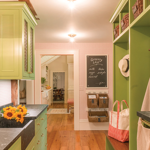
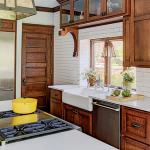
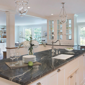
The shape of the shed roof has the added advantage of a large, flexible interior space free of supports and walls. This uninterrupted volume let us create two distinct work areas. Early in the design process, we attached our names to different sides of the new kitchen. Vince’s side has plenty of preparation space, a sink, and easy access to the refrigerator, stove, and pots and pans. My side accommodates a baking center (a deep flour drawer, vertical slots for baking sheets, and drawers for baking accessories and mixer attachments) as well as a large, deep sink and the dishwasher, with easy access to dishes and silverware.
Corridor provides the backbone
I imagined design solutions by sketching dozens of variations of the addition. While drawing different appliance and workstation configurations on tracing paper, I happened to stack the sheets together and noticed that the north wall was always an organizing principle. This long corridor, which I call “the line,” became the primary organizing principle of the space and functions as the main path through the house. It runs from the screened-porch entrance through the mudroom, the kitchen, and the dining space, ending in the living room. I defined the line with a 7-ft.-high dropped ceiling. The height feels comfortable when you walk along the corridor and creates a sense of arrival as you step into the taller kitchen, dining, and living spaces.
For more photos, drawings, and details, click the View PDF button below:
