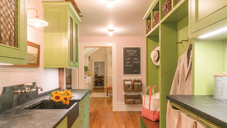
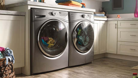
A Kitchen in Two Parts
By adding a scullery, a cook makes room for both cooking and cleanup.
Synopsis: Food writer and cooking teacher Lynne Sampson decided that what she really needed to do her job right was an old-fashioned scullery. See how she renovated her kitchen and adjoining mudroom and laundry to create the perfect work/storage space, based on the food preparation and clean-up space designed into many Victorian kitchens. This article explains how a scullery is used, why it meets the needs of all kinds of cooks, and how our readers can design one into the space they already have.
As a food writer, recipe tester, and part-time professional baker, I use my kitchen a lot—and I go through tons of dishes. So when my husband and I decided to renovate the poorly remodeled kitchen in our 1904 home in the small mountain town of Joseph, Ore., efficiency was high on my wish list. Because I teach cooking classes, I knew the kitchen had to perform like a professional one. Yet, an industrial stainless-steel sink and oversize sprayer just didn’t jibe with the turn-of-the century style I had in mind. I wanted convenience with a cozy, traditional look—and dedicated areas for cooking and cleanup. I wanted a scullery.
Keep the mess out of sight
In the Victorian age, the scullery was where servants toiled, keeping mundane and unsightly tasks out of the head cook’s way. Years ago, I cooked at a bed and breakfast that had a scullery in a hallway near the back door. It had a double sink, dishwasher, uncluttered counter space, and open shelving. I logged many hours there washing vegetables away from the main kitchen traffic. After dinner service, the cleanup took place in the scullery, neatly out of sight.
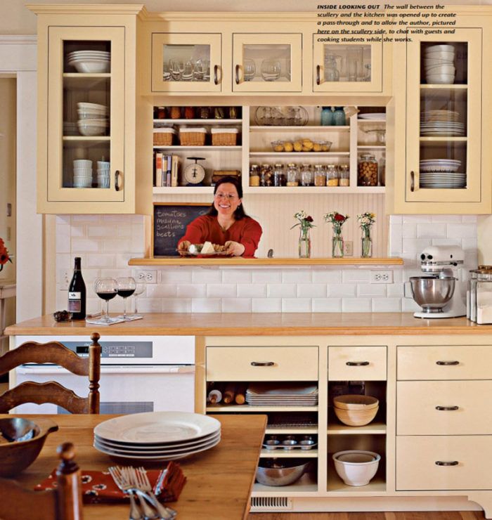
It was an old-fashioned idea, but I knew a scullery would work for me. Admittedly, we had a lot of flexibility, since we were prepared to gut our existing kitchen. No walls were spared to flip-flop the kitchen from the east to the west side of the house, taking advantage of a large deck and mountain views. Designer Judy Templeton of JT Designs, in Joseph, Ore., reworked the plans several times before we came up with the final design. Surprisingly, we decided to keep our scullery in plain view. By opening up the wall between the scullery and the kitchen, we let light in and created a pass-through for getting dirty dishes to the sink. Now, the “scullery maid” never feels cut off from the rest of the kitchen, which is nice because we eat at our farmhouse table in the kitchen even when we entertain.
Function comes first
The centerpiece of our scullery is a salvaged 1950s double sink with integral drain boards, which we found in our neighbor’s yard. It was a bit weathered but looked brand-new once we had it re-enameled. The American Kitchens faucet is still manufactured, so we were able to order a longer, 9-inch faucet for washing big pots. Whether I’m testing a recipe or making dinner for a crowd, I can ferry every pan and bowl to the scullery sink until I’m ready to tackle the dishes, and I still have a second sink in the main kitchen to use for food preparation.
At first, we questioned the wisdom of hiding the dishwasher in the scullery. But our cabinet maker, Brian Oliver, built dish cabinets above the scullery sink that open two ways: toward the kitchen for setting the table, and toward the scullery for putting dishes away. We worked with our contractor, Charlie Kissinger, to plan storage only steps away from the dishwasher for silverware, cooking utensils, and pots and pans.
For more photos and details on how this kitchen remodeled incorporated a scullery, click the View PDF button below.

