A Modern Bath with Period Charm
Reversing a backward floor plan brings style and function to an American foursquare bathroom.
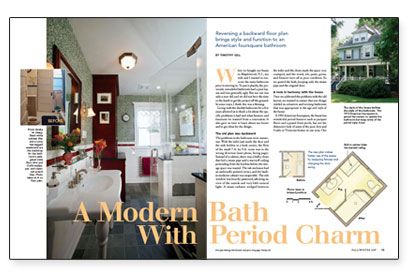
Synopsis: Rescued from a previous remodel in the 1960s, this original 1910 bathroom is uncovered and redesigned for better flow of traffic. The updated design combines the period-authentic charm of a traditional foursquare with modern amenities such as a pedestal sink, slate-tile floor, glass-enclosed shower stall, classic subway tile, chair rail, and a built-in hutch to hide an obtrusive steam pipe.
When we bought our house in Maplewood, N.J., my wife and I wanted to renovate the main bathroom prior to moving in. To put it plainly, the previously remodeled bathroom had a poor layout and was generally ugly. But our son was only a year old, and we did not have the time or the funds to get the project off the ground. In some ways, I think this was a blessing.
Living with the shoddy bathroom for a few years allowed us to think a lot about the specific problems it had and what features and functions we wanted from a renovation. It also gave us time to learn about our house and to get ideas for the design.
The old plan was backward
The problems in the bathroom were numerous. With the toilet just inside the door and the sink hidden in a back corner, the flow of the small 7-ft. by 9-ft. room was in the wrong direction. Instead of a cabinet, there was a bulky closet that hid a steam pipe and a stairwell ceiling protruding from the kitchen below; the storage space was wasted. The tub enclosure had an unfriendly pointed corner, and the built-in medicine cabinet was inoperable. The sole window was heavily patterned, allowing no view of the outside and very little natural light. A steam radiator wedged between the toilet and the closet made the space very cramped, and the wood, tile, paint, grout, and fixtures were all in poor condition. So we gutted the bath, keeping only the steam pipe and the original door.
A look in harmony with the house
Once we addressed the problems with the old layout, we wanted to ensure that our design yielded an attractive and inviting bathroom that was appropriate to the age and style of the house.
A 1910 American foursquare, the house has wonderful period features such as parquet floors and a grand front porch, but not the distinctive look of some of the pure Arts and Crafts or Victorian homes in our area. Our challenge was to design a bathroom with modern features and a style that was harmonious with the look of our house.
Our approach combined classic white subway tiles, chair rail, and cove-molding pieces. Using white tile as the backdrop, we added color with wallpaper, accent tiles, and slate flooring. We hung a William Morris willow-bough-design wallpaper from Bradbury & Bradbury (www.bradbury.com) above the chair rail and used a Roycroft-pattern accent tile (www.meredithtile.com) in a claret red below the chair rail. We chose pale-green slate tiles for the floor to complement the light-green background of the wallpaper, and a few randomly placed floor tiles engraved with a pattern added a tiny tactile and visual smile under our feet.
For more photos, drawings, and details, click the View PDF button below:

