A Small House Grows Up and Out
A modern remodel takes shape on the California coast -- with light, views, privacy, and budget in mind.
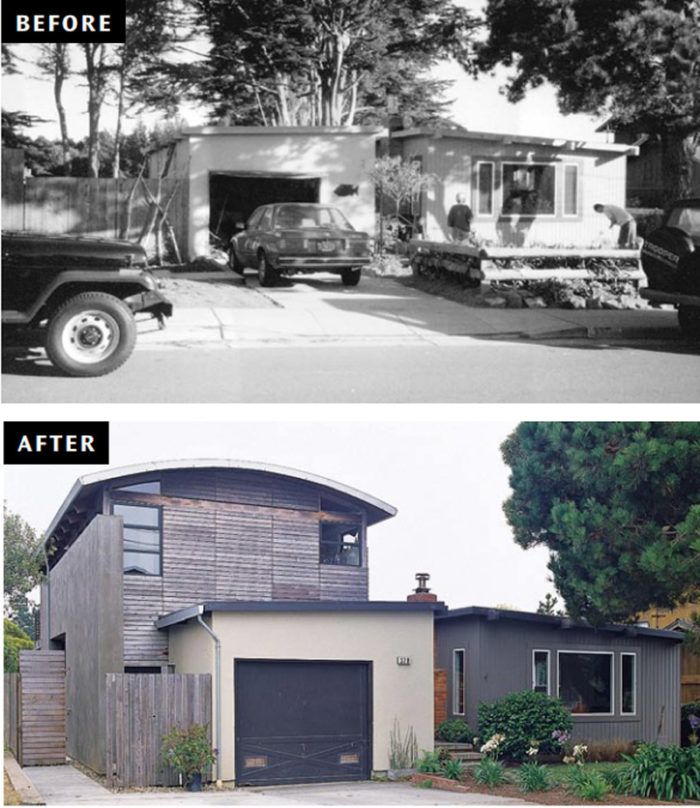
Synopsis: Homeowners Erik and Tena Watts needed more space for a growing family, but they couldn’t afford to move from their 1300 square foot home, nor did they want to. They loved the beachfront location, so they opted for a remodel — one that would be eye-catching and modern, but relatively economical. The result is a barrel-roofed, light-filled, concrete-sided contemporary that suits the couple’s lifestyle and sensibility.
For years, the small 1950s house in the California seaside town of Moss Beach suited Erik and Tena Watts just fine. With one young son, the couple lived in every bit of the 1,300-square-foot, two bedroom house sitting just two blocks from the ocean, an hour south of San Francisco. When they bought the house, in 1991, it was one of many modest, unassuming homes in the neighborhood. But before long, the neighbors started adding on. All around town, houses were getting larger, and massive remodels were encroaching on the couple’s treasured views, light, and privacy.
By 1998, when the couple learned they were expecting another child, their house no longer seemed big enough. They thought about moving, but they loved the location and the overall feel of their home, so they asked a friend, architect David Darling of Aidlin Darling Design, in San Francisco, to draw up plans for a remodel. Says Erik: “All of his designs are custom and unique, but he’s also totally aware of budget—and we needed to do this as economically as possible.”
At the time, the Moss Beach area was going through a housing boom, so labor was expensive and hard to find. But the couple discovered that by hiring tradespeople they knew who would work for reasonable fees, and by asking their architect to focus on cost-saving measures, they could remodel for around the same price as moving. So they decided to stay put.
Adding on by going out—and up
The Wattses and their architect all lean toward a modern, semi-industrial home style, so they didn’t spend much time discussing aesthetics. Instead they talked about how the materials, windows, and floor plan could work together to fulfill the family’s needs and fit in with their eclectic neighborhood. “There are large two-story houses and also smaller bungalows in the neighborhood,” Darling says. “I tried to get a form that married both.”
First Darling and his partner, Joshua Aidlin, studied the house’s advantages and disadvantages. In the back, the house looked out onto six acres of green space, a definite benefit in a dense neighborhood. To the left and right, however, large houses towered over it, often giving the Wattses a closed-in feeling. To add room, maximize natural light, and minimize the impact of the neighboring houses, Darling designed an addition that incorporated part of the original house as well as some yard space from the east and south sides of the garage. The new, two-story, 1,100- square-foot rectangle includes a ground-level family room, bathroom, and bedroom, and an upper-level loft like master bedroom, bath, and office. But this isn’t just any rectangular addition. A barrel-vaulted roof, an interior/ exterior cement plaster wall, natural siding, and creative window solutions give the home a distinctive look.
For photos, floor plans, and additional details on this remodel, click the View PDF button below.


