Urbane Renewal
A bright new kitchen blooms from an inspired mix of light, space, and materials.
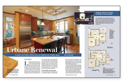
Synopsis: Designer Rick Proppe engineered the remodel of a dark and cramped kitchen in a 100-year-old Chicago house. He added a two-story, 10-ft. wide addition on the back of the house, which created new space for dining and entertaining. New windows integrated into the cabinets and an updated lighting design brightened the space; new cabinets, an island, a kitchen office, and a nearby sitting area with window seat and fireplace completed the space’s renewal.
Like many cities that grew up in the late 19th century, Chicago is covered by dense swaths of small houses squeezed onto smaller lots. Built in 1914 a few miles north of downtown, this particular brick house was not very different from its neighbors, except that it occupied a double lot. As in most houses of that era, the kitchen was located at the back of the house, a functional space at best. Although it had been remodeled about 30 years ago, the kitchen was still small (about 12 ft. square) and dim. The only light came from a few fluorescent tubes and a ceiling fan/light combo; two windows couldn’t brighten the murky interior. When homeowners Monna and Gwen called my firm, it was to announce that they wanted to have a new master suite and, more important, a better kitchen.
A small addition with big results
The primary goal of this remodeling project was to build an addition on the back of the house. The modest 10-ft. addition created the necessary space for a larger master suite upstairs and gave us just over 150 sq. ft. of additional space to maneuver elements of the new kitchen.
We moved the sink from the south wall to the new back wall of the kitchen, then grouped the range, refrigerator, and microwave along the south wall. On the north side of the new space, we created storage by installing pantry cabinets that flank a small built-in desk.
After contractor Marian Plewa installed the header that replaced the old exterior wall, we saw that we had an opportunity to create an interesting space in the kitchen ceiling. Although the height of the new ceiling had to be lowered to conceal the structural beam, we designed a small coffered section that was centered on the header. This recess is somewhat formal, but the clean rectilinear lines go well with the rest of the kitchen. The recess’s central location and two pendant light fixtures really set the stage for the new island directly below.
Using cabinets and counters as a palette
The homeowners had some specific ideas about their new kitchen and about design in general: They liked clean lines and warm colors, and they wanted us to mix things up a bit. We started with the warm tones of cherry for the cabinets and complemented them with the cooler gray-green of the granite countertops. We had fun designing the cabinet-door configuration and broke the flat slab doors and drawers into uneven banks. We even used one of the upper spaces as a display cabinet, lighted from within by a small halogen puck fixture. The tiled fireplace surround combined the colors of the granite countertops with metallic accents similar to those in the concrete countertop on the island.
For more photos, drawings, and details, click the View PDF button below:

