Making a Better Ranch
An exterior remodel and some thoughtful landscaping give a 1960s dinosaur new life.
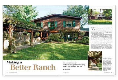
Synopsis: Ranch houses are ubiquitous, but they don’t have to be ugly, especially if they sit on a mountain site. Architect Tina Govan took a 1960s ranch that was covered in white vinyl and brick, and using cedar shingles and flagstone, she transformed it into a house that feels as if it belongs in its setting. Govan also designed arbors, outdoor spaces, and a screened porch that make a stronger connection between the house and its surroundings.
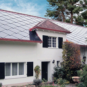
When they first saw the house, the Brights thought it was the ugliest place on Lookout Mountain. A two-story ranch built in the 1960s, it was clad in white vinyl and brick. But when George walked out to the edge of the bluff and took in the view, he changed his mind. They bought the house immediately.
Over the next few years, they concentrated on renovating the interior, but they weren’t sure what to do about the exterior. They knew that they wanted the house to appear less dated; they wanted to reconcile its hard look with the natural mountain setting, improving the relationship of the house to the site in a way that allowed them more opportunities to enjoy this beautiful little piece of northern Georgia.
One of the first decisions was to use local building materials; they really help to tie house and site together. When a house shares materials with its surrounding environment, it becomes more connected to that place, blurring the boundary between building and landscape. The house and site gain a unique sense of identity that can only improve the owners’ emotional ties to the property. Also, local materials are often cheaper and more sustainable. Transportation costs are less, which in turn cuts overall costs. Because materials are close by, energy is saved in their transfer over shorter distances, and they are replaced more easily when needed.
A change of clothes makes all the difference
As I mentioned, the Brights’ house sits atop Lookout Mountain, a high plateau that’s carpeted in hardwood trees growing up through sandstone outcroppings. As it was built, the house looked very much out of place. The Brights and I took several steps to make it fit better.
First, the brick veneer was torn off the house to make room for more stone that continues up to form a base for the house. In places, the stone rises up as walls, columns, and a chimney, making the house seem as if it grew out of the ground around it. At the walls, we replaced the stark white vinyl siding with more natural-looking cedar shakes, helping to blend the house into the surrounding woods. We replaced all the brick paving with local flagstone, a move that more strongly integrates the outdoor spaces with the surrounding rock ledges of the bluff.
Building transitional spaces, or “thickening the edge”
To integrate a home better with its site, you must pay close attention to where the two meet. Rather than separating a home’s interior from the outside with a simple stud wall, you can create a zone of transitional spaces that gradually take you from inside to out. In the same way that materials can blur the distinction between house and landscape, this broader interface presents and mixes the best qualities of both.
For more photos, drawings, and details, click the View PDF button below:
