Better Roof, Better Bath
Enlarging an existing dormer made space for twin vanities, a curbless shower, and a generous closet.
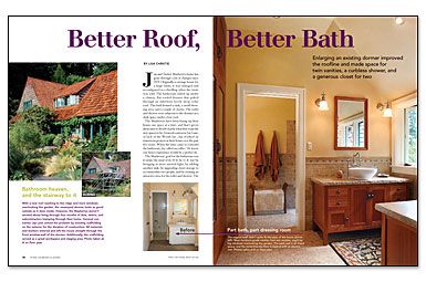
Synopsis: When this 1925 carriage house was enlarged and reconfigured as a dwelling, the bathroom ended up beneath a clumsy, flat-roofed dormer. The sink and dressing area were in one section, and the shower and toilet were in an adjacent space under a low roof. The homeowners hired architect Lisa Christie to remodel the bathroom, with the goals of bringing in more natural light, adding another sink, upgrading closet space for two people, and creating an attractive area for the toilet and shower. Christie’s solution was to improve the roof: She widened the dormer by 4 ft. and added another window, which increased head height and flooded the space with daylight. The layout of the bath didn’t change, but now there’s room for twin vanities and a wall full of closets; in the other section, a curbless shower shares the space with a wall-mounted toilet (tank access is through a clever hidden panel). With travertine tile on the walls and the radiant floor, and Honduras mahogany for the vanities, medicine cabinets, and closet doors, the new bath captures the look and feel of a traditional Craftsman room.
Jan and Tucker Mayberry’s home has gone through a lot of changes since 1925. Originally a carriage house for a large estate, it was enlarged and reconfigured as a dwelling when the estate was sold. The bathroom ended up under a clumsy, flat-roofed dormer that poked through an otherwise lovely steep cedar roof. This bath housed a sink, a small dressing area, and a couple of closets. The toilet and shower were adjacent to the dormer in a dark space under a low roof.
The Mayberrys have been fixing up their house one space at a time, and that’s given them time to decide exactly what they want the new spaces to be. General contractor Jay Lane, of Jack of the Woods Inc., has worked on numerous projects at their house over the past five years. When the time came to remodel the bathroom, Jay called my office. He knew our firm’s experience would be a perfect fit.
The Mayberrys’ goal for the bathroom was to make the most of its 10-ft. by 12-ft. size by bringing in more natural light, by adding another sink, by upgrading closet storage to accommodate two people, and by creating an attractive area for the toilet and shower. The solution came by way of a new dormer and an opportunity to enhance the traditional architecture of the house.
Take the roof to the ridge
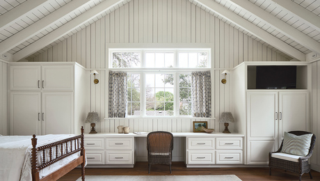
The new plan kept the original bathroom layout intact: toilet and shower in one area, sinks and closets in another. Our decision to widen the dormer by 4 ft. and add a fourth window gained much-needed head height for the toilet/shower space, and flooded the bathroom with natural light. The new dormer has a much steeper roof, in keeping with the aesthetics of the house.
Next to the windows, two vanities face each other under a vaulted ceiling. The wall space above each sink is wide enough to accommodate large mirrors that conceal the medicine cabinets. Each one is flanked by wall-mounted sconces.
The other section of the new bath features a wall-mounted toilet by Duravit. Floor tile slides underneath the toilet with no interruption, making the area seem a bit larger; it’s also easier to clean. The toilet tank is concealed in the wall. Typically, access to the tank is through a plastic panel mounted behind the toilet. However, such a panel didn’t contribute to the traditional Craftsman feeling we were after. The contractor had an ingenious alternative: removable tiles.
For more photos and details, click the View PDF button below:


