Greening an Outdated Kitchen
Smart use of space and materials made a small kitchen family and environmentally friendly.
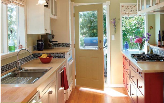
Synopsis: Before the remodel, just getting from the front door of this Victoria, B.C., home to the adjacent kitchen could be a perilous journey. The open front door made it difficult to see where you were headed, and the coat-closet door threatened to push you down the basement stairs. What also could have been a perilous endeavor — doing business with friends and designing a kitchen with a buffet full of challenges — instead resulted in a fantastic kitchen for an environmentally conscious family. Turning the coat closet to face into the kitchen, widening the entry, and removing a wall that separated the kitchen from the dining room modernized the floor plan. Architecturally correct details and personal touches added charm. And ecologically sound materials, appliances, and construction satisfied the owners’ and the designer’s shared environmental views.
When the Simonsons purchased their 1955 home six years ago, they knew that they wanted to raise their children there. The house is well built, warm, and light, with a large yard and a location near good schools and great friends. The outdated kitchen, however, was not family friendly.
Because the kitchen was adjacent to the main entry, guests were greeted with a muffled hello from behind the open front door, which blocked traffic between the foyer and the kitchen. As if awkward doors were a design theme, opening the foyer’s coat-closet doors threatened to push guests down the basement stairs.
The kitchen also suffered from a wall that blocked the dining room and the views of the backyard. Due to an overwhelming lack of cabinetry along that wall, the Simonsons were using an old desk and dresser as storage and counter space. With two school-age kids and two working parents using the kitchen as home base, the family felt destined to be buried under a mountain of homework, mail, and shoes. If they were going to stay in their house, they knew the kitchen had to change.
My husband and I met the Simonsons through our children’s preschool. Although working with friends can be a risky proposition, the Simonsons’ design and environmental sensibilities coincided with our own, creating a comfortable working relationship. When we first started discussing how to update their kitchen, we agreed not to make the house any larger or incongruous with the 50-year-old neighborhood.
The Simonsons’ philosophy is that bigger is not better. Also, their roof was only two years old, and the expense of opening the outside of the house would sacrifice the budget and any finer details. With these thoughts in mind, we set some goals. We knew that we had to create a more fluid transition from the front entry into the kitchen, to increase the amount of storage space, and to update appliances. The kitchen and dining room begged for a better connection, and the details had to retain the house’s original character while reflecting the family’s personality.
A new and improved entry
The front door opens into a hallway; the kitchen is to the left, bedrooms to the right. Changing the swing direction of the door would have cleared the way for those headed to the kitchen—and created a new obstacle for those headed to the bedrooms. To make the open front door less of a blockade, I widened the kitchen entry by 6 in. by turning the coat closet to face into the kitchen. This slight change also solved the problem of the dangerous closet doors: Now it is possible to come in the front door, see the person who opened it, and hang your coat without peril.
Across from the closet are a recycling area and a pantry. The recycling center is a 24-in.-wide cabinet with plastic bins. Its location near the entry keeps the bins out of the kitchen’s working area. The adjacent pantry, and another at the far end of the kitchen, has 15-in.-wide pullout shelves for easy access.
For more photos and details on this green kitchen remodel, click the View PDF button below.
