Same Space, Dazzling New Kitchen
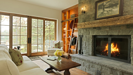
With only slight changes to the floor plan, this kitchen went from dark and cramped to open and inviting.
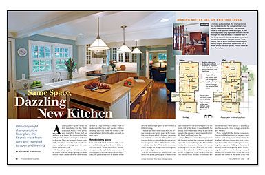
Synopsis: Jamie and Mark Markoe’s initial thoughts were to build a substantial addition to their 1970’s colonial house to gain a larger kitchen, new family room, sunroom, laundry, and entry. While their home had the right location, they felt it lacked the character, openness, and light-filled spaces they desired. After examining each space and function, architect Rosemary McMonigal discovered the best solution was to reorganize the layout of the home, rather than build an addition. Once the flow and space functions were met, the design focused on transforming the existing house to more classic details and aesthetic solutions.
As they added up the items on their remodeling wish list, Mark and Jamie Markoe were pretty sure that their house had an addition in its future. An expanded kitchen with space for informal dining was at the top of their list. They also wanted a family room with a fireplace, a laundry, and a mudroom entry with plenty of storage space for coats, boots, and winter gear.
My firm designs plenty of additions, but no matter what the budget, getting the most return for my clients on their construction dollars is a top priority. I always want to make sure that there isn’t another solution awaiting discovery within the bounds of the original house before breaking ground on new space.
Retool existing spaces
I sat down with Mark and Jamie with an eye toward identifying their home’s deficiencies and assets. As we studied the circulation patterns through the house, the sizes of existing spaces, and the requirements of new ones, our gut reaction told us that the house already had enough space; it just needed a little tweaking.
Almost one-third of the main floor, the living room was the largest space in the house. But even though it had a fireplace, the room was used only occasionally. The problem was that you had to go through the foyer to get to the living room; it was off the beaten track, so nobody went there. With its three exterior walls, though, the living room offered great potential for light and views.
On the other hand, the family room was used a lot. It was partly open to the kitchen and connected to the screened porch on the south side of the house. Coincidentally, the family room’s more than 200 sq. ft. just about equaled the amount of space required to fulfill Mark and Jamie’s wish list.
Bingo. Why not connect the living room to the kitchen and use this generous, neglected space for everyday living? We did just that with a doorway next to the powder room, resulting in a circular flow with the other rooms. With ready access to the living room from the kitchen, the old family room became redundant. We divided it into three pieces: a laundry, a mudroom, and a food-storage area in the new kitchen.
Next, we tackled the dining component. Jamie and Mark wanted to preserve their seldom-used dining room and transform the kitchen’s informal dining area from a dark, spindled cubby into something more inviting. Once again, we challenged the notion of adding versus reconfiguring space. Removing the wall between the dining room and the kitchen brought light, views, and fresh air into the center of the house from both sides, and forged a strong visual connection between the two spaces.
For more photos, drawings, and details, click the View PDF button below:

