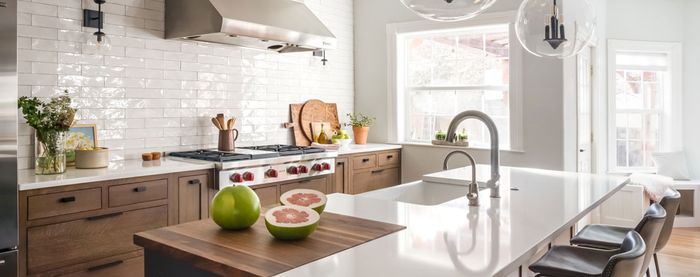
Where Kitchen Islands Go Wrong
Getting the island right is the defining moment of kitchen design; here are some pitfalls to avoid.
Kitchen islands can be difficult to design. They not only must be functional, but they also should make an aesthetic contribution to the room without overpowering it. I’ve seen more than one island that doesn’t quite live up to its potential. Here’s where islands often seem to miss the mark:
- The scale is wrong. Either too big or too small is a killer. If the island domi- nates the space, then overzealous countertop planning has gotten the better of you. If the island is too small, it isn’t useful.
- Cooking is not focused on the center of the room. As a result, the pleasure of socializing in the kitchen declines.
- The island does not unite the functions of cabinets on opposing walls. It should shorten distances between cleaning, cooking, prepping, and serving areas.
- The meal-prep area has no view. Ideally, it should overlook the table, the entry door, or the garden.
- The island doesn’t free enough space for a sofa, a hutch, or an architectural feature. If any of these details can’t fit in the final design, your plan needs review.
- Circulation space is cramped. Enlarge surrounding passages by shrinking the island or by moving it into the center of the room.
Johnny Grey is a kitchen designer with studios in England and San Francisco. He has written and lectured widely on kitchen design. His article “Getting the Most from a Kitchen Island” appears in Fine Homebuilding‘s Kitchens & Baths 2006. Photo: © Jacqui Small 2004, from Kitchen Culture: Reinventing Kitchen Design by Johnny Grey (Firefly Books, 2004)


