The Not So Big House explained that the secret to finding a sense of home lies in changing the way we have been taught to think about houses and value — for example, reevaluating the rooms you need in a home, designing a floor plan inspired by today’s informal lifestyle, and building to last. The first book also discussed a few of the basic concepts related to the quality of space, such as shelter around activity, interior views, and doing double duty. Creating the Not So Big House describes even more concepts that can take the experience of living in a house from mere shelter to the art of dwelling. Let’s now look at these key spatial concepts — and give them some names. You’ll find many others identified throughout the book.
The third dimension
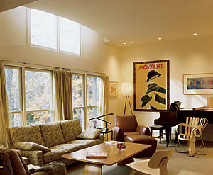
The key to many of these concepts lies in the third dimension — in the heights of things and how those heights relate to our own human proportions. In The Not So Big House, I briefly described the effect that ceiling height has on us. Today, if we want to make a house interesting, the most common response is to raise the ceiling. But a 9-ft.- or 10-ft.-high ceiling can be just as boring as an 8-ft.-high ceiling. It’s not so much the height that makes it interesting as the variation in height and the scale of each space in relation to other spaces and to its inhabitants. This three-dimensional experience, combined with the detailing of the interior surfaces, helps to create a comfortable home.
If people really considered the cost of a vaulted ceiling, I’m convinced they would invest their money a different way. The trouble is that it’s easy to say “12-ft.-high ceiling” and have someone understand what you mean. It’s much harder to communicate a desire for beautiful proportions and comfortable nooks. These things are less tangible and therefore less commonly implemented. Once we have a language for them, I suspect that many more people will choose to spend their money on these life-enhancing qualities rather than on tallness.
Most people think they should be able to tell from a floor plan what a house will look and feel like. But in fact a floor plan tells almost nothing about the “feel” of a house. It’s like looking at a map of a city and assuming that it will tell you what it is like to be there. The map represents only two dimensions, while the experience of being in a place resides in three dimensions — in the canopy of the trees, the height of the buildings, the skyways that bridge overhead — everything the map can’t show. The only thing a map can tell you is how to direct your feet from one place to another. It’s the same with floor plans. The “feel” comes from the experience of our senses, not just from the route we take from one room to the next.
Fear of “too smallness”
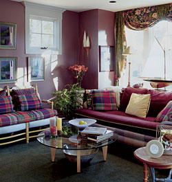
One of the most important Not So Big concepts is what I call fear of “too smallness.” We’re so afraid of feeling cramped that we’ve gone to the opposite extreme and made spaces that are too big to find a place to settle in. Then we have to buy huge furniture to fit the scale of the room. “Oversized” sounds good until you find that you can’t touch the floor with your feet. Meanwhile, the cozy corners–often unplanned, leftover spaces–are our favorite spots. It’s enjoyable to be able to look into a larger space, but many people prefer the view from the periphery–from a comfortable alcove, for example.
When you look at a photograph of a small space, it’s typical to envision it as larger than it actually is. This is because in order to capture enough of the space in the image, the photographer has to use a wide-angle lens, which tricks the eye into believing the space is larger than it actually is. If you compare your perception from the photo with the dimensions of the plan, you’ll get a better understanding of the true scale.
In Matthew Schoenherr’s house, you’ll see how he’s made a space that’s only 10 ft. by 12 ft. into a cozy but comfortable living room. A room this size would definitely evoke a fear of “too smallness” in many people today. But the space is effective because it offers views into the dining area and kitchen, past the pod of space that gives it visual separation. If it were an enclosed room of that dimension, it would indeed feel small. And if there were no pod of space dividing the activity areas, it would also feel small, because all 500 sq. ft. of the main floor would be perceived as one place, housing five different functions, all on top of one another.
Designing my own home showed me how sensitive I had become to clients’ fears of “too smallness.” I knew that I wanted a low-ceilinged alcove for reading and watching TV, to contrast with the 8-ft.-high ceilings of the rest of the main level. I made the space just 6 ft. 10-1/2 in. tall, and it’s easily my favorite spot to sit. But until I built this house, I’d never even suggested building a ceiling less than 7 ft. tall, because so many people have this fear of feeling cramped. Now that I have an example of such a space to show clients, I’ve found that many people ask me to duplicate it in their homes. It wouldn’t be appropriate for an entire room, but for small alcoves it’s in proportion to the activity area, and it feels just right.
Visual weight
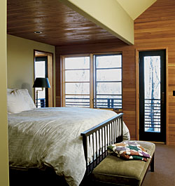
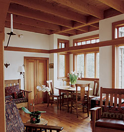
Another technique architects use to manipulate the sense of scale in a space is called visual weight. If a room has a smooth, flat ceiling that’s painted a light color, it will feel taller than if it were textured in some way (with exposed beams, for example) and a darker color. The darker and more textured the surface, the heavier it will appear. And heaviness feels lower, because it is more present in our peripheral vision, even when we’re not looking directly at it.
In the house shown in the photo above right, you’ll see that for the size of the room the ceiling is quite tall (about 10 ft.). If the ceiling had been drywalled and painted white to match the walls, it might have felt too tall for the space. But by exposing the floor framing for the level above, the natural wood color and the texture created by the joists make the ceiling appear heavier and thus lower, in keeping with the proportions of the room.
Framed openings
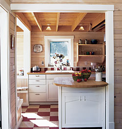
Another spatial concept relates to the effect you get by setting off a change of place with a framed opening. Surround an opening with trim, and you subtly communicate this change and, in so doing, give the places on either side their own separate identities. Think about a front door, for example. When you move through the framed opening of the door, you are aware of moving through a gateway that separates exterior from interior. The way you feel once inside is very different from the way you felt outside. The frame informs you that you’ve entered a new place, and you experience that new place differently as a result.
Although we associate this concept primarily with doorways, it can be employed in any location where you want to distinguish one space from another. For example, in the Third Street Cottage community in Washington State, architect Ross Chapin used this technique to increase the feeling of spaciousness in the tiny cottages. Wide framed openings between kitchen, living, and dining areas clearly define each activity place within a minimal area.
This technique was used frequently in bungalows of the early 20th century, and for the same reason: to make less space do more. The cased archways of these old gems are one of their most appreciated features. If you’ve ever been in a bungalow where the archways have been removed between the dining and living areas to make the space seem more open, you know that the effect is exactly the opposite. The combined room suddenly seems small, not big enough for the two functions that it previously housed quite adequately. The framed opening gives each space its own personality.
In general, the wider the moldings, the more prominent the perception of differentiation will be. One of the most regrettable trends in home design over the past few decades has been the decrease in the size of trim moldings used around windows and doors. Although it is possible to make a big impact with narrow trim, the standard ranch-style casings on the interior and minimal brick-mold casings on the exterior typically make it look as though each window and door has been unceremoniously and gracelessly shoved into the wall. It’s analogous to hanging a picture on the wall without a frame. It’ll do in a pinch, but it doesn’t look good.
Spatial layering
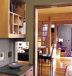
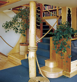
The concept of layering takes the idea of framed openings one step further. This technique uses a series of openings and surfaces, implied and otherwise, to subtly break the perceived space into segments. Architects use this concept a lot but have a hard time explaining it. You almost have to see it to understand, but once you do, it can be a powerful tool in making the most of the space you have.
In this photo at right, you can see four layers defined by three framed openings. The columns with beams above give definition to the walkway that runs through the center of the plan but still allow it to serve as an extension of both the living and dining areas. The glass partition just visible to the left of the first column is like a translucent membrane between two of the layers.
Just as happens with one framed opening between two rooms, layering gives the illusion that each space is larger because it tells the eye where one place stops and the next starts, even though there are no walls to obstruct the view. We interpret this subconsciously as bigger, because we perceive multiple zones. Take away the beams and columns and there’s just one not very big, undifferentiated space.
Theme and variations in the house of author
As seen in the four photos below, the author’s house illustrates a play on a theme and variations, using a form (the circle) and a material (glass block).
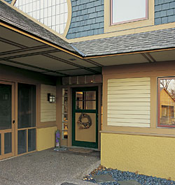
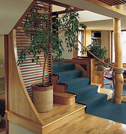
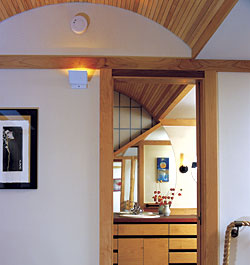
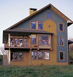
Theme and variations
One final concept you should keep in mind as you create your own Not So Big House is developing a theme and variations throughout the design. Every house in this book employs this concept, and it’s what gives each its integrity and at least some of its personality. If you want a house to have unique characteristics that make it more than just an assemblage of spaces, you can adopt a few special shapes or materials that are repeated throughout the house. If this is done heavy handedly, it will look clunky or will make you think “Enough already.” If you’ve ever seen a house with an octagonal window in almost every room, you’ll know what I mean. But when used thoughtfully, a house with a theme and variations is like a well-composed piece of music. From one movement to the next, you know it’s the same piece because themes will return as it proceeds, though never repeated exactly as before.
In my own house I used two themes–one a shape (a circle) and the other a material (glass block) — to tie the design together (see Theme and variations in the author’s own house). Looking at the house from the street, the first thing that strikes you is the big round window in the gable end above the garage roof. As you step up to the front door, you notice that the door is framed by large glass blocks that seem to highlight the shape of the door. Once you cross the threshold and look into the house, to the left is a curved wall that extends up the stairs to form the handrail for the upper flight, creating a perfect semicircle as it goes. At the upper landing, the circle theme continues with a barrel-vaulted ceiling above. And if you’re observant, you’ll notice that the barrel vault continues into the bathroom, where it frames the round window that you saw on the front of the house. As a finishing touch, the circle form is continued on the wall with a mirror cut to the same radius.
From the backyard, you can see the final expression of the theme. The same curve that was present on the front of the house and that ran though the bathroom and second-floor ceilings extends out to the south wall, where it provides the perimeter trim between the stucco and the shingle patterning. On this rear elevation, you can also see the repetition of the glass block pattern, which now fully frames a perfectly square window that aligns with the front door on the other side of the house.
These are not themes and variations that hit you over the head. They’re there, but they play their integrating function quietly, so that most people won’t even be consciously aware of them. That’s where the art of the concept lies. You’ve probably heard the expression, “The whole is greater than the sum of its parts.” A Not So Big House is always more than the ingredients that went into it, and it’s this weaving of themes, variations, personal touches, and lifestyle patterns that creates a whole that’s profoundly satisfying. Architects often hear from their clients that once they move into their own Not So Big House, they don’t want to leave, because they’ve finally found out what home is all about. It’s a perfect reflection of who they are and how they live, and it’s just big enough to be a perfect fit.
As an advocate of “less is more” in residential architecture and interior design, Sarah Susanka has emerged as one of America’s favorite home architects. Photos by: Grey Crawford.
