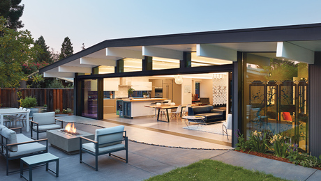
Have you noticed that over the past couple of decades, new houses in the suburbs have been getting bigger and bigger? These structures loom large on their newly carved-out sites, staring blankly toward more of the same. Is this what home has come to mean: massive storage containers, void of personality, for people who are too busy to stop and realize that the American dream they’ve mortgaged their futures for is a hollow one? What can you do with all that space?
If my observations as a practicing residential architect are anything to go by, a lot of this space is almost never used, and inhabitants of big houses struggle to find comfort close to the kitchen, where there is some semblance of heart and hearth. Every space is so big that no matter where you go, you feel as though you are rattling around. There’s no place to settle.
“Slowly but surely, as a culture, we are coming to recognize that quantity and volume of space are not related to comfort.”
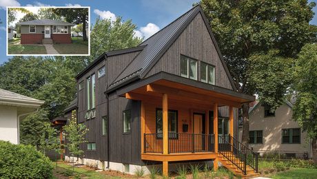
For nearly a decade, people who have tried to live in these big houses have visited our office and asked, “Is there an alternative? Can you design us a house that is more tailored, more beautiful, more reflective of our personalities?” The answer, of course, is yes, but there is a trade-off. Like a tailored suit, a tailored house costs more per square foot than its off-the-rack counterpart. So we advise our clients that they will likely spend the same money on a smaller custom house than they would pay for a large, noncustom house.
For those who’ve already had the rattling-around experience, this trade-off meets with zero resistance. They recognize that the emptiness they felt in their megahomes is related to scale. Slowly but surely, as a culture, we are coming to recognize that quantity and volume of space are not related to comfort, except in the most tenuous of ways. There’s a great movement of the national soul at work as we seek that which we’ve lost in our acquisitive rush to become bigger and better.
pinpointing extra rooms that aren’t needed
If we need to build smaller to reapportion dollars toward creating comfort and character, what spaces can we do without? Let’s look at our assumptions about what a house must have.
For starters, there are the formal living and dining rooms. The living room? Just how many people actually use their living rooms anymore? It should be renamed the “ain’t-no-living-happening-here” room in most households. And the dining room? Some families use it only once or twice a year, some never. Certainly there are exceptions, but these two rooms on the list of our cultural expectations about what a house should contain underscore just how far removed our vision is from reality. The archetype we rely on is one that fit a lifestyle from the turn of the 20th century, when life was more formal and wives spent most of their time at home.
“Many of our clients admit, “Well, we won’t use them ourselves, but for resale we need these rooms.'”
Part of the problem is that clients are held hostage by market forces. Real-estate agents and appraisers, for example, advise that the marketplace expects a living room and a dining room. Omission of these spaces could equal a bad investment. Many of our clients admit, “Well, we won’t use them ourselves, but for resale we need these rooms”—a clear case of the tail wagging the dog.
The same market forces will—in all likelihood—bring about the necessary course correction. I believe that as the cost of construction continues to rise and that as people see what is possible with the same dollar expenditure if we build smaller, more detailed homes, there will be a gradual embrace of a new, more realistic model of home.
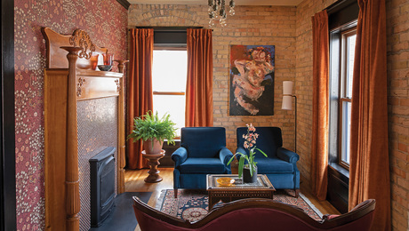
I predict that in a decade or two, when you are asked what constitutes a home, the list will start out with kitchen and family room. And if there is a substitute for the atrophying living room, it will be something more akin to a parlor: a small, intimate room that can be used for activities away from the main family gathering place.
Waiting for dinner
So what about when guests come over? What happens then? Let’s look at a house that has a living room and a dining room, as well as a family room off the kitchen. You are preparing a special dinner. The guests have arrived. They are sitting around the kitchen island and the family room, watching as you work, asking if they can help with anything, enjoying the informal social atmosphere.
As the meal preparation nears completion, you try to usher said guests into the dining room, which is set with your best china, candles in the center of the table establishing the ambience. But the guests resist. They don’t want to be in that formal space alone. Not until you carry the main dish into the dining room are they finally willing to part with their barstools and assume their places at the table.
“We prefer to be more relaxed than our housing archetype wants us to be.”
This scene is common in American homes today and illustrates a characteristic that we have a hard time accepting. We prefer to be more relaxed than our housing archetype wants us to be. So we cling to the informality of the family room as long as we can.
I ask my clients to consider a design that would turn the everyday family eating area into a dining room when guests are visiting. A change in lighting and possibly a sliding partition to separate the kitchen from the table area (if you are a particularly messy cook, or if you are squeamish about having the dirty dishes visible) are all that is needed to make one space serve both formal and informal functions. The savings in terms of reduced square footage and commensurate dollars are obvious, and the fact is that for most families and guests, this feels more comfortable. Guests are no longer required to be more formal than they really want to be. If as you read this you think, “But I really use my dining room a lot,” then this is not an appropriate room for you to eliminate. There are exceptions to the trend, and there are other ways to whittle down the size of a house.
Space you can embrace
What we do not seem to appreciate is that expansiveness, although it can look appealing in a photograph, just isn’t conducive to curling up with a good book. Many of the huge rooms we see in magazines today are really comfortable to be in only when you are sharing the experience with a dozen or so of your best friends. For one or two people, large rooms can be overwhelming.
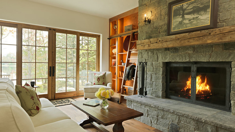
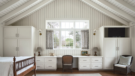
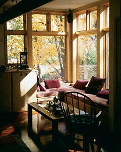
In considering how to shrink the size of a room, let’s begin by considering the window seat, a feature that I think contains the elements of comfort many of us are seeking. Imagine yourself sitting in one. The floor is brought up, the ceiling is brought down, the walls are brought in, and the seat rests between inside and outside.
“Expansiveness isn’t conducive to curling up with a good book.”
From this vantage point, you can see what is going on in both of these realms as you rest in this place that is almost literally wrapping itself around you. The place is tailored just for this activity of sitting and looking out. When you are there, you know it, and the experience is delightful. If someone else were to come up and sit there with you, your territory would be invaded; it wouldn’t surprise your visitor if you were to say, “Hey, this is my spot.” You can call it yours while you are there precisely because it is so defined and so clearly made for one.
The same idea can be used to design places for two or more, using such approaches as ceiling height and surrounding windows or walls to define each place. Think of a dining alcove or a breakfast nook, for example, where the ceiling is lower than in the rest of the room and where the walls circumscribe the activity within. These details soak up the budget that would have been spent on more square feet of floor space. But without such definition, people may feel that they are floating unmoored in a room, which can be unsettling.
My experience tells me women are more sensitive to this phenomenon than are men. But the concept holds within it the key to making houses that fit us better. I share it with you so that you can judge for yourselves what places you gravitate toward for hanging out. Make note of their spatial characteristics so that when it comes time to design a new home or addition for yourself, you don’t leave out the spaces that make you feel most at home.
