Growing Family, Growing Bungalow
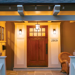
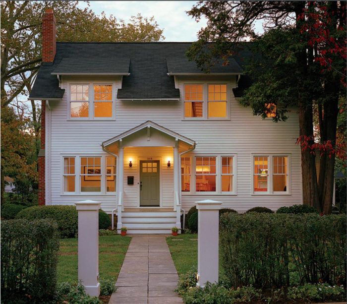
Tripled in size, this house went from a weekend cottage to a home for four and still fits quietly into its old neighborhood.
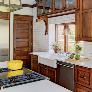
Magazine extra: View a photo slide show for additional shots of Moore’s masterfully-integrated remodel/addition.
The little cottage on Cherry Street
I grew up in Falls Church, Va., not far from Cherry Street, a quiet, old neighborhood where I always felt at home. As a teenager, regardless of where I was going, I’d find an excuse to drive down Cherry Street. The more time I spent in this neighborhood, the more I became enamored with one house: a one-story 1920s bungalow. I called it a “cottage bungalow” because of its diminutive scale, low-pitch roof, and lack of superfluous decoration.
After starting my own architecture firm, I worked on a few of the Cherry Street houses. While most of them grew, the small bungalow remained mostly unchanged and ultimately came up for sale. Of course, I bought it, and without hesitation, I restored it to its original charm. I thought my work was complete; the house was perfect for my wife and me. Then I found out it soon would become home for more.
If I didn’t remodel it, I thought, someone else would. So we decided to stay and add space for our growing family. However, the project posed personal and architectural dilemmas: How could I expand the charming little house without losing the modest exterior appearance that makes it so perfect? And how would a new exterior stay true to the original house while accommodating an open, organized, and light-filled floor plan that feels relevant to the way we live today?
Putting the neighborhood before the house
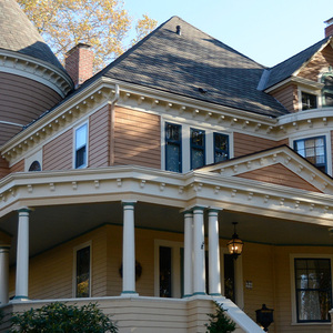
Searching for resolutions to these dilemmas, I began to study other houses in our neighborhood. Mostly older colonial-revival, Italianate, and Gothic-revival homes, all of them had been renovated and expanded over time, but had stayed true to their original style with appropriate proportions. Surrounded by two-story homes, our house not only was much smaller than any other in the neighborhood, but it also was the only Craftsman-style house on the block, a distinction that I did not want to lose
My next task was to study our house. I noticed that the siding’s 5-in. exposure complemented the house’s small size; that the 6-in. skirtboard and wood drip edge provided a pleasing transition between the concrete foundation and the clapboard siding; that the 4-in. corner boards made every turn crisp; that the 2-ft. overhanging eaves and rakes, with exposed rafter tails and beaded sheathing, provided shade and texture; and that the wooden brackets structurally and aesthetically supported each leg of rake. Originally designed for function, these details created the aesthetic that drew me to the house in the first place, and they had to be maintained.
I also noticed the effect that two trees had on the house. A tall eastern red cedar hugging the northeast corner reinforced the small scale, and an American sycamore in the south-side yard offered shade from the midday summer sun. Both needed to be saved.
For before and after floor plans and more on this cottage remodel, click the View PDF button below.

