Home Remedies
A batch of small changes revitalizes a tired floor plan, and a 400-sq.-ft. addition crowns the house with a graceful new roof.
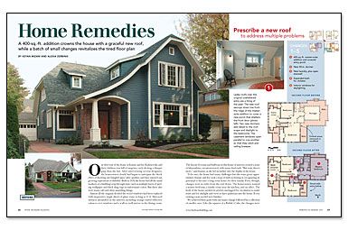
Synopsis: Building designers Keyan Mizani and Alexia Zerbinis were able to rescue this 1928 house that had all the usual markers of a building’s trip through time, such as peeling wallpaper, thick shag rugs in unfortunate colors, and many odd and often unsettling things. The biggest change was a new roof that extends over the living room to provide just enough space for a master suite without expanding the house’s footprint. The rest of the “cure” entailed unclogging major circulation arteries on the first floor, as well as reassigning rooms so that their functions and locations made sense. Finally, by fine-tuning the kitchen layout—relocating the back door, adding new cabinets and a breakfast nook, and replacing an obsolete chimney with pullout pantries—they rehabilitated the heart of the house.
Our first tour of the home of Jeanne and Joe Kaliszewski and their children was full of surprises, each eliciting a sharper gasp than the last. After interviewing several designers, the homeowners clearly had begun to anticipate the shock effect of showing one bungled space after another, and they enjoyed our growing expressions of disbelief. Built in 1928, the house had all the usual markers of a building’s trip through time, such as multiple layers of peeling wallpaper and thick shag rugs in unfortunate colors. But there also were many odd and often unsettling things.
Almost all the original divided-lite wood windows had been replaced with inoperative single sheets of glass, some as long as 11 ft. Mirrored surfaces abounded on the interior, including orange-tinted reflective valances over windows and a wall-to-wall mirror in the dining room.
The layout of rooms and hallways in this house of mirrors created a sense of labyrinthine, circuitous travel, with many dead ends. “But wait, there’s more,” said Jeanne, as she led us farther into the depths of the house.
To be sure, the house had many challenges but also some great opportunities. Jeanne and Joe took a leap of faith in buying it, recognizing its potential to become a long-term home for their family. First, though, changes were in order from the roof down. The homeowners wanted a master bedroom, a family room near the kitchen, and an office. The body of the house needed its arteries unclogged for circulation to make sense and for daylight and views to have pathways into the house. Every existing room needed new finishes.
We achieved these goals with one major change followed by a collection of smaller ones. Like the squares of a Rubik’s Cube, the changes were interrelated and had to work together to solve the puzzle. The solution included the early involvement of our general contractor, RMJ Construction, who provided preliminary cost estimates, allowing us to evaluate and prioritize the changes under consideration.
Rescue the upstairs with a bold stroke
When Jeanne and Joe first sat down with our design firm, two of their top priorities were to improve the house’s front facade and to add a master suite to the second floor. We saw an opportunity to accomplish both with a second-story addition.
The house had some potentially prime real estate lurking under the low roof over the living room. The awkward relationship of this roof to a separate roof over the entry also was the main contributor to the clumsy appearance of the front of the house and to drainage problems caused by the valley between the roofs.
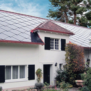
In their place, a new roof now matches up with the highest ridgeline of the house, extending over the living room to provide just enough space for a master suite without expanding the house’s footprint. On the north side, the new roof sweeps down in a dramatic curve, sheltering a prominent covered entry porch.
For more photos and details, click the View PDF button below:
