Adding the Perfect Porch
You can add a porch to almost any house, but only a well-designed one will look like it's always been there. In this excerpt from their book, "On the Porch," architect James M. Crisp and project designer Sandra L. Mahoney suggest several fundamentals for designing the perfect new porch for an existing home.
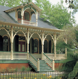
Some houses look fine just as they are, but there aren’t many that would not benefit from the addition of a porch. The question is, which porch? Luckily, it’s not hard to figure out the answer. A house with strong architectural roots has a history to inspire you. There are house-plan collections and architectural reference books that can show you the most faithful way to add a porch onto your period house.
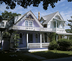
But what if you can’t find your house in a history book? Then you need to take a close look to identify stylistic clues that can help you design a porch that looks like it belongs. Porch details—posts, rails, rooflines, eaves, and foundations—all have characteristics that can be designed to mirror the details on your home. Some details are so subtle that the average person won’t notice them, such as the trim at the top of a porch post. In fact, there’s any number of trim combinations that will work fine at the top of that post. But if you want to accurately match your new porch to your home, you need to do your homework. To make the new porch fit your old home, you’ll need to consider elements that will guide your design: materials, proportion, and details.
Materials
Choosing materials that match (or are sympathetic to) an existing structure is fairly straightforward. Although some houses don’t leave much room for creativity (a Romanesque home is one of the few that calls for an all-stone porch, for example), a great many porches are made of wood or some combination of wood and other materials.
How do you piece together those combinations? Get ideas from your house and its surrounding materials, including window trim, roofing, walkways, even outbuildings. As you’ll see in the next chapter on porch anatomy, there are ample opportunities to introduce a mix of materials. The trick is to duplicate or complement the materials that have already been used to build and trim out your home. If the real thing (antique brick, for example) is no longer available, you can come close with reproduction materials and even synthetics, which we’ll discuss in detail in Chapter 3.
Proportion
Of the three elements of good design, the most ethereal is proportion. It’s the thing that most people don’t consciously notice, but many know instinctively if it is wrong. On a porch, it might be the size or shape of the posts, rails, or trim. The best way to understand the effect that proportion has on design is to study porches that you like and don’t like.
There are many reasons why a porch may appear unattractive to you, including color or a poor choice of materials, but a porch with bad proportions (columns that are poorly placed or too thin) will always feel awkward no matter how many times you paint it. When designing your own porch or reviewing your architect’s design, remember that if it doesn’t look right on paper, chances are it won’t look good in person. If you can’t tell by looking at plans, build a model to get a different perspective. In our practice, we build models of almost all of our projects, including porches.
Details
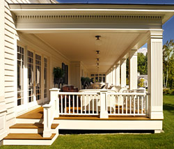
It’s hard to separate details from proportion, because every detail has its own proportion and all are part of the porch as a whole. Details may include the rhythm of crown molding or the shape of a wooden decorative bracket. One way to determine if the details you’ve selected will work is to nail up samples during construction so you can see how they look.
Keep in mind that some details are for decorative purposes, whereas others play a critical role in the longevity of the porch. An overly ornate balustrade on a plain porch will stand out like a sore thumb, but a handrail that’s joined to a post incorrectly might invite water into the structure, beginning the decline of the porch or even the foundation of the house itself.
A Good Fit
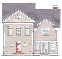
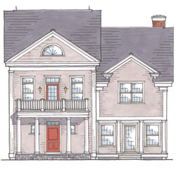
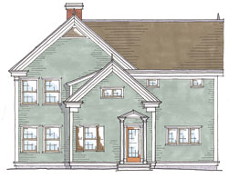
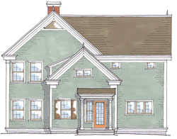
Have you ever looked at a house and sensed that something about it wasn’t quite right? Perhaps it didn’t look finished or feel balanced. Was it the placement of the windows? The pitch of the roof? The size of the porch? It’s not always easy to put your finger on what’s wrong, but it helps if you understand a few principles of good design. These drawings illustrate the difference between porches that are appropriately placed and in good proportion to the house—and those that aren’t.
1. a) How awkward a big, boxy house looks with a microscopic portico attached.
b) How a house and porch are balanced when they are in proportion.
2. a) How skimpy columns from undersized lumber can make a porch look tacked on.
b) How a wide header and substantial columns appear to support a façade.
The Transforming Porch
The lessons we’ve learned over hundreds of years of porch building in the United States should not be lost. Historical porches have endured because they were built to properly shed water, avoid rot, and withstand the elements. They possess timeless beauty because proportions were carefully considered and they were designed in harmony with the houses to which they were attached.
A well-made, but too-small, porch might last for a hundred years, but it will always look like a mistake. We believe it’s important to give very careful thought to the design and construction of porches—just as our ancestors did.
As we’ve seen, it’s not hard to know what kind of porch to build if your house is of a distinctive style, era, or pedigree. But what if your house has no distinctive style to speak of? What if it’s really nothing more than a Plain Jane ranch, colonial, or Cape? Well, it’s not as bad as you think—not if you consider the porch’s amazing ability to transform the look of a home.
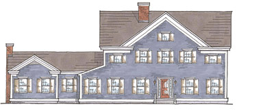
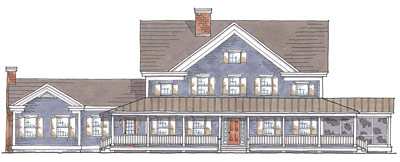
Open Land Inspires a Country Home
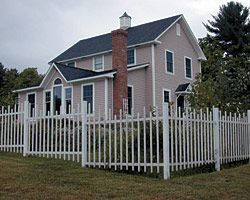
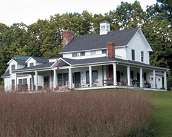
Let your porch take the lead
For the simple reason that a porch is so visible and open to interpretation, it can actually define the style of a house that has none to begin with. A case in point: We were recently paid a visit by clients who had bought a home on an idyllic, tree-lined country road. They told us the house was too small for their family, but more important, they just didn’t like the way it looked. We rode over with them to take a look and immediately agreed that the house seemed to lack character. In fact, it was about as plain as any home we’d ever been asked to renovate. (See “About Face” on p. 76).
Among other changes, we proposed a wraparound porch that included a private deck off two second-story bedrooms. The porch alone made a palpable difference in the way the house looked—and the way the owners looked at the house. They liked the view from the porch so much they decided to clear additional land to enhance it. In turn, they found they were spending more time outdoors. In this case, the porch not only transformed the house, but also inspired the owners and altered the surrounding landscape.
This doesn’t mean that you can work magic on your house or your lifestyle by simply adding a porch you like. As with any addition, you must consider the existing structure, materials, proportions, details—all the things that make for a seamless transformation.
James M. Crisp is the principal of Crisp Architecture in Millbrook, New York. Sandra L. Mahoney is a Senior Project Designer at the firm.
