A Fresh Start for a Farmhouse Kitchen
Wrapping a center stair with cabinets cleared the way for a sociable new kitchen with a breathtaking backdrop.
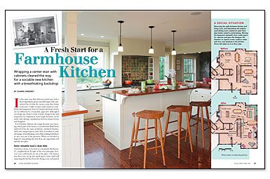
Synopsis: In a Shelburne, Vt., home, where the first floor was cut up into small spaces, designer Shawn Sweeney took on the task of connecting the kitchen to the dining and living rooms and to the surrounding countryside. Although the walls between rooms could be removed, one major feature couldn’t: a central stairway. Sweeney and his team came up with a way to use it to their advantage — by wrapping the entire stairwell with a built-in. This bold move improved views of the outdoors, while the rest of the remodel refined interior sightlines and created distinct social areas and kitchen workstations for everyone.
In the same way that delicious meals start with a list of ingredients, great remodels begin with a prioritized list of what the owners want their house to become. Unlike recipes easily found in cookbooks and magazines, however, homes and homeowners are too different for a formulaic approach. Although I encourage my clients to look in home-design books and magazines for inspiration, some tough decisions can be made only during consultations between homeowners and designers.
for Christine Murray, the tough decision was choosing which part of her house to remodel first. Both floors suffered from the same problems: outdated finishes, dark and cramped spaces, and a lack of windows to take advantage of breathtaking views. But tackling both floors at once was out of the question. When we decided to begin by remodelling the first floor, the ingredients fell quickly into place.
Some remodels need a clean slate
Christine’s house is located in a beautiful Shelburne, Vt., neighborhood. In spite of the view potential, however, you could barely see out of the place. The home’s first floor was cut up into small spaces with a full wall separating the kitchen from the dining room, and partial walls between the dining and living rooms.
The original kitchen had room for a large dining table and was open to the family room. Its separation from the dining and living rooms, however, meant that these spaces were seldom used. Also, dark, old cabinets and too few windows made the kitchen feel closed-in and dated.
First and foremost on Christine’s wish list was a fresh new look. She had clipped a collection of magazine photos that revealed her interest in a number of styles, which we blended for a contemporary farmhouse feel. New cabinetry with traditional white beadboard, inset doors and drawers, and eclectic details would be easy to embellish with a variety of materials and finishes.
My priority for the project was to connect the kitchen to the dining and living rooms and to the surrounding countryside. A stairway in the center of the first floor couldn’t be removed, but the walls between kitchen, dining room, and living room could. With the walls gone, the placement of the kitchen became ideal. These collaborative decisions gave us a clean slate on which to create a new kitchen connected to the home’s public spaces.
Create a new kitchen connected to the home’s public spaces
Christine’s house and her family’s lifestyle had little to gain from a formal dining room. She does a lot of entertaining, and the old floor plan shut her off from the guests she was cooking for. With a table already in use between the kitchen and the family room, we decided to do away with the dining room and to expand the living room to fit a new fireplace. Not only does the new plan provide long views from the kitchen into the family room in one direction and into the living room in the other, but it also provides distinct social areas. The casual family room is where kids typically play; the formal living room is where adults tend to gather. Between the two, the kitchen is the center of attention.
For more photos, drawings, and details, click the View PDF button below:
