Closet or Bath?
A trade-off seemed inevitable, but a clever solution made both possible.
Synopsis: In a Craftsman-era house designed by the great Bay Area architect Bernard Maybeck, a teenager’s bedroom co-habits with less than a half-bath; it’s a bedroom-plus-sink combination. When the homeowners decide their son is due for an upgrade, the plan is to colonize the room’s closet for a bath expansion. But what about the lost storage? Author Charles Miller provides play-by-play of the architect’s other chess move. The result is an improved use of space with a net gain over the old closet’s storage, and a full, modern, uncluttered bath.
Charlie’s bedroom was just about perfect. Upstairs in a Craftsman-era house designed a century ago by the great Bay Area architect Bernard Maybeck, the room overlooks a winding creek shaded by large oak trees. The only thing missing in Charlie’s bedroom was the rest of the bathroom.
At the turn of the 20th century, it was common for a bedroom to have its own lavatory. Charlie’s bedroom shared this arrangement; the bathing and toilet facilities were in a bathroom down the hall. As Charlie turned the corner into his teenage years, however, having his own full bath rose higher on the priority list. His bedroom closet was the logical piece of real estate for a bathroom expansion. But what about the lost storage? Replacing that was the other chess move.
A signature detail restores storage
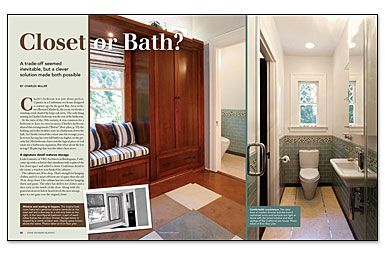
Leslie Lamarre of TRG Architects in Burlingame, Calif., came up with a solution that simultaneously replaced the lost closet space and added a classic Craftsman detail to the room: a window seat flanked by cabinets.
The cabinets are 24 in. deep. That’s enough for hanging clothes, and it’s a more efficient use of space than the old 39-in.-deep closet. One cabinet has two rods for hanging shirts and pants. The other has shelves for clothes and a shoe rack on the inside of the door. Along with the generous drawers below bench level, the new storage space is a net gain over the original closet.
The cabinets are made of cherry but are stained with a brownish glaze to look like American elm, which is more in keeping with the West Coast Craftsman look. A cork floor and carpet squares from Flor round out the changes in the bedroom. Both materials have sustainable underpinnings. Plus, Flor carpets are designed to be recycled. The company even offers to pick up its carpets and to cart them away for recycling when it’s time for replacement.
Long, narrow, and uncluttered
At a little more than 3 ft. wide and about 12 ft. long, Charlie’s bath could have been a dark shooting gallery. Lamarre kept it light with sleek finishes, fixtures that hug the walls, and a glass shower door. Coke-bottle-green glass tile lines the shower and wraps the lower walls of the rest of the bath as wainscoting. Bands of variegated-glass mosaics tie it all together and emphasize the linear layout. A made-you-look detail of two silvery strips of aluminum runs like rails down the middle of the room, bordering the three rows of limestone floor tiles.
A Lacava wall-mounted sink, only 11 in. deep, doesn’t crowd the room, yet it has enough deck space to rest a wet toothbrush and a bar of soap. Its chrome, T-shaped trap turns a typically unattractive collection of tubes into a sculptural detail. Even the flush-mounted body-spray showerheads hug the walls, intruding as little as possible into the airspace.
For more photos and details, click the View PDF button below:


